
As I mention in the bio for this blog, one of the most influential individuals in my professional development as an appraiser is George Dell. He is a nationally recognized valuation expert who teaches a method he calls “Evidence Based Valuation©.”
(If you’ve never taken a class from George, stop reading this blog post, go to his website, register for one of his classes—oh, it’s on the other side of the country? So what? Register!—and then resume reading this post. You’re back? Great.)
George’s classes emphasizes reproducible appraisal findings and deemphasizes subjectivity and guessing. Reports that follow George’s tenets are clearer, more logical, and more convincing to the end user. I can personally attest to a substantial increase in work quality.
George is on a bit of a crusade to get appraisers to use more sophisticated analytical tools. One such tool is the programming language R.
R can be a bit intimidating for appraisers—even for those who possess advanced Excel skills. However, one does not have to be a seasoned computer programmer to immediately start using it to produce charts and graphs that can aid in analysis and improve a report’s quality.
Let me walk you through the steps needed to produce this chart, known as a correlogram:

Per the STHDA website, a website that shares information on statistical tools, a correlation test is “used to evaluate the association between two or more variables.” Typically, a number is assigned that can range from -1 to +1. If two variables, say “Close_Price” and “Total_SF” have a correlation of +0.74, that means there is a strong positive association between the two. (In reports, this is often expressed as a percentage.) If the number were negative, it would mean as one variable goes up the other goes in the opposite direction. A good example of this in my market is the relationship between “Year_Built” and “Acres.” Newer homes tend to be on smaller lots as often a larger lot is purchased and partitioned by a developer.
A correlation matrix, per STHDA, “is used to investigate the dependence between multiple variables at the same time. The result is a table containing the correlation coefficients between each variable and the others.”
A correlogram is a visualization of the correlation statistics.
Once you get the hang of the process, you can start producing correlograms in under 5 minutes using R. It allows for fantastic support in an appraisal report.
Correlation matrices do, however, have their limitations and need to be used carefully. Again, I strongly recommend taking George Dell’s “Stats, Graphs & Data Science¹” class to obtain a better understanding.
Without further ado, let’s begin:
Step 1:
Install the R programming language: https://cran.r-project.org/
R runs on Windows, Mac, and Linux.
Step 2:
Download R Studio (a graphical overlay to R) from this site. R Studio is a free program. Make sure you choose the desktop option. (If the site is asking you to pay $30,000 a year, you accidentally clicked on the commercial license product . 😊)
Step 3:
Install the “PerformanceAnalytics” package.
Click the “Packages” tab in the bottom-right pane. Click “Install.” Type in the name of the package (it will autocomplete based on what is available on CRAN).
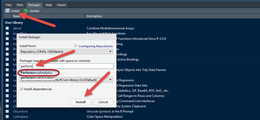
Note: You can customize the look of R Studio, I’ve chosen a darker theme as it is easier on the eyes, so don’t be concerned if my screenshots don’t exactly match what you see.
Step 4:
Open the R script file that contains the code.
You have a number of options here. To save yourself time, you can simply click this link to download a prepared R script file I am hosting on Dropbox. On Dropbox, click the download button on the upper right-hand corner and you will get a file that looks something like this, depending on your folder view settings:

When you double-click on the R script file R Studio will automatically open if it is closed or, if already open, simply add the code to the top-left pane. The code is just three lines long and will look something like this on your display:

The first 5 lines in blue are just comments I’ve added and are not code. By putting a “#” sign in front of comments, I am telling the program not to treat the text as code.
If you prefer not to download the prepared file, simply copy the text from the Dropbox display and paste it into a new R script.
Step 5:
Import the data from an Excel file. Click on the “Import Dataset” tab in the top right-hand pane, and click “From Excel…”:

If you try to import a CSV file you’ll get this error:
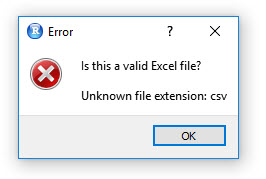
Future versions of R Studio may be able to handle CSV files directly, but for now, just make sure the file is an actual Excel file.
You’ll get a preview of your data that looks like this:

For appraisal work, you’ll want to start off working with variables that can be put in the “double” type format (a computer variable type that permits greater numerical precision). The type of variables we will want in our correlation matrix are, in brief, ones that are interval or ratio variables like “Close_Price” where it makes sense to say that a home is twice as expensive as another. (Working with a class of variables known as “categorical variables” is beyond the scope of this blog post—a Q3 home is not twice as nice as a Q6 home.)
I’ve made some custom Excel templates that allows me to take the data exported from my local MLS and it put it into the format I want. I then save just that tab’s information to a separate file labeled “Correlation Data.”
Pro Tips: a) For column headers, use the underscore to separate words rather than a blank space. So, “Total_SF” rather than “Total SF” is safer. b) Don’t use the “#” sign for any headers as that can mess up some R package’s ability to interpret. So rather than “#_Acres” put “No_Acres” or just “Acres.” c) Make sure “Close_Date” is in Excel “serial date” format.
Once, you’ve looked the data over, simply click the “Import” button at the bottom right to bring it into R.
Step 5:
Highlight the three lines of code and click the “Run” button:

Well, that part was easy!
(If you highlighted the comments above the code, it will have no effect on the outcome.)
Your graph will appear in the “Plots” tab at the bottom-right pane. Simpy click the “Export” option and you can save as an image or PDF and stick it in your report:

Once your templates are all set up, you can produce this chart in just minutes.
Correlograms can be very powerful. Reading from the top row, “Close_Price,” and reading across allows you to see how all the other variables correlate with “Close_Price.” If, “Acres” and “Close_Price” show virtually no correlation, you can point to the correlogram as proof that no lot size adjustment is needed.
There are many different types of correlograms that you can do with R. In a future post, I’ll review a number of them!
Let me know your thoughts in the comments section. If you have a question, don’t hesitate to ask!
And, finally, take George Dell’s class!

Thank you si much for this article! I really want to start using R in my appraisal work and your article is just what I needed to get going. I met George Dell in San Antonio at the AppraiserFest. He is an awesome guy! Thanks for sharing this info. I loom forward to your future blogs.
LikeLike
My pleasure. I definitely recommend taking as many classes from George as you can. Time well spent…
LikeLiked by 1 person
Abdur, thanks for writing this post. I did take George’s class but got a little lost in it. When I have a minute I am going to try and walk through this tutorial to produce a correlogram. Keep up the great work!
LikeLike
Thanks Abdur. I see this is a correlogram that shows correlation. What is the next step where it gives you the suggested adjustment?
LikeLike
Adjustments are a different matter altogether. The correlation matrix is testing if there is a relationship between two variables (whether positive or negative). Deriving adjustments, as you know, can be done many different ways–including regression and paired-sales. I look at the CM as a starting point and it can steer me away from making unneeded adjustments.
LikeLike
I followed the steps, clicked on Run and get this error message. Can you tell what I am doing wrong by this error message.? Thanks
> chart.Correlation(my_data1, histogram=TRUE, pch=19)
Error in as.matrix(x, ncol = NCOL(x)) : object ‘my_data1’ not found
LikeLike
Did you highlight all three lines of code? It appears you only highlighted the last line. All three lines must be highlighted and executed together. The first line calls the package library, the second line assigns your data to the variable my_data1, and the third line draws the correlogram.
LikeLike
Superb article on the need to leave subjective decision-making behind and come into the light of letting the data tell us what is important and what is not. This is the type of critical-thinking tool appraisers have needed for a long time! Analyzing the available data this way is way more relevant and timely than wasting time and effort telling the client whether the windows are single-hung or double-hung, or what the bathroom wainscoting looks like (how do those possibly affect value?). Thanks!
LikeLike
I get to the very end and keep getting the following message: Error in pairs.default(x, gap = 0, lower.panel = panel.smooth, upper.panel = panel.cor, : non-numeric argument to ‘pairs’
Any help would be appreciated.
LikeLike
Douglas, it looks like you are including columns that are not numeric. The correlation matrix can only handle numeric variables. Make sure your date field is in “serial date” format. See my screenshot above. Feel free to email me screenshots or sample files at: abdur@aqualityappraisal.com
LikeLike