The Portland Pearl District Condo Market – The Last 10 Years (2015-2024)

Via Wikimedia Commons

The Pearl District is one of Portland’s urban core neighborhoods. Bordering the Willamette River, the neighborhood used to be dominated by warehouses and railroad yards but is now home to a variety of businesses, art galleries, and housing. The City of Portland offers the following description:

The Pearl is a young neighborhood, its most recent incarnation established in the early 1990s. Its modern persona is heavily influenced by the tenets of New Urbanism, which prizes mixed-use, walkability, diversity, human scale and conservation.

The purchasable housing stock type in the Pearl District can be described in one word: condominiums. Except for one small townhome development, the neighborhood has no other housing type. (All other housing is lease-only in apartment buildings.) So, how has the Pearl District condo market performed over the last 10 years? Let’s crunch some numbers and dig into the stats.

Note: We will only be examining the open market, defined as condo units advertised on RMLS. Off-market private sales will not be included in the following analysis.

PEARL DISTRICT SUMMARY STATISTICS

Taking the 35,000-foot view, we can see the average yearly prices have been steadily declining since 2016:

Bar graph showing average yearly condo sales price in Pearl District, Portland, Oregon from 2015-2024.

Average prices this year are essentially the same as they were in 2015. (Ouch.) The main reason for this decline is due to a couple of large high-rise condominium buildings being completed in 2016 and 2018. (We’ll talk more them later in this post.) For now, suffice to say, the completion of those projects has created a glut of units the market is still trying to digest. That combined with high mortgage interest rates and low volume has depressed average sales prices.

Here is that same info expressed in an average yearly price per square foot:

Bar graph showing average yearly condo sales price per square foot in Pearl District, Portland, Oregon from 2015-2024.

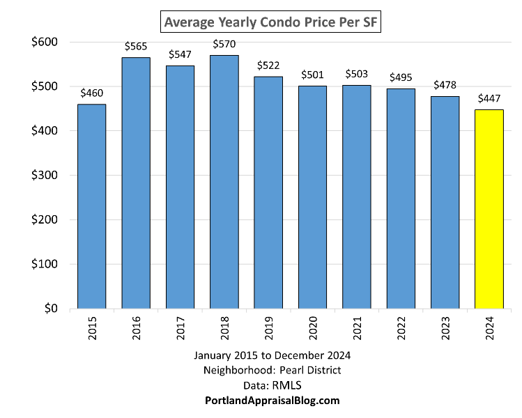
The contrast between 2015 and 2024 is a bit more pronounced when viewed from a price-per-square-foot vantage point.

Unsurprisingly, condo units have been steadily spending more time on the market before finding a buyer:

Bar graph showing average yearly cumulative days on market in Pearl District, Portland, Oregon from 2015-2024.

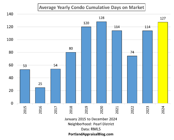
Units have been averaging 3-4 months on the open market before finally selling.

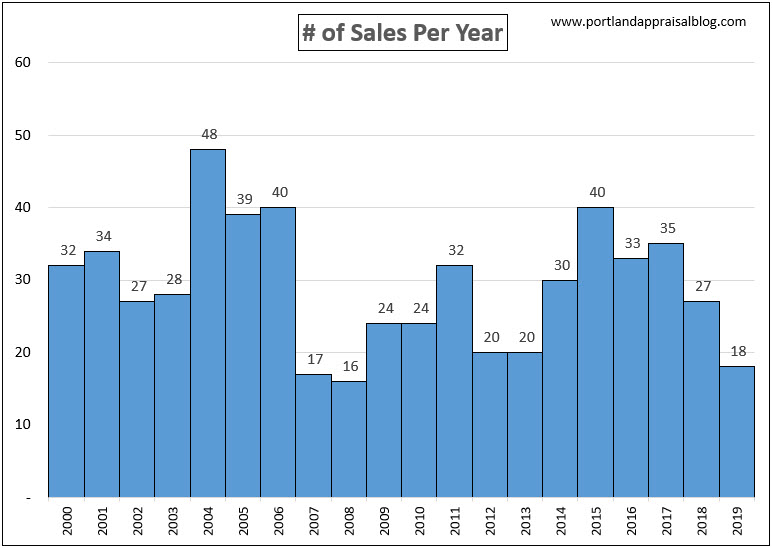
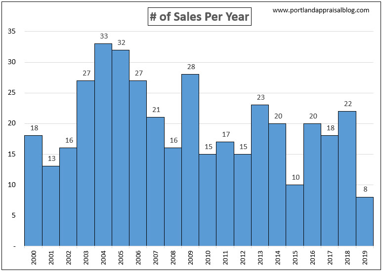
Volume has been trending downwards as the market struggles with the current high interest rate environment:

Bar graph showing average yearly condo sales volume in Pearl District, Portland, Oregon from 2015-2024.

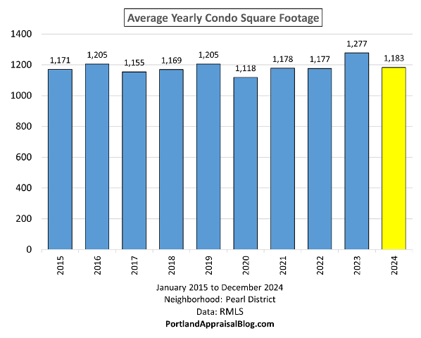
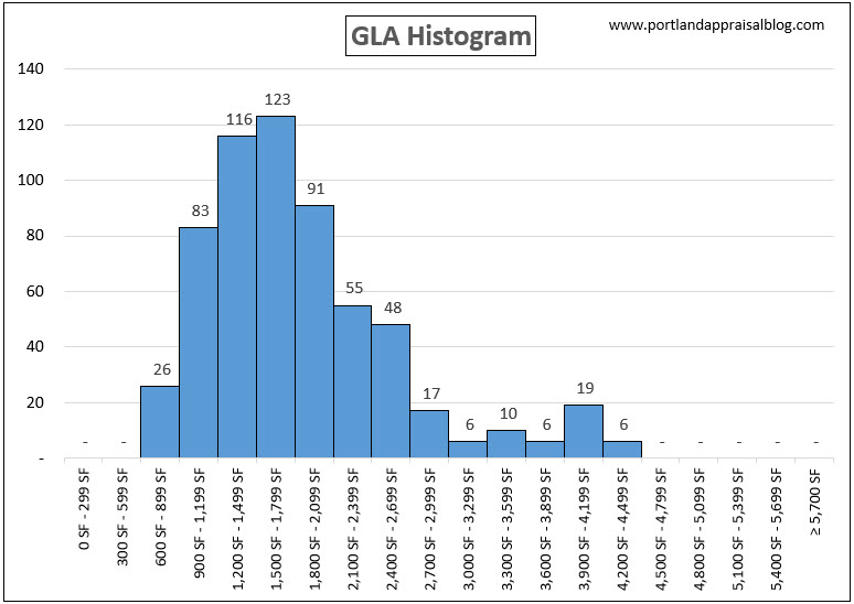
Finally, a look at the average size of the units each year shows no major swings and a general conformity in square footage:

Bar graph showing average yearly condo square footage in Pearl District, Portland, Oregon from 2015-2024.

2024 HASN’T BEEN A GREAT YEAR FOR THE PEARL DISTRICT

Using line graphs we can parse the data on a monthly basis for the last four years to see how 2024 compares to the previous three years. Let’s start with the average monthly sales price:

Line graph showing monthly average condo sales price in Pearl District, Portland, Oregon from 2021-2024.

It should be noted the month of December 2024 is dashed as the month is not yet complete as of the post date and trends may slightly change depending on the remaining data. The year 2024 has generally underperformed the prior years. Interestingly, the months of May & June of the year 2022 were the lowest. This was right when the Federal Reserve began spiking the interest rates, with immediate effect on the market.

The following shows the monthly days on market:

Line graph showing monthly average condo days on market in Pearl District, Portland, Oregon from 2021-2024.

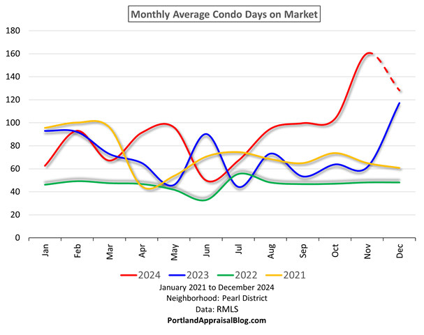
2024 has pulled away from the previous years and units are having a much harder time selling.

The following shows the sales price to the original list price ratio:

Line graph showing monthly average condo sales price to original list price percentage in Pearl District, Portland, Oregon from 2021-2024.

A ratio above 100% is good for sellers, as it typically indicates a “hot” market with competitive bidding. 2024 has seen a sharp drop off since late summer.

Finally a look at volume:

Line graph showing monthly average condo sales volume in Pearl District, Portland, Oregon from 2021-2024.

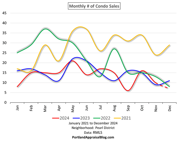
It’s been neck and neck between 2023 and 2024, but it looks like 2024 will close the year with the lowest monthly winter volume over the last four years.

IMPACT OF MAJOR HIGH-RISE CONDOMINIUMS

Images of Cosmopolitan and Vista Pearl via Wikimedia Commons

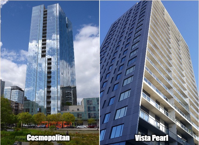
The Cosmopolitan is the largest residential tower in the City of Portland. The building is 28 stories, has 343,560 sq. ft. of space, and 150 condo units. It greatly enhances Portland’s skyline. The tower was completed in 2016.

Vista Pearl is also an impressive building, with 21 stories above ground and 153 condo units. Vista was completed in 2018 and is STILL selling units that have never been occupied. (One unoccupied unit sold in early 2024.)

The following graph shows the number of condo units in active status versus the number of units in pending status (under contract) for the entire Pearl District for the last ten years:

Line graph showing daily number of condos in active status versus pending status in Pearl District, Portland, Oregon from 2015-2024.

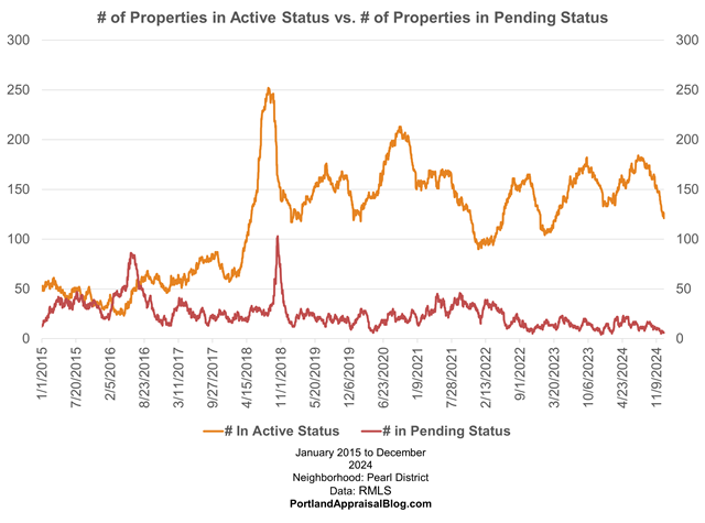
When the number of pendings exceed the number of active listings that generally indicates a hot market where demand outstrips supply. The market did a fairly good job absorbing the units from the Cosmopolitan. However, when Vista Pearl came online, the market became glutted. The graph shows a sharp spike in active listings in 2018 when that tower was completed and the inventory levels have remained high ever since.

The two structures compete well against one another. Here is a graph of sales prices from the Cosmopolitan and Vista Pearl:

Double scatter plot showing sales in the Cosmopolitan on the Park condo tower and the Vista Pearl condo tower in Pearl District, Portland, Oregon.

The flurry of initial sales for each building can be seen on their respective completion dates (2016 & 2018). The general range of initial sales prices were similar. The subsequent years show an intermixture of dots, indicating no clear dominance of one tower over the other. The edge does go to the Cosmopolitan in the rarified heights of luxury condo units. And the air gets quite thin above $3 million, with most of the sales in that range belonging to the Cosmopolitan.

The highest sale in the Cosmopolitan was a 4,472- sq. ft. penthouse unit on the 27th floor. It was originally designed as two condo units, but before the tower was completed the two units were consolidated, creating the largest unit in the complex, with panoramic views. The 27th floor penthouse initially sold for $5,441,294 in 2016 as a new construction. The unit later sold for $6,995,000 in 2019—which is a record on the open market for the last ten years in the Pearl District (the seller never dropped the price and waited 244 days to find a buyer). As of this post date, the unit is back on the market for a more “modest” asking price of $4,500,000. If the penthouse closes at that price, it will represent a 36% drop in value from the previous sale. Photos of the unit are currently available online.

A QUICK LOOK AT THE LUXURY CONDO MARKET IN THE PEARL DISTRICT

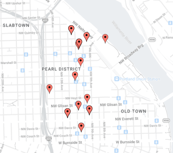
Let’s wrap up our survey of Pearl District condos by examining the luxury market. Here, we define the luxury market as condominiums that sold at or above $2 million. The following map shows where those sales occured:

Map of location of sales of $2 million plus condo sales in the Pearl District in Portland, Oregon

The following table summarizes info about the sales:

Table of condo complexes that had sales of $2 million plus unit between 2015-2024 in the Pearl District, Portland, Oregon.

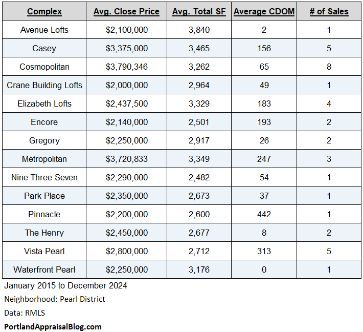
Unsurprisingly, the Cosmopolitan is the clear winner, however, the Casey and Metropolitan complexes are close behind in average sales prices, with the Vista Pearl complex claiming 4th place in the luxury condo market.

Thank you for reading the post! I hope you found some useful or interesting nugget of information. Please consider subscribing.

Question: When do you think the Pearl District will finally absorb all the excess inventory?

CODA

Are you an agent and wonder why appraisers always do “x”? Are you a homeowner that got a report and have a question or two about appraisal terminology or methodology? If so, please feel free to contact me. I enjoy interacting with various market participants and am always happy to help out where I can! And if you are in need of any appraisal services, feel free to reach out to us!

Crestwood—Neighborhood Analysis of Single-Family Residential Homes (November 2019)

The Crestwood neighborhood is part of the Southwest portion of Portland and is one of the periphery neighborhoods. This neighborhood is largely residential with minor commercial and one city park (Dickinson). This neighborhood has a overlapping section with the adjacent Ashcreek, but that small section is omitted in the following analysis.

2019-11-30_21-10-51


Appraisers endeavor to take the measure of a neighborhood with a variety of tables, charts, and graphs. It helps them to frame the value opinion and see how the subject property relates to the neighborhood as a whole. Before we dive in, a…

Quick Note

The following information is based on detached single-family residential homes that were sold and/or listed on the open market as reported by RMLS—the primary MLS service for the City of Portland. Data was pulled from the year 2000 to the present date. The data export was checked, validated, and scrubbed of obvious errors using custom tools developed by the author. With that out of the way, let’s look at some neighborhood stats.

Neighborhood Statistics Overview

The following table summarizes important metrics for the neighborhood. Each column is independent of the others and the basement square foot column reflects only properties with a basement.

2019-11-30_21-25-18

Approximately 3% of sales in the neighborhood were new constructions.

The following scatter plot shows all closed-sale detached single-family residences  (with a red trendline):

DOS

The neighborhood suffered during the housing crisis, but has recovered with prices generally higher than they were before the crash. The following chart shows quarterly average and median sales prices over the last two years:

Quarter

Percentile rank is a way of seeing price bands for the neighborhood. For instance, the 50th percentile, or median rank, shows that half of all sales since the year 2000 have been under $279,900. Prices are fairly clustered all the way up to the 90th percentile:

Percentile


The following table shows important marketing information for both the last two years and since the year 2000:

2019-12-01_0-20-24


The “SP/OLP” label stands for “sales price/original list price” ratio. This is an important metric, as it shows what the particular property sold for relative to the original list price that was advertised. The “SP/LP” column tracks what the sales price was relative to the final published list price. This column, while not as important as the first one, still yields important insights as to the direction of negotiations. The “DOM” column tracks the days on market for all properties sold and listed and helps frame expected marketing time. Finally, the “CtL” label stands for “contract-to-list” ratio. It is the number of pending sales divided by the total number of listings. A low ratio means many properties are sitting on the open market waiting for offers. A high ratio indicates properties are being absorbed by the market quickly, commonly referred to as a “seller’s market.”

As of this post date, there are more properties under contract than waiting for an offer.

The following table more closely examines DOM as well as CDOM (cumulative days on market). CDOM is also an important metric as homes are often taken off the market and then subsequently relisted (typically at a lower price). The CDOM metric can give you a better idea of total expected marketing time. The table breaks out DOM & CDOM by price segment:

2019-12-01_0-36-08


Let’s wrap up the neighborhood statistics overview with the following table showing the sales terms in the market over the last two years:

2019-12-01_0-40-47


Conventional financing is predominant, with the majority of the remaining sales being cash buyers or buyers using FHA financing.

Let’s conclude our tour of Crestwood with a histogram analysis of the neighborhood:

Histogram Analysis

Age

Age

Most properties in the neighborhood are between 30-69 years of age.

Bathroom Count


Bath

A home with two full bathrooms is the most typical for the market.

Bedroom Count


Bedroom

The vast majority of homes are have either three of four bedrooms.

Garage Stall Count

Gar

Most homes in the neighborhood have a two-car garage.

Total Square Footage

Total SF

This metric includes above-grade living area and basement space for a combined figure. The median total square footage for the neighborhood is ~1,800 sq. ft.

Gross Living Area

GLA

Gross living area only consider non-basement living space. Often the market reacts more strongly to gross living area, usually applying a discount to basement space. Median gross living area is approximately 1,400 sq. ft.

Level Count

# of Levels

The majority of properties are two levels in this neighborhood, although a single-level is very common.

Lot Size

Acres

The median lot size for home in the neighborhood is ~9,150 sq. ft. 

Sales Price

Sales Price

This histogram includes sales prices over a 20-year period. The median sales price over the last 20 years is: ~$280,000; and the median sales price over the last 2 years is: $437,000.

The highest sales price obtained in the neighborhood (on the open market) was $1,095,000 on 10/16/2018. The home was a new construction at the time of the sale and has 4,050 total square feet.

# of Sales


# of Sales

The number of sales in the neighborhood have been trending lower this year as compared to the previous two.

So, there you have it, a market overview for the Crestwood neighborhood!

Appraisal Reports

If you are a homeowner and are looking to sell your home, you would greatly benefit from a prelisting appraisal. Our firm will bring high-level analytics to your report and give you a sound understanding of the current market.

If you are an agent and need detailed neighborhood analysis, or analysis of specific areas or specific segments of the market, please contact us and we can generate a custom report to help you frame a listing price for your client!

Far Southwest—Neighborhood Analysis of Single-Family Residential Homes (August 2019)

The Far Southwest neighborhood is just that—far southwest! It represents one of the periphery neighborhoods of the City of Portland. The neighborhood is largely dominated by the Portland Community College Sylvania Campus. The campus was opened in 1968 and has approximately 28,000 students enrolled each year.

Aerial Small

Appraisers endeavor to take the measure of a neighborhood with a variety of tables, charts, and graphs. It helps them to frame the value opinion and see how the subject property relates to the neighborhood as a whole. Before we dive in, a…

Quick Note

The following information is based on detached single-family residential homes that were sold and/or listed on the open market as reported by RMLS—the primary MLS service for the City of Portland. Data was pulled from the year 2000 to the present date. The data export was checked, validated, and scrubbed of obvious errors using custom tools developed by the author. With that out of the way, let’s look at some neighborhood stats.

Neighborhood Statistics Overview

The following table summarizes important metrics for the neighborhood. Each column is independent of the others and the basement square foot column reflects only properties with a basement.

2019-08-11_17-37-32

Approximately 6% of sales in the neighborhood were new constructions.

The following scatter plot shows all closed-sale detached single-family residences  (with a red trendline):

2019-08-11_18-00-32

The neighborhood suffered during the housing crisis, but has recovered with prices generally higher than they were before the crash. The red trendline shows prices have leveled and have even dipped a bit. This is further borne out by a review of average and median sales prices over the last two years:

Quarters

Percentile rank is a way of seeing price bands for the neighborhood. For instance, the 50th percentile, or median rank, shows that half of all sales since the year 2000 have been under $340,350. Prices are fairly clustered all the way up to the 90th percentile:

Percentile

The following table shows important marketing information for both the last two years and since the year 2000:

OLP

The “SP/OLP” label stands for “sales price/original list price” ratio. This is an important metric, as it shows what the particular property sold for relative to the original list price that was advertised. The “SP/LP” column tracks what the sales price was relative to the final published list price. This column, while not as important as the first one, still yields important insights as to the direction of negotiations. The “DOM” column tracks the days on market for all properties sold and listed and helps frame expected marketing time. Finally, the “CtL” label stands for “contract-to-list” ratio. It is the number of pending sales divided by the total number of listings. A low ratio means many properties are sitting on the open market waiting for offers. A high ratio indicates properties are being absorbed by the market quickly, commonly referred to as a “seller’s market.”

As of this post date, there are more properties waiting for offers than are under contract.

The following table more closely examines DOM as well as CDOM (cumulative days on market). CDOM is also an important metric as homes are often taken off the market and then subsequently relisted (typically at a lower price). The CDOM metric can give you a better idea of total expected marketing time. The table breaks out DOM & CDOM by price segment:

CDOM

Let’s wrap up the neighborhood statistics overview with the following table showing the sales terms in the market over the last two years:

Sale Terms

While conventional financing is predominant, there is a substantial cash market.

Let’s conclude our tour of South Portland with a histogram analysis of the neighborhood:

Histogram Analysis

Age

Age

Most properties in the neighborhood are between 10-44 years of age.

Bathroom Count

Bath

A home with two full bathrooms and one half bathroom (powder room) is the most typical for the market.

Bedroom Count

Bedroom

The vast majority of homes are have either three of four bedrooms.

Garage Stall Count

Garage

Most homes in the neighborhood have a two-car garage.

Total Square Footage

TSF

This metric includes above-grade living area and basement space for a combined figure. The median total square footage for the neighborhood is ~2,400 sq. ft.

Gross Living Area

GLA

Gross living area only consider non-basement living space. Often the market reacts more strongly to gross living area, usually applying a discount to basement space. Median gross living area is approximately 1,880 sq. ft.

Level Count

Levels

The majority of properties are two levels in this neighborhood.

Lot Size

Lot

The median lot size for home in the neighborhood is ~10,000 sq. ft. 

Sales Price

Sales Price

This histogram includes sales prices over a 20-year period. The median sales price over the last 20 years is: ~$340,000; and the median sales price over the last 2 years is: $437,000.

The highest sales price obtained in the neighborhood (on the open market) was $1,095,000 on 10/16/2018. The home was a new construction at the time of the sale and has 4,050 total square feet.

# of Sales

# of Sales

The number of sales in the neighborhood have been trending higher this year as compared to the previous one.

So, there you have it, a market overview for the Far Southwest neighborhood!

Appraisal Reports

If you are a homeowner and are looking to sell your home, you would greatly benefit from a prelisting appraisal. Our firm will bring high-level analytics to your report and give you a sound understanding of the current market.

If you are an agent and need detailed neighborhood analysis, or analysis of specific areas or specific segments of the market, please contact us and we can generate a custom report to help you frame a listing price for your client!

South Portland—Neighborhood Analysis of Single-Family Residential Homes (July 2019)

The South Portland neighborhood is one of Portland’s waterfront communities, bordering the Willamette River. It is connected to the east side of the city via four bridges and boasts some of the city’s modern skyscrapers—including the John Ross Tower, Portland’s largest residential structure. Shopping, fine dining, numerous parks, recreation, OHSU with its aerial tramway, and major employment centers are all features of this dynamic neighborhood.

2019-07-27_8-02-02

Despite being part of Portland’s urban core, the South Portland neighborhood has a thriving detached single-family home market.

Appraisers endeavor to take the measure of a neighborhood with a variety of tables, charts, and graphs. It helps them to frame the value opinion and see how the subject property relates to the neighborhood as a whole. Before we dive in, a…

Quick Note

The following information is based on detached single-family residential homes that were sold and/or listed on the open market as reported by RMLS—the primary MLS service for the City of Portland. Data was pulled from the year 2000 to the present date. The data export was checked, validated, and scrubbed of obvious errors using custom tools developed by the author. With that out of the way, let’s look at some neighborhood stats.

Neighborhood Statistics Overview

The following table summarizes important metrics for the neighborhood. Each column is independent of the others and the basement square foot column reflects only properties with a basement.

Neigh Stats Corrected

There has been relatively little new construction in the neighborhood with ~5.8% of all sales having been new homes.

The following scatter plot shows all closed-sale detached single-family residences  (with a red trendline):

DOS vs SP

The neighborhood suffered during the housing crisis, but has recovered with prices generally higher than they were before the crash. The red trendline shows prices have leveled and have even dipped a bit. This is further borne out by a review of average and median sales prices over the last two years:

Two Years

Percentile rank is a way of seeing price bands for the neighborhood. For instance, the 50th percentile, or median rank, shows that half of all sales since the year 2000 have been under $359,000. Prices are fairly clustered up to the 90th percentile where the upper range begins to balloon:

Percentiles-2

The following table shows important marketing information for both the last two years and since the year 2000:

OLP

The “SP/OLP” label stands for “sales price/original list price” ratio. This is an important metric, as it shows what the particular property sold for relative to the original list price that was advertised. The “SP/LP” column tracks what the sales price was relative to the final published list price. This column, while not as important as the first one, still yields important insights as to the direction of negotiations. The “DOM” column tracks the days on market for all properties sold and listed and helps frame expected marketing time. Finally, the “CtL” label stands for “contract-to-list” ratio. It is the number of pending sales divided by the total number of listings. A low ratio means many properties are sitting on the open market waiting for offers. A high ratio indicates properties are being absorbed by the market quickly, commonly referred to as a “seller’s market.”

As of this post date, there are more properties waiting for offers than are under contract. The CtL is a fluid metric, however, and may not be indicative of long-term trends.

The following table more closely examines DOM as well as CDOM (cumulative days on market). CDOM is also an important metric as homes are often taken off the market and then subsequently relisted (typically at a lower price). The CDOM metric can give you a better idea of total expected marketing time. The table breaks out DOM & CDOM by price segment:

By Segments

Let’s wrap up the neighborhood statistics overview with the following table showing the sales terms in the market over the last two years:

2019-07-27_9-57-18

While conventional financing is predominant, there is a substantial cash market.

Let’s conclude our tour of South Portland with a histogram analysis of the neighborhood:

Histogram Analysis

Age

Age

Most properties in the neighborhood are over a half century old. With the oldest home being a 920 sq. ft. cottage built while Abraham Lincoln was still president of the United States.

Bathroom Count

Bathroom

A two-bathroom home is the most typical for the market, with a single bathroom being fairly common as well.

Bedroom Count

BR

The vast majority of homes are have three bedrooms.

Garage Stall Count

Gar Fixed

There is near parity between properties with no garage and a one-car garage. A two-car garage is not uncommon either.

Total Square Footage

2019-07-27_10-43-38

This metric includes above-grade living area and basement space for a combined figure. The median total square footage for the neighborhood is ~2,200 sq. ft.

Gross Living Area

GLA

Gross living area only consider non-basement living space. Often the market reacts more strongly to gross living area, usually applying a discount to basement space. Median gross living area is approximately 1,550 sq. ft.

Level Count

Levels

The majority of properties are three levels in this neighborhood.

Lot Size

Lot Size

The lion’s share of properties are on lots 0.06 ac – 0.119 acres (~2,610 sq. ft. – ~5,180 sq. ft.). 

Sales Price

Sales Price

This histogram includes sales prices over a 20-year period. The median sales price over the last 20 years is: $359,000; and the median sales price over the last 2 years is: $530,533.

The highest sales price obtained in the neighborhood (on the open market) was $1,500,000 on 6/13/2018. The home is over 6,000 total square feet; sits on one of the larger lots for the neighborhood; has a sauna & pool; and has a studio!

# of Sales

Sales Per Yr

The number of sales in the neighborhood have been trending lower this year as compared to the previous two.

So, there you have it, a market overview for the South Portland neighborhood!

Appraisal Reports

If you are a homeowner and are looking to sell your home, you would greatly benefit from a prelisting appraisal. Our firm will bring high-level analytics to your report and give you a sound understanding of the current market.

If you are an agent and need detailed neighborhood analysis, or analysis of specific areas or specific segments of the market, please contact us and we can generate a custom report to help you frame a listing price for your client!


Ladd’s Addition—Neighborhood Analysis of Single-Family Residential Homes (July 2019)

Ladd’s Addition is a unique historic district in the city of Portland that is known for its diagonal street pattern radiating from a central park spoke—the Ladd Circle Park & Rose Gardens. Ladd’s addition is named after the 19th century Portland mayor, William S. Ladd. This historic district is part of the Hosford-Abernethy neighborhood. The street layout is easy to spot from aerial maps of the city and clearly delineates the district’s boundaries.

2018-11-07_18-10-38

Appraisers endeavor to take the measure of a neighborhood with a variety of charts and graphs. It helps them to frame the value opinion and see how the subject property relates to the neighborhood as a whole. For this blog post we will use the venerable histogram to better understand the single-family residential market for Ladd’s Addition.

A histogram is a graphical display of data using bars of different heights. In a histogram, each bar groups numbers into ranges. Taller bars show that more data falls in that range. A histogram may be used to display the shape and spread of the data of the real estate market and illustrate trends of properties that have sold and/or are listed. They’re a great visual tool!

The following information is based on detached single-family residential homes that were sold and/or listed on the open market as reported by RMLS—the primary MLS service for the City of Portland. Data was pulled from the year 2000 to the present date.

Age

Age

Most properties within Ladd’s Addition were built around 1900-1930. This is reflected in the age histogram showing most of the homes falling in the 91-97 years bracket. New/newer constructions in Ladd’s addition is nearly unheard of.

35 different homes that sold over the last 20 years were on the National Register of Historic Places.

Bathroom Count

Bathroom

Most homes in the neighborhood have two bathrooms; but a home with only one bathroom is not uncommon. One home had the equivalent of 5 & 1/2 bathrooms. There is no waiting in that house!

Bedroom Count

Bedroom

Two to four bedrooms is the norm, with a few outliers having either one or 6-7 bedrooms.

Garage Stall Count

GAR

A one-car garage is the norm for Ladd’s Addition. However, a substantial number of homes in the dataset have either no garage at all or an extra garage stall.

Total Square Footage

Total SF

This metric includes above-grade living area and basement space for a combined figure. The median total square footage for the neighborhood is 2,500 sq. ft. There are some larger homes in the area, with 32 sales/listings being at or above 4,800 sq. ft.

Gross Living Area

GLA

Gross living area only consider non-basement living space. Often the market reacts more strongly to gross living area, usually applying a discount to basement space. Median gross living area is approximately 1,700 sq. ft.

Level Count

# of Levels

The majority of properties are three levels in this neighborhood.

Lot Size

Lot Size

The vast majority of properties are on lots 0.120 ac – 0.129 acres (~5,227 sq. ft. – ~5,619 sq. ft.). There is substantial uniformity of lot sizes in this neighborhood.

Sales Price

Sales Price

This histogram includes sales prices over a 20-year period. The highest sales price obtained in the neighborhood (on the open market) was $1,105,000 on 3/17/2017.

# of Sales

# of Sales

Ladd’s Addition doesn’t have a substantial turnover of homes each year. The fewest sales in a year was back in 2015, when only 10 single-family residential homes sold. 2016-2018 averaged 20 sales per year. This year looks to be trending lower. Year-to-date sales are only 8 and, if the trend holds, 2019 may signal a cooling off of the number of sales.

So, there you have it, a brief histogram overview of one of Portland’s most iconic neighborhoods!

Appraisal Reports

If you are a homeowner and are looking to sell your home, you would greatly benefit from a prelisting appraisal. Our firm will bring high-level analytics to your report and give you a sound understanding of the current market.

If you are an agent and need detailed neighborhood analysis, or analysis of specific areas or specific segments of the market, please contact us and we can generate a custom report to help you frame a listing price for your client!