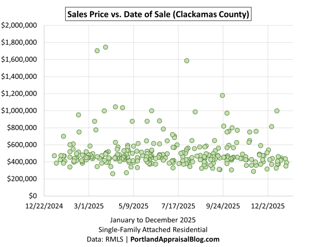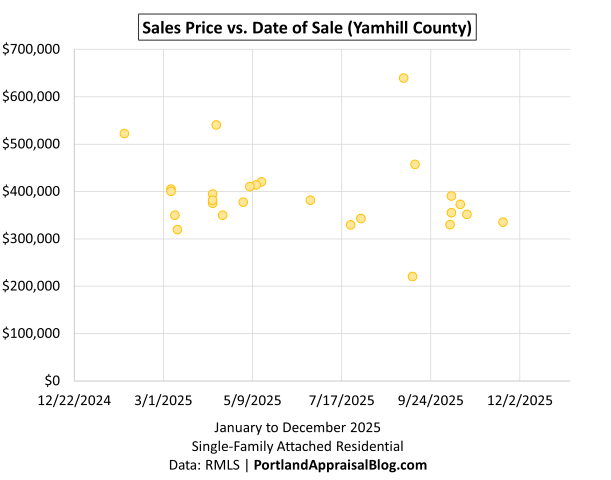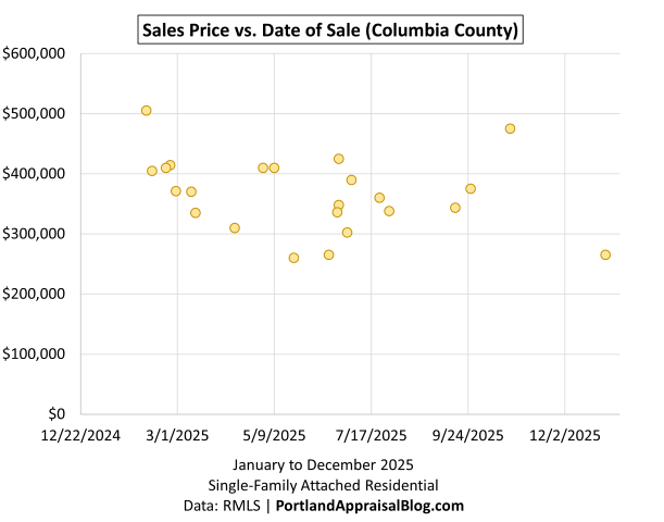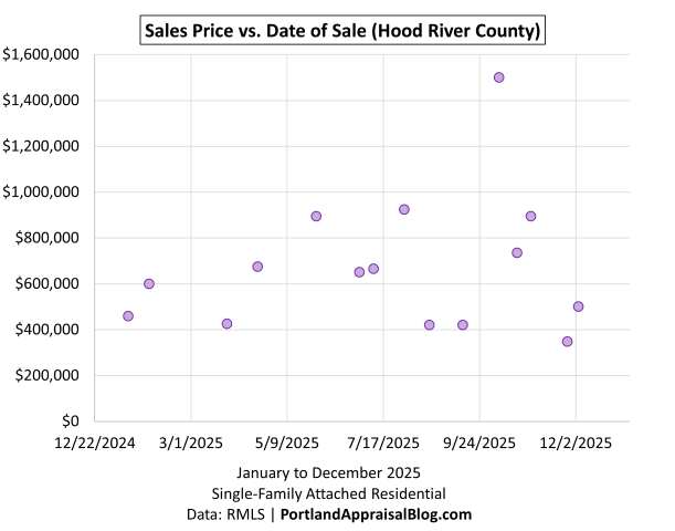

The Portland Region Q1 2026 Attached Homes Market Update

The Q1 2026 Portland Region attached‑home update: median price $420k (‑5%), PPSF $287 (‑4%), sales +10%, dollar volume +4%. Affordability jumps to 69% (+41 pts) of the market. New construction +15%. County patterns, builder pivots, appraisal insights and more.

The Portland White Stag sign.
Photo: Abdur Abdul-Malik, Portland Appraisal Blog

Introduction

The first quarter of 2026 was a study in contrasts across the Portland region’s attached‑home market. The three major counties—Multnomah, Washington, and Clackamas—continued to anchor the segment, each revealing its own distinct pattern of demand, pricing behavior, and builder activity. Together they formed the core of the regional story: softer prices, steady buyer engagement, and a noticeable shift in how builders are positioning new product. Beneath those broad themes, however, each county expressed the quarter differently, shaped by its inventory profile, geography, and development pipeline.

Washington County remained the region’s most uniform and predictable attached‑home market, with tight clustering in the mid‑price bands and a clear, data‑driven softening that still preserved strong absorption. Multnomah showed more variation, with affordability improving and pricing adjusting in a way that reflected both buyer sensitivity and the county’s diverse housing stock. Clackamas, by contrast, continued to operate at a higher price level, with a dense band of activity in the low‑$400s and a meaningful upper‑tier presence. Builders in Clackamas also made a notable pivot toward smaller new‑construction units—a strategic response to qualification thresholds that shaped the quarter’s pricing dynamics.

Outside the “Big Three,” the story was defined not by trends but by scale. Yamhill, Columbia, and Hood River each recorded only a handful of attached‑home sales, and their year‑over‑year changes reflected the volatility inherent in extremely small datasets. In these counties, a single closing can shift averages dramatically, and the absence of just a few transactions can reshape dollar volume.

Taken together, Q1 2026 shows a region adjusting to softer demand with realistic pricing, steady buyer participation, and builder strategies increasingly aligned with affordability constraints.

Table of Contents

Data Housekeeping

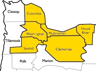
The Portland Region in this update comprises the six Oregon counties of Columbia, Clackamas, Hood River, Multnomah, Washington, and Yamhill. These counties form a contiguous housing ecosystem centered on Portland—Multnomah as the core home county, with the others tightly integrated through commuting patterns, economic ties, and shared market dynamics (e.g., Yamhill’s strong connection via Highway 99W and wine-country adjacency). Beyond Yamhill, the MLS system changes, further distinguishing this six-county area from broader geographic aggregations. For a detailed overview—including county profiles, population data, key value influencers, and why this definition differs from the official seven-county Portland–Vancouver–Hillsboro MSA—see the dedicated page: The Portland Region – Six-County Market Area Overview.
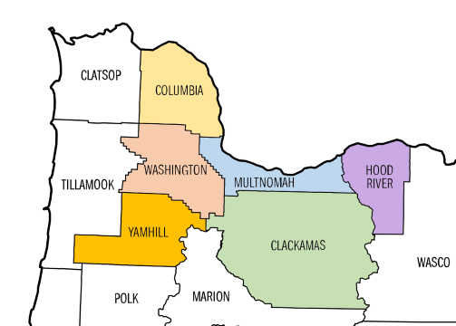
Colored map of the six counties comprising the Portland Region: Clackamas, Columbia, Hood River, Multnomah, Washington, and Yamhill.
The six-county Portland Region
Via SunCatcherStudio

All data is sourced from RMLS and reflects open-market attached single-family residential sales. SNL (“Sold Not Listed”) entries—off-market transactions entered retroactively—have been excluded to preserve consistency with true market activity.

All figures have undergone a standard cleaning process to address common RMLS accuracy challenges, including misclassifications (such as condominiums listed as attached homes), square‑footage and price entry errors, incomplete fields, status/date mismatches, and other non‑representative entries. This post focuses exclusively on attached homes on owned land; while a condominium townhome and an attached townhome may appear similar, their ownership structures differ substantially. Condominiums are therefore carefully removed from this dataset. For a detailed overview of these issues, their impact on market analysis, and the mitigation steps used (automated flagging, cross‑verification, and manual review), see the dedicated page: RMLS Data Accuracy Challenges.

Portland Appraisal Blog Affordability Index (PABAI)

What PABAI Measures

The Portland Appraisal Blog Affordability Index (PABAI) is a model that estimates how home sale prices compare to what a median‑income household can qualify for under standard lending assumptions (HUD Portland‑Vancouver‑Hillsboro MSA median income, 20% down, and a 28% DTI for principal, interest, taxes, insurance, and HOA dues).

Unlike national affordability indices, PABAI is built from actual RMLS transactions rather than a single hypothetical price point. It computes an affordability ratio for every closed sale in the Portland Region during the analysis period using rates matched to the date of close, reported taxes, reported HOA dues, and an insurance estimate based on a percentage of the home’s value. The individual affordability ratios are then averaged to produce the reported PABAI value for that period. For Q1 2026, this approach captures the actual mix of homes sold and the financing conditions present at the time those transactions occurred. Each housing segment—detached, attached, condos, and manufactured—is calculated separately, ensuring that segment‑specific dynamics are preserved rather than blended together. This approach provides a more detailed, locally grounded view of Portland‑area affordability and avoids the distortions that occur when fundamentally different housing types are combined into a single regional metric.

A PABAI of 100 means the market is exactly affordable at that income level (the Q1 2026 HUD median MSA income was $124,100 for a family of four). Values above 100 indicate excess qualifying capacity (more affordable), while values below 100 indicate a shortfall (strained affordability). Full methodology and the interpretation scale are available on the PABAI explainer page.

PABAI RangeInterpretation
120+Strongly Affordable
100–119Moderately Affordable
80–99Strained
Below 80Severely Constrained

Note: While every sale produces an affordability ratio, the PABAI itself requires at least 20 sales to be statistically meaningful. Counties with fewer than 20 attached sales will report affordability counts and percentages, but not a PABAI.

Residential Housing Snapshot

CategoryDetachedAttachedCondoManuf.
Total $ Volume$2.2B$161.0M$199.0M$32.4M
Avg Price$659,197$444,672$389,438$540,352
Avg PPSF (Total SF)$316.21$286.91$325.55$356.75
Avg Total SF2,1641,5761,1801,571
Avg Lot Size (ac)0.6550.066N/A7.959
Avg Age (Yrs)46.0315.0932.0329.10
Avg CDOM80.2280.59119.62118.25
# of Sales3,34936251160
% of Market78.21%8.45%11.93%1.40%
Highest Sale$5,725,950$1,175,000$2,450,000$2,400,000
Lowest Sale$135,000$249,000$100,000$199,700
Price Spread Ratio42.414.7224.5012.02
PPSF Spread Ratio30.934.0811.9113.29
Total SF Spread Ratio23.464.1412.243.52
Avg PABAI85.45110.38122.83118.04
Q1 2026 (4,282 total residential sales).
Data: RMLS | PortlandAppraisalBlog.com

The four residential segments in the Portland Region continue to operate as a tightly connected ecosystem, each shaping and responding to the others in predictable ways. Detached homes remain the anchor segment—by far the largest in both sales count and dollar volume—and their scale sets the tone for regional pricing, land intensity, and buyer movement. With more than 3,300 sales and over $2.2 billion in closed volume this quarter, detached homes define the outer boundaries of what the market can deliver, from sub‑$150,000 fixers to multi‑million‑dollar estates. Their wide spread ratios across price, PPSF, and size reflect this internal diversity and underscore why detached remains the segment most buyers prefer even when affordability pushes them elsewhere.

Attached homes sit directly beneath detached in the regional hierarchy and serve as the clearest alternative when detached becomes harder to access. They are the youngest segment in the metro—averaging just over 15 years old—and the most uniform, with tight spread ratios that signal a highly consistent, commodity‑like product. Their average price of $444,672 and moderate affordability (PABAI 110.38) position them as the region’s primary safety‑net for buyers priced out of detached homes. The typical attached home is smaller, newer, and far more predictable in layout and utility than detached, and this consistency is a defining feature of the segment. In Q1 2026, attached homes represented 8.45% of all residential sales but played an outsized role in absorbing affordability‑sensitive demand.

Condos remain the most affordable segment in the region, with a PABAI of 122.83 this quarter, but affordability alone does not translate into broad appeal. They are also geographically concentrated: 67.71% of all condo sales occurred in Multnomah County, with most located in the City of Portland. This concentration reflects both historical development patterns and buyer preferences—condos are scarce or nonexistent in many suburban and rural areas where detached and attached homes dominate. Their average age is more than double that of attached homes, and HOA dues shape both buyer preferences and long‑term affordability. Condos make up nearly 12% of all Q1 sales yet contribute less than 8% of total dollar volume. Given the lower average price compared to all other segments, this gap is expected and reflects the structural role condos play in the ecosystem—an accessible option for some buyers, but not a proportional driver of regional dollar volume.

Manufactured homes represent the smallest segment by far, with only 60 sales this quarter. Their averages run high because many transactions include significant acreage—an average lot size of nearly eight acres—and with such a small sample, outliers exert more influence on segment averages than in any other category. Manufactured homes share several surface‑level similarities with condos (age, CDOM, affordability), but diverge sharply in how they trade: manufactured homes trade on land, while condos trade on dues.

Across the ecosystem, three of the four segments cluster in the low–mid $300s PPSF, underscoring that structure cost is relatively consistent across the metro. It is land, size, dues, and buyer preferences that create the separation between segments. Detached homes show the widest internal variation, attached homes the tightest, condos a bimodal profile shaped by older stock and boutique new construction, and manufactured homes a land‑driven spread that reflects acreage more than dwelling characteristics. This snapshot frames the broader regional context and sets the stage for the attached‑home‑specific analysis that follows.

Portland Region Q1 2026 Overview
Overall Regional Trends

The table below summarizes key metrics for attached homes residential sales in the Portland Region (Columbia, Clackamas, Hood River, Multnomah, Washington, and Yamhill counties) for Q1 2026 compared with Q1 2025.

CategoryQ1 2025Q1 2026Change
Total $ Volume$154,193,082$160,971,196+4.40%
Average Price$470,101$444,672-5.41%
Median Price$442,425$420,250-5.01%
Avg SP/OLP97.30%96.31%-1.02%
Avg PPSF (TSF)$297.52$286.91-3.56%
Avg HOA Dues$243.36$255.05+4.81%
Median HOA Dues$215.50$233.00+8.12%
Avg Lot Size (ac)0.06210.0657+5.71%
Avg Age (Yrs)14.4015.09+4.85%
Avg CDOM84.0280.59-4.07%
Avg Total SF1,6041,576-1.76%
Total # of Sales328362+10.37%
# of New Constr.131150+14.50%
# of REOs02
# of Short Sales00
Average PABAI93.43110.38+16.95 pts
# Affordable118250+132 homes
% Affordable35.98%69.06%+40.90 pts
Note: The calculated average HOA dues is for sales reporting nonzero HOA dues (260 sales for Q1 2025 & 279 sales for Q1 2026). All other metrics use the full dataset for each quarter.
Single-Family Attached Residential | Q1 2025 & Q1 2026
Data: RMLS | PortlandAppraisalBlog.com

Key Observations From the Aggregate Data

The attached‑home segment softened meaningfully in Q1 2026, and the year‑over‑year comparison highlights a market adjusting to both price pressure and improved borrowing conditions. Average and median prices declined around five percent. This softness is not isolated—most counties saw similar declines—but Washington County’s dominance in attached‑home activity (51.38% of all regional sales) means its pricing trends exert the strongest pull on the regional averages. The ongoing impact of the Intel layoffs likely contributed to slightly faster market times, modestly lower prices, and a sharp improvement in affordability metrics.

Affordability is the standout story of the quarter. The segment flipped from strained to moderately affordable, with the PABAI jumping from 93.4 to 110.4. This is a substantial shift and reflects the combined effect of lower prices and better interest rates. The share of affordable attached homes surged from 35.98% to 69.06%, adding 132 more qualifying homes to the pool. This is not a compositional artifact; it is a direct response to improved lending conditions and softer pricing. When affordability improves, demand typically follows, and Q1 2026 delivered exactly that pattern.

Sales volume rose 10.37% year‑over‑year, and total dollar volume increased 4.40%. Importantly, the rise in dollar volume was driven by more sales, not higher prices. This distinction matters: it signals a market where buyers are re‑entering due to improved conditions rather than chasing rising values. The attached segment often acts as the pressure‑release valve for buyers priced out of detached homes, and this quarter’s data reinforces that role.

New construction played a meaningful part in the quarter’s dynamics. Closings increased from 131 to 150 (+14.50%), and Washington County accounted for roughly 60% of all new attached homes. This continues a multi‑year pattern in which Washington County favors new attached homes over new condos—a stark contrast to the condominium segment, which recorded zero new‑construction closings in Q1 2026. The slight increase in average age (14.40 → 15.09) despite more new construction indicates that the older resale stock still dominates the segment’s composition.

Market efficiency improved modestly. Cumulative days on market tightened from 84.02 to 80.59, and sellers yielded slightly more ground on pricing, with the average SP/OLP ratio dipping from 97.30% to 96.31%. These are small but meaningful signals of a market adjusting to softer pricing expectations. Distress remains negligible—only two REO sales and zero short sales—confirming that the segment’s softness is driven by normal market forces rather than financial stress.

Property characteristics remained stable. Square footage declined slightly (–1.76%), lot size held steady, and PPSF (based on total square footage) fell modestly (–3.56%). HOA dues increased, but only modestly (median +8.12%), far below the condominium segment’s 14% median jump. This stability reinforces that the segment’s year‑over‑year changes are driven primarily by pricing and interest‑rate dynamics rather than shifts in the underlying housing stock.

All six counties recorded attached‑home sales, though several had only a handful of closings. These counties will receive factual micro‑summaries later in the post, but the regional trends are overwhelmingly shaped by Multnomah, Washington, and Clackamas counties—with Washington County exerting the strongest influence due to its sheer volume.

Overall, Q1 2026 delivered a more affordable, more active, and slightly softer attached‑home market—one that responded predictably to improved rates and regional economic conditions. The segment’s role as the metro’s safety-net housing option is fully on display in this dataset.

Portland Region Scatter Plots

To visualize the distribution of individual attached homes sales prices across Q1 2026, the following scatter plots show sales price against date of sale:

The full‑quarter scatter plot provides a clear visual of how attached‑home prices distributed across Q1 2026. Even with normal day‑to‑day variation, the segment shows a remarkably tight mid‑market band: more than 70% of all attached sales closed between $350,000 and $499,999, and over 31% clustered specifically in the $400,000–$449,999 range. This concentration is exactly what the spread‑ratio metrics signal—attached homes are the metro’s most uniform, commodity‑like segment, with predictable layouts, consistent utility, and limited variation in size.

The scatter also shows a modest number of lower‑priced sales, but they are rare. Only eight sales closed below $300,000, and just one sale fell below $250,000. This scarcity reinforces the segment’s role in the ecosystem: attached homes are more affordable than detached, but they are not an entry‑level segment in the same way condos can be. Buyers seeking sub‑$300,000 opportunities generally must look to condominiums or manufactured homes.

At the upper end, the scatter includes a small number of premium attached homes, with roughly a dozen sales above $700,000 and three sales at or above $950,000. These outliers demonstrate that the segment can support higher‑end product in select neighborhoods, but they are too infrequent to influence regional averages or affordability metrics.

Activity is evenly distributed across the quarter, with no visible surges or drop‑offs. This aligns with the sales‑count data: closings increased year‑over‑year, driven by improved affordability and a notable rise in new‑construction deliveries. The scatter shows no abrupt price spikes or collapses—just a steady, slightly softer price environment consistent with the five‑percent decline in average and median values.

Overall, the full scatter plot reinforces the defining characteristics of the attached‑home segment: stable demand, tight pricing distribution, and a mid‑market profile that anchors the region’s affordability landscape.

Zooming in on sales priced at $600,000 or less, we have:
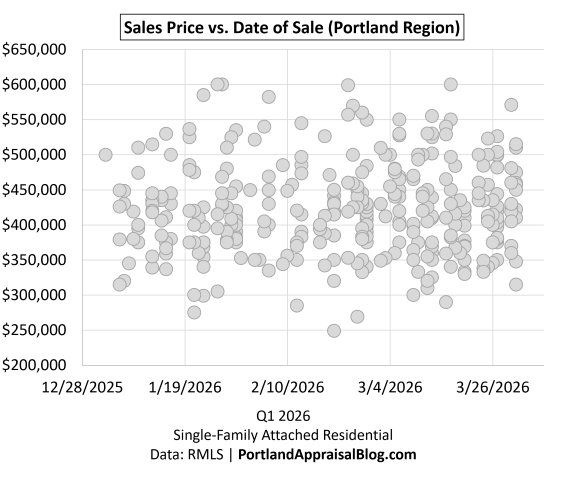
Note: The y-axis starts at $200,000 to allow better examination of the scatter plot.

The zoomed‑in scatter plot sharpens what the full‑scale view already suggested: attached‑home prices in Q1 2026 were tightly concentrated in the mid‑market band. With the vertical axis capped at $650,000, the plot highlights the segment’s core range—roughly $300,000 to $550,000—where nearly 80% of all sales occurred. The clustering is dense, consistent, and evenly distributed across the quarter, reinforcing the segment’s commodity‑like profile and the stability of demand throughout Q1.

The zoomed view also makes the lower‑priced portion of the market easier to see. Only a handful of sales fell below $300,000, and just one dipped below $250,000. This scarcity underscores that attached homes are not the region’s entry‑level segment; buyers seeking sub‑$300,000 opportunities overwhelmingly turn to condos or manufactured homes instead.

At the upper end, the zoomed plot shows a small number of sales pushing into the $600,000–$650,000 range. These are the same premium outliers visible in the full scatter, but the zoomed view makes clear how infrequent they are relative to the segment’s core. They represent neighborhood‑specific product rather than a broader trend.

Overall, the zoomed‑in scatter confirms the defining characteristics of the attached‑home segment: a tight, predictable price distribution; steady activity across the quarter; and a mid‑market profile that aligns with the segment’s role as the region’s primary affordability bridge between condos and detached homes.

Sales Volume

A treemap visualizing the distribution of attached homes sales by county in Q1 2026 clearly illustrates the market’s geographic concentration.
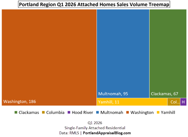
The treemap makes the geographic structure of the attached‑home market immediately clear: activity in Q1 2026 was overwhelmingly concentrated in the Big Three counties, with Washington County dominating the segment. More than half of all attached‑home closings occurred in Washington County alone, reflecting both its larger suburban housing base and its multi‑year preference for attached homes over condominiums. Multnomah and Clackamas counties round out the core, together contributing another 44% of all sales. In total, 96.13% of the region’s attached‑home activity came from the Big Three, underscoring how tightly the segment is anchored to the metro’s primary population and employment centers.

The remaining counties—Yamhill, Columbia, and Hood River—recorded only modest activity, with a combined 14 sales. These counties routinely produce small attached‑home counts due to their housing stock composition, development patterns, and buyer preferences. Their limited volume does not materially influence regional averages, but their participation confirms that attached homes are present, albeit sparsely, across the full six‑county region.

Washington County’s outsized share is especially important for interpreting regional trends. Because it accounts for 51.38% of all attached closings, its pricing, affordability, and new‑construction dynamics exert the strongest pull on the regional metrics discussed earlier. The treemap visually reinforces this influence: Washington County is not just the largest block—it is the structural center of the attached‑home market in Q1 2026.

The bar chart below compares monthly sales volume across the three months of Q1 for 2025 and Q1 2026.

The month‑by‑month comparison highlights how attached‑home activity evolved across the quarter and why total sales ultimately finished higher than in Q1 2025. The pattern is uneven but intuitive: softer pricing and improved affordability brought more buyers back into the market, but the timing of that return varied by month.

January posted a modest increase, rising from 89 to 99 sales (+10). This aligns with the early‑quarter improvement in rates and the segment’s overall affordability shift. February, however, moved in the opposite direction, declining from 127 to 99 sales (–28).

March delivered the decisive shift. Sales jumped from 112 to 164 (+52), the strongest monthly gain of the quarter and the clearest signal of renewed buyer engagement. This surge is consistent with the broader Q1 narrative: affordability improved sharply, new‑construction closings increased, and the region’s core counties saw more buyers re‑enter the market.

While Washington County held nearly steady year‑over‑year, the overall increase in regional sales volume was driven by higher activity in Multnomah County, along with additional gains in Clackamas and Yamhill counties. These counties collectively tipped the scales, pushing the quarter to a 10.37% increase in total attached‑home sales.

Taken together, the monthly pattern shows a market responding predictably to improved conditions. Buyers returned gradually, then decisively, producing a strong finish to the quarter.

Sales Price

The bar chart below compares monthly average sales prices across the three months of Q1 for 2025 and Q1 2026.
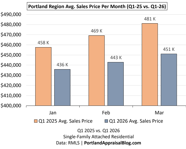
Note: The y-axis starts at $400,000 to allow better examination of monthly differences.

Average sales prices declined across all three months of Q1 2026, and the pattern is both consistent and meaningful. January fell 4.75% year‑over‑year, February declined 5.60%, and March posted the steepest drop at 6.24%. While the magnitudes differ slightly, the direction is uniform: attached‑home prices were lower every month of the quarter compared to Q1 2025.

For buyers, this softening provided a genuine silver lining. Lower prices, paired with improved interest rates, helped push affordability sharply higher—one of the defining stories of the quarter. The attached segment flipped from strained to moderately affordable, and the monthly price declines played a direct role in that shift.

The softness was broad‑based. Every county except Hood River saw both average and median prices decline year‑over‑year. Hood River recorded only one attached sale, so its stability is not meaningful in a trend sense. The regional pattern reflects a tougher quarter for attached homes overall, and given that Washington County accounts for more than half of all attached closings, its slight year‑over‑year decline carries outsized influence. The ongoing Intel layoffs likely contributed to this pressure, adding a layer of economic uncertainty that nudged pricing expectations downward.

Even so, the segment remained active. Buyers responded predictably to improved affordability, and increased sales in Multnomah, Clackamas, and Yamhill counties helped offset Washington County’s slight decline. The result is a quarter where prices softened, affordability improved, and demand strengthened—an unusual but coherent combination that reflects the attached homes market’s multi-year trend of softening prices.

New Construction

The bar graph below shows monthly total attached homes sales in Q1 2026, with new construction volume nested within each bar to illustrate the portion of sales that were newly built.
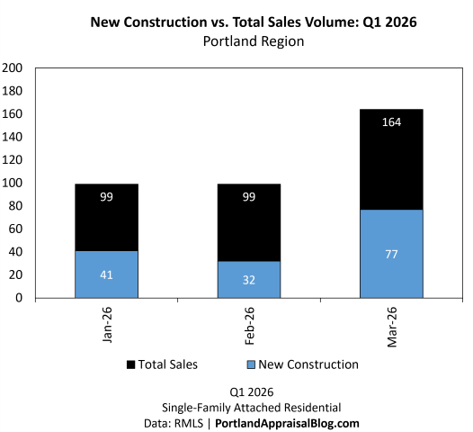
The nested bar chart makes one point immediately clear: new construction is a defining feature of the attached‑home segment. Across Q1 2026, newly built homes accounted for 41.44% of all attached‑home closings, an unusually high share for any residential segment and fully consistent with attached homes having the lowest average age of the four major single-family housing categories.

The monthly pattern is also instructive. January and February delivered solid new‑construction activity, with 41 and 32 closings respectively—roughly one‑third to two‑fifths of all sales in each month. Then March surged. New‑construction closings jumped to 77, representing nearly 47% of all attached‑home sales that month.

Regionally, these figures underscore how central new construction is to the attached‑home ecosystem. The segment relies heavily on newly built supply to meet demand, and builders continue to deliver a substantial share of the product buyers ultimately purchase.

The bar graph below shows new construction sales broken out by county for Q1 2025 and Q1 2026.

The county‑level breakout highlights how unevenly new‑construction activity is distributed across the region and why the attached‑home segment continues to have the lowest average age of the four major housing categories.

Clackamas posted a modest gain, rising from 16 to 18 new‑construction closings (+12.50%). Washington County held essentially steady, dipping slightly from 91 to 90 (–1.10%). Multnomah, however, delivered the standout performance: new‑construction closings jumped from 24 to 40 (+66.67%), making it the fastest‑growing county in Q1 2026 for newly built attached homes. Yamhill added two new‑construction sales after recording none the prior year, while Columbia and Hood River remained at zero.

Even with Multnomah’s impressive growth, Washington County remains the structural center of new construction in the attached‑home segment. Its 90 closings represent 60% of all new‑construction activity—more than the remaining counties combined. This dominance is consistent with Washington County’s multi‑year pattern: it continues to favor new attached homes over new condos, and builders remain highly active in its suburban submarkets.

Regionally, the story is straightforward: new construction is not a supplemental source of inventory—it is a core driver of the attached‑home market. Q1 2026 reaffirmed that role with strong winter performance and a March surge, supported by notable gains in Multnomah and steady output from Washington County.

The table below shows new construction sales volume by dollar amount for Q1 2026 compared with Q1 2025.

CountyQ1 2025 $ AmountQ1 2026 $ Amount% Change
Clackamas$10,129,115$8,256,272-18.49%
Columbia$0$0
Hood River$0$0
Multnomah$9,839,365$16,203,94764.68%
Washington$43,283,100$40,248,175-7.01%
Yamhill$0$859,800
Sum$63,251,580$65,568,1943.66%
Single-Family Attached Residential | Q1 2025 & Q1 2026
Data: RMLS | PortlandAppraisalBlog.com

The following double bar chart provides the above information at a glance.

New‑construction dollar volume rose modestly at the regional level in Q1 2026, increasing 3.66% year‑over‑year. But beneath that headline, the counties moved in very different directions—and understanding those differences is essential to interpreting the segment accurately.

Clackamas is the clearest example of a compositional reset rather than a pricing decline. Even though new‑construction sales increased from 16 to 18, total dollar volume fell sharply. The reason is straightforward: Q1 2025 included two exceptionally high‑end attached homes in Lake Oswego, each selling for more than $1.7M. Nothing in Q1 2026 exceeded the mid‑$500Ks. With those two luxury sales gone, the average price dropped significantly, but the median moved only modestly, reflecting a shift toward smaller, more affordable homes rather than a collapse in values.

Multnomah’s story is much simpler. New‑construction closings jumped from 24 to 40, and dollar volume rose accordingly. This is a clean volume‑driven increase, consistent with the county’s broader surge in attached‑home activity and its growing share of the region’s new‑construction market.

Washington County presents the opposite dynamic: sales were essentially unchanged, yet dollar volume declined. This signals genuine price softening, not a change in product mix. Builders conceded more on original list prices, average and median prices fell, price‑per‑square‑foot declined, and market times lengthened. Given Washington County’s outsized role in the attached‑home segment—and the economic backdrop created by the Intel layoffs—this softening resulted in builders netting roughly $3M fewer dollars year‑over‑year.

Taken together, these county‑level dynamics explain why regional dollar volume still managed a modest increase. Multnomah’s growth offset Washington County’s softening, and Clackamas’s compositional reset simply returned the county to its typical mid‑market profile. The result is a quarter where new construction remained a central driver of the attached‑home ecosystem, even as pricing pressures and product shifts varied sharply by county.

The following map shows the distribution of new construction sales.

The map of new‑construction closings reinforces a pattern that has been consistent for years: attached‑home new construction is overwhelmingly an urban and suburban phenomenon. The clusters concentrate along the westside and southside growth corridors—places like Hillsboro, Beaverton, Tigard, Sherwood, and Happy Valley—with smaller pockets extending into Gresham and the inner eastside.

What stands out is how tightly new construction hugs existing infrastructure, employment centers, and established development patterns. These aren’t rural builds or fringe‑market experiments; they’re infill projects, master‑planned communities, and suburban expansions in areas already primed for attached‑home demand. The distribution mirrors the segment’s identity: younger housing stock, smaller lots, and builder activity concentrated where land availability and zoning make attached homes feasible.

This spatial pattern also aligns with the county‑level dynamics discussed earlier. Washington County’s dominance is visible in the dense westside clusters, Multnomah’s growth shows up in the eastside and inner‑Portland pockets, and Clackamas’s contributions appear in the Happy Valley corridor.

Cumulative Days on Market

The bar chart below compares average cumulative days on market (CDOM) across the three months of Q1 for 2025 and Q1 2026.

The bar chart comparing average cumulative days on market across Q1 shows a clear and consistent pattern: the first two months of 2026 moved faster than the prior year, and those gains more than offset the slight lengthening in March.

January improved from 84 to 77 days (–8.32%), and February followed the same trajectory, dropping from 92 to 85 days (–7.62%). These early‑quarter improvements reflect stronger buyer engagement and quicker decision cycles at a time when mortgage rates were trending downward—moving from 6.16% to 5.98%. While rates aren’t the only factor influencing market tempo, this alignment likely contributed to the faster absorption we observed in January–February.

March, by contrast, saw average CDOM rise from 74 to 80 days (+7.21%). This coincided with a noticeable rate reversal, with mortgage rates climbing up 6.38% by month‑end. That shift likely introduced a bit of buyer hesitation and modestly slowed absorption. The increase wasn’t large enough to erase the momentum established earlier in the quarter, but it did slow the segment down.

Taken together, Q1 2026 still moved faster overall. The segment benefited from quicker early‑quarter absorption, and the modest recalibration in March reflects a market responding to short‑term rate movement rather than signaling a broader slowdown.

HOA Dues

While not all attached homes are located in an HOA with mandatory dues, they are a defining feature of the attached homes residential market:

CategoryQ1 2025Q1 2026Change
# of HOA Sales260279+19 homes
Total Sales328362+34 homes
% of Market79.27%77.07%-2.77 pts
HOA dues count are sales reporting nonzero HOA dues.
Single-Family Attached Residential | Q1 2025 & Q1 2026
Data: RMLS | PortlandAppraisalBlog.com

The Q1 data shows just how central HOA‑based living is to the attached‑home segment. Out of 362 sales in Q1 2026, 279 reported nonzero HOA dues, meaning more than three‑quarters of all attached‑home closings occurred within dues‑bearing communities.

The increase in HOA‑dues sales—from 260 to 279—reinforces the stability of this pattern. Attached homes continue to be built, marketed, and purchased within communities where shared maintenance, common‑area amenities, and community standards shape both monthly payment profiles and long‑term ownership costs. HOA dues remain a defining financial component of the segment, influencing affordability calculations and distinguishing attached homes from their detached counterparts, which have much lower dues—averaging about $70 per month in the Big Three counties—and only 26% of sales occurring within HOAs.

In short, the attached‑home market continues to operate as a dues‑anchored ecosystem—HOA communities aren’t the exception; they’re the norm.

The bar chart below compares average monthly HOA dues (for reporting sales) for Q1 2025 and Q1 2026 broken out by county:
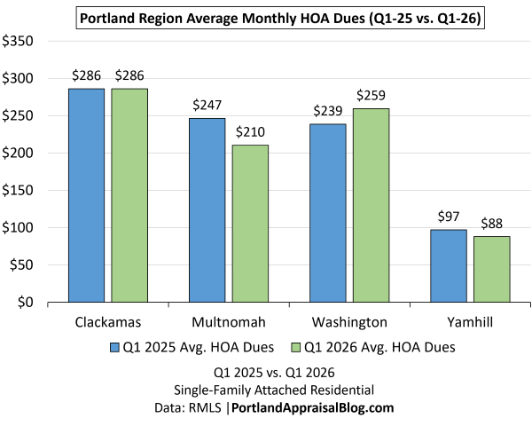
The county‑level comparison of average monthly HOA dues shows a mix of modest declines, one notable increase, and two counties that are omitted from the bar chart due to little or no attached‑home HOA activity in the period. Columbia had only a single dues‑bearing sale in Q1 2025 and none in Q1 2026, while Hood River’s dues figures are based on extremely limited sales and therefore aren’t included in the visual.

Clackamas, Multnomah, and Yamhill all posted year‑over‑year declines, while Washington County saw an increase from $238.66 to $259.44 (+8.71%). These shifts are meaningful, but interpretation requires attention to reporting behavior—especially in counties with active new‑construction pipelines.

Multnomah’s decline from $246.69 to $210.49 (–14.68%) should be read cautiously. The county saw a strong boost in new‑construction sales in Q1 2026, and it’s common for new‑construction listings to report zero HOA dues in MLS when dues haven’t been finalized at the time of listing. This can temporarily depress the average even when underlying dues are stable. Washington County, by contrast, had steady new‑construction activity year‑over‑year, making its increase more reliable and less affected by non‑reporting.

Yamhill’s decline is modest and should also be interpreted cautiously due to a small number of sales. Clackamas remains stable, with only a slight decrease.

Taken together, the county‑level data reinforces a familiar pattern: HOA dues vary across the region, but accurate interpretation requires accounting for reporting dynamics—especially in markets with active new construction.

Miscellaneous Statistics & Standout Transactions

Here are some of the most notable outliers and extremes from the 2026 Portland Region attached homes residential market—numbers that illustrate the full range of the data and the extremes buyers and appraisers encounter.

Lowest Sales Price: $249,000—This home is located in Wilkes Portland neighborhood. The unit is 1,114 sq. ft. and has two bedrooms and two bathrooms. Photos of this property are currently available online.

Highest Sales Price: $1,175,000—This home is located in Hood River, Oregon. The unit is 1,819 sq. ft. and has three bedrooms and three bathrooms. This property also has the highest price per square foot for the quarter ($645.95). Photos of this property are currently available online.

Lowest Price Per Square Foot: $158.13—This home is located in Lake Oswego, Oregon. The unit is 1,992 sq. ft., has three bedrooms and 2.1 bathrooms; it closed for $315,000. Photos of this property are currently available online.

Longest CDOM: 501 days—This home is located in the Northwest Heights Portland neighborhood. The unit is 1,431 sq. ft. and has two bedrooms and two bathrooms. Initially listed September 2024 for $450,000, it finally closed for $350,000 in late-February 2026. Photos of this property are currently available online.

Smallest Attached Home: 794 sq. ft.—This attached home is located in Newberg, Oregon. The one-bedroom, one-bathroom home is located in the 55+ community of Crestview Manor. Photos of this property are currently available online.

Largest Attached Home: 3,284 sq. ft.—The largest townhome of the quarter is located in West Linn, Oregon. The home has four bedrooms and 3.1 bathrooms. The unit closed for $897,500. Photos of this property are currently available online.

Highest Monthly HOA Dues: $793.00—This home is located in Lake Oswego, Oregon. The unit closed for $455,000 and is 1,314 sq. ft and has two bedrooms and two bathrooms. The HOA dues include a community pool, recreation facility as well as coverage of water, sewer, and exterior maintenance. Photos of this property are currently available online.

With the regional aggregate trends, graphs, monthly patterns, and notable outliers covered, the remainder of this update turns to a county-level breakdown. The following sections present year-over-year comparisons for each of the six counties in the Portland Region—Multnomah, Washington, Clackamas, Yamhill, Columbia, and Hood River. Each county snapshot includes key metrics, commentary on local drivers, and any segment-specific observations that help explain broader regional patterns.

Multnomah County Q1 2026 Stats

The table below summarizes key metrics for Multnomah County attached homes residential sales in Q1 2026 compared with Q1 2025.

CategoryQ1 2025Q1 2026Change
Total $ Volume$28,855,250$40,935,465+41.86%
Average Price$450,863$430,900-4.43%
Median Price$410,000$395,000-3.66%
Avg SP/OLP96.50%97.17%+0.70%
Avg PPSF (TSF)$319.62$294.07-8.00%
Avg HOA Dues$246.69$210.49-14.68%
Median HOA Dues$187.00$178.00-4.81%
Avg Lot Size (ac)0.05660.0602+6.41%
Avg Age (Yrs)14.5013.84-4.54%
Avg CDOM92.8373.34-21.00%
Avg Total SF1,4671,513+3.12%
Total # of Sales6495+48.44%
# of New Constr.2440+66.67%
# of REOs02
# of Short Sales00
Average PABAI98.92119.88+20.96 pts
# Affordable3672+36 homes
% Affordable56.25%75.79%+19.54 pts
Note: The calculated average HOA dues is for sales reporting nonzero HOA dues (31 sales for Q1 2025 & 41 sales for Q1 2026). All other metrics use the full dataset for each quarter.
Single-Family Attached Residential | Q1 2025 & Q1 2026
Data: RMLS | PortlandAppraisalBlog.com

Multnomah County delivered a high‑volume quarter shaped overwhelmingly by new‑construction activity. Total dollar volume rose 41.86%, nearly proportional to the 48.44% increase in closed sales, confirming that the quarter’s strength came from more units selling, not higher prices.

Prices moved lower year‑over‑year despite slightly larger homes on slightly larger lots. Average price fell 4.43%, median price declined 3.66%, and average PPSF dropped 8.00%. This pattern reflects a clear compositional shift: new‑construction units averaged 1,350 square feet, compared with 1,631 square feet for resale units. Smaller homes enter the market at lower total prices even when their PPSF is strong, and Multnomah’s 40 new‑construction closings (up from 24) pulled the county’s pricing metrics downward.

Market tempo improved sharply. Average cumulative days on market fell from 92.83 to 73.34—a nearly 20‑day reduction. Builders tend to price new units to move, and the county’s elevated new‑construction share helped accelerate absorption. Sellers also gained a bit of ground relative to their initial list prices, with SP/OLP rising to 97.17%, indicating realistic initial pricing and responsive buyer demand.

HOA dues declined on both an average and median basis, but this drop is almost certainly illusory. New‑construction listings frequently report zero dues when HOA budgets are not finalized at the time of listing, and Multnomah’s surge in brand‑new inventory makes this reporting dynamic the most likely explanation for the decline.

Affordability expanded dramatically. The county’s PABAI rose to 119.88, and 75.79% of all sales qualified as affordable—more than three‑quarters of the market. This reflects both the influence of smaller, lower‑priced new‑construction units and the rate environment that supported stronger buyer access during the quarter. Builders are striving to meet the market where effective demand exists, and the Q1 delivery mix shows they were targeting price points buyers could actually reach.

Overall, Multnomah County’s Q1 2026 performance was defined by a large influx of smaller new‑construction homes, reshaping pricing, dues, affordability, and market tempo. The result was a fast‑moving, highly accessible quarter with strong buyer engagement and realistic seller pricing.

The following is a scatter plot of all Multnomah County attached homes sales in Q1 2026:
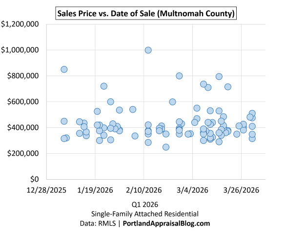
The scatter plot for Q1 2026 shows a market that is tightly concentrated in a very narrow price band. 76.84% of all Multnomah attached‑home sales closed between $300,000 and $500,000, which is an unusually compressed range compared with the detached‑home market. There is very little activity below $300,000 and only a small number of sales above $600,000, reinforcing just how centered this segment is around the mid‑market tiers.

The distribution is especially dense in the $350,000–$399,000 and $400,000–$449,000 brackets, which together account for more than half of all sales. The scatter reflects this visually: most points cluster in a tight vertical band, with only a few outliers pushing toward the upper end of the market.

The plot also shows a noticeable flurry of closings in the final stretch of March. At first glance, this might look like a demand‑side surge, but rates were climbing during that period—not the kind of environment that typically produces a sudden buyer rush. The timing instead reflects new‑construction deliveries closing out at quarter‑end, which becomes clear when isolating just the new‑construction sales.
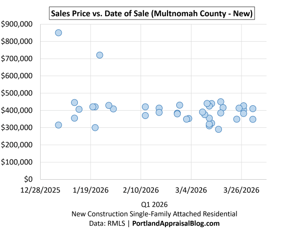
When viewed alongside the main scatter, the new‑construction plot makes the pattern unmistakable: the late‑March cluster is a supply‑timed closing wave, not a rate‑driven spike in demand. Builders brought units online and pushed to finish the quarter strong, and those closings landed in a tight sequence at the end of March.

Together, the two scatters confirm a mid‑tier‑dominated market with minimal lower‑end activity, a thin upper tail, and a late‑quarter wave of new‑construction closings that helped lift overall volume.

The following map shows the distribution of new construction sales during Q1 2026:
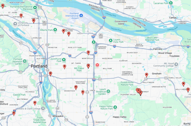
The map of new‑construction sales shows a clear eastside concentration, and that pattern reflects the underlying development realities of Multnomah County. The eastside offers more flexible land availability, more accommodating zoning, and gentler topography, all of which support attached‑home projects at mid‑market price points. Builders can deliver units efficiently and at scale, and the result is the tight $300,000–$450,000 band seen in the new‑construction scatter.

The westside, by contrast, presents a very different development environment. Large portions of the westside are shaped by steep topography, constrained parcels, and higher‑priced neighborhoods where land costs and existing built form make attached‑home development less feasible. The economics simply don’t align with the mid‑tier price points where effective demand is strongest. As a result, new‑construction attached homes are far less common west of the Willamette, and the map reflects that imbalance clearly.

Together, the map and scatter plots show that new construction shaped not only the pricing and timing of Q1 2026, but also its spatial footprint—concentrated east of the river, aligned with the corridors where attached‑home development is most viable.

Washington County Q1 2026 Stats

The table below summarizes key metrics for Washington County attached homes residential sales in Q1 2026 compared with Q1 2025.

CategoryQ1 2025Q1 2026Change
Total $ Volume$86,314,512$80,863,943-6.31%
Average Price$459,120$434,752-5.31%
Median Price$444,177$425,000-4.32%
Avg SP/OLP97.55%95.70%-1.89%
Avg PPSF (TSF)$289.69$277.49-4.21%
Avg HOA Dues$238.66$259.44+8.71%
Median HOA Dues$232.00$248.00+6.90%
Avg Lot Size (ac)0.05880.0623+6.03%
Avg Age (Yrs)13.8413.98+1.04%
Avg CDOM76.1386.90+14.15%
Avg Total SF1,6091,588-1.35%
Total # of Sales188186-1.06%
# of New Constr.9190-1.10%
# of REOs00
# of Short Sales00
Average PABAI93.24108.60+15.36 pts
# Affordable57126+69 homes
% Affordable30.32%67.74%+37.42 pts
Note: The calculated average HOA dues is for sales reporting nonzero HOA dues (171 sales for Q1 2025 & 176 sales for Q1 2026). All other metrics use the full dataset for each quarter.
Single-Family Attached Residential | Q1 2025 & Q1 2026
Data: RMLS | PortlandAppraisalBlog.com

Washington County’s attached‑home market softened in Q1 2026, and the declines are genuine. With total sales down by only two homes and new‑construction volume essentially unchanged (91 → 90), the year‑over‑year comparison reflects real demand‑side cooling rather than a shift in unit mix. Average price, median price, SP/OLP, and PPSF all moved lower, while CDOM rose by about ten days—a pattern consistent with buyers becoming more cautious. The ongoing fallout from the Intel layoffs likely contributed to this softer environment, especially in the resale segment.

Despite only two fewer sales, sellers took in $5.45 million less this quarter compared to last year. That’s a meaningful drop in total dollar volume, and it underscores how broad the softening was: lower prices, lower PPSF, and slightly weaker negotiation outcomes all combined to pull revenue down.

Affordability, however, surged. More than two thirds of the market (67.74%) qualified as affordable under the PABAI framework, up from just 30.32% a year earlier. PABAI jumped by 37.42 points, reflecting how rate movements and softer pricing intersected to dramatically expand buyer qualification. And because new‑construction volume was nearly identical year over year, the usual issue of under‑reported HOA dues is effectively a wash—meaning the affordability trend is directionally reliable for Washington County, even though new‑construction dues remain understated in RMLS.

A side‑by‑side look at new construction versus resale in Q1 2026 shows a market that is almost perfectly split by both dollar volume and number of sales. New homes delivered slightly more square footage and larger lots, but the median price difference between new ($449,945) and resale ($410,500) was only about $40,000, indicating that Washington County does not impose a large premium for new attached homes.

Overall, Washington County’s attached‑home segment in Q1 2026 reflects a stable mix, softer demand, expanded affordability, and a nearly even split between new and resale activity. The declines are real, the affordability gains are meaningful, and the market’s performance is best understood as a demand‑side cooling rather than a structural or compositional shift.

The following is a scatter plot of all Washington County sales in Q1 2026:

The scatter plot shows a market operating within an exceptionally tight price band. Nearly the entire quarter’s activity falls between $300,000 and $500,000, and more than half the market (54.84%) is concentrated in the $350,000–$449,999 range. This mid‑tier clustering is the defining feature of Washington County’s attached‑home segment in Q1 2026, and the scatter makes it visually unmistakable: a dense horizontal band with very few outliers above $550,000 and almost nothing below $300,000.

There is a modest uptick in closings during March, reflecting two overlapping dynamics. First, Washington County saw a slight increase in new‑construction closings toward the end of the quarter, which naturally produces a small late‑March cluster. Second, the attached‑home market typically warms as spring approaches, and the scatter shows that familiar seasonal lift. Even so, the March activity remains firmly within the same mid‑tier band, reinforcing how stable and price‑disciplined the segment was throughout Q1.

Overall, the scatter confirms a highly concentrated mid‑market, minimal lower‑end activity, and only a thin upper tail. Washington County’s attached‑home market in Q1 2026 operated within one of the narrowest price distributions in the region, and the scatter plot visually mirrors the softness and affordability expansion seen in the county‑level metrics.

The following map shows the distribution of new construction sales during Q1 2026:
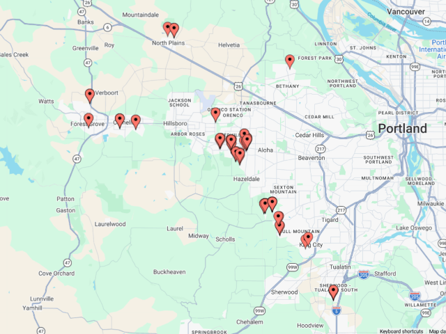
The new‑construction map for Washington County shows a development pattern that’s almost textbook for the westside: clusters of new attached‑home activity sitting right at the edges of cities, aligned with the urban growth boundary (UGB). The visual cue is unmistakable—the red markers concentrate precisely where the map transitions from urban coloration into green, signaling rural reserve, agricultural land, or forested areas. That boundary line is where Washington County’s attached‑home development has historically been most viable, and Q1 2026 continues that pattern.

Most of the new‑construction activity appears around Hillsboro, Aloha, Cornelius, and Forest Grove, with additional pockets near Bethany and South Beaverton. These are areas where land is still assemblable, topography is gentle, and zoning supports higher‑density formats. Builders gravitate to these UGB‑adjacent zones because they offer the combination of flat terrain, infrastructure access, and development‑friendly entitlements needed to deliver attached homes at mid‑tier price points.

What’s equally notable is where new construction isn’t happening. The interior of established neighborhoods—Cedar Hills, Sexton Mountain, Bull Mountain, central Beaverton—shows very few markers. These areas have higher land costs, fragmented parcels, and steeper topography in places, all of which make attached‑home development more difficult. The map’s pattern reflects that reality: new construction hugs the green edges rather than filling in the urban core.

Clackamas County Q1 2026 Stats

The table below summarizes key metrics for Clackamas County attached homes residential sales in Q1 2026 compared with Q1 2025.

CategoryQ1 2025Q1 2026Change
Total $ Volume$32,731,115$33,201,588+1.44%
Average Price$536,576$495,546-7.65%
Median Price$467,500$440,000-5.88%
Avg SP/OLP97.43%96.35%-1.11%
Avg PPSF (TSF)$299.00$294.75-1.42%
Avg HOA Dues$286.20$286.19-0.00%
Median HOA Dues$225.50$243.00+7.76%
Avg Lot Size (ac)0.070.08+6.16%
Avg Age (Yrs)14.5617.91+23.03%
Avg CDOM106.9576.82-28.17%
Avg Total SF1,7621,692-3.98%
Total # of Sales6167+9.84%
# of New Constr.1618+12.50%
# of REOs00
# of Short Sales00
Average PABAI84.8997.72+12.83 pts
# Affordable1439+25 homes
% Affordable22.95%58.21%+35.26 pts
Note: The calculated average HOA dues is for sales reporting nonzero HOA dues (50 sales for Q1 2025 & 56 sales for Q1 2026). All other metrics use the full dataset for each quarter.
Single-Family Attached Residential | Q1 2025 & Q1 2026
Data: RMLS | PortlandAppraisalBlog.com

Clackamas County posted a mixed performance in Q1 2026, with rising sales activity but clear price erosion. Total sales increased nearly 10% year over year (61 → 67), yet total dollar volume rose only 1.44%, meaning sellers collectively earned just $470,473 more than last year. That gap between unit growth and revenue growth is the clearest sign of softening prices: average price fell 7.65%, median price declined 5.88%, and PPSF slipped modestly. Some of this decline reflects a shift toward smaller units—average total square footage dropped by nearly 4%—but the price reductions exceed what size alone would explain, indicating genuine market cooling.

Affordability expanded sharply, rising from 22.95% to 58.21%, yet Clackamas still remains the least affordable of the three major counties. Larger average square footage, higher HOA dues, and an older attached‑home stock all contribute to this structural reality. The average age of sold units jumped from 14.6 to 17.9 years, reinforcing that Clackamas has fewer new attached‑home projects and a more mature inventory profile compared with Multnomah and Washington counties.

One of the more notable improvements was in market efficiency: CDOM fell dramatically, dropping from 107 days to 77 days. Even with lower prices, homes sold significantly faster, suggesting sellers adjusted expectations and buyers responded to more realistic pricing. This is consistent with a market that is softening but still liquid.

A closer look at new construction versus resale in Q1 2026 shows that builders and resale sellers operated in distinctly different segments. New construction accounted for 18 sales, while resale represented 49, and the two cohorts diverged sharply in size. New homes averaged 1,572 sq. ft., compared with 1,736 sq. ft. for resale—a 164 sq. ft. difference that explains most of the pricing gap. Builders are clearly delivering smaller new units to keep average prices down—1,920 sq. ft. in Q1 2025 to 1,572 sq. ft. in Q1 2026—and when adjusting for square footage, the new‑construction premium essentially disappears. PPSF is nearly identical between the two groups, and a back‑of‑the‑envelope calculation shows that equal‑sized units would have nearly the same implied value.

Overall, Clackamas County’s attached‑home market in Q1 2026 reflects higher sales activity, lower prices, faster absorption, and a meaningful shift toward smaller new‑construction units. The county remains the least affordable of the Big Three, but the quarter shows a market adjusting efficiently to softer demand and delivering product that aligns with buyer qualification thresholds.

The following is a scatter plot of all Clackamas County sales in Q1 2026:
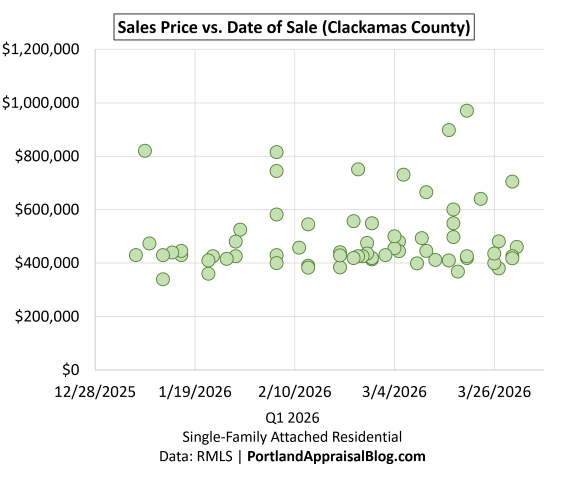
The scatter plot for Clackamas County shows a price distribution that is both tightly concentrated in the mid‑market and meaningfully stretched into the upper tiers, a pattern that distinguishes the county from both Multnomah and Washington. The densest portion of the quarter’s activity sits between $400,000 and $449,999, and when combined with the adjacent $450,000–$499,999 tier, these two ranges account for nearly three‑quarters of all sales. This narrow mid‑market band is the defining feature of Clackamas attached‑home pricing in Q1 2026.

What’s equally notable is what the scatter doesn’t show: almost no activity below $350,000. Only one sale fell into the 300–349K range, and nothing transacted below that. This absence of lower‑priced units is a structural characteristic of Clackamas County’s attached‑home stock—larger average square footage, higher HOA dues, and older inventory all push the market upward compared with the other major counties. The scatter makes this visually obvious: the lower end is essentially missing.

Above the mid‑market band, Clackamas shows a meaningful upper tail. Several sales closed between $600,000 and $1,000,000, including one above $950,000. This upper‑tier activity is far more pronounced than in Washington County, where attached‑home pricing is tightly uniform and rarely reaches these levels. In contrast, Clackamas supports a wider range of attached‑home formats and sizes, and the scatter reflects that diversity with a broader vertical spread.

Taken together, the scatter plot illustrates why Clackamas remains the least affordable of the Big Three counties. While all three counties struggle to produce units under $300,000, Multnomah’s densest band sits lower (350–399K), and Washington has substantial activity in the 300–399K range. Clackamas, by contrast, clusters higher and shows more upper‑tier sales, reinforcing the county’s structurally elevated pricing profile.

The following map shows the distribution of new construction sales during Q1 2026:
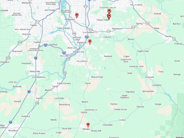
The new‑construction map for Clackamas County shows a pattern that’s immediately recognizable once you’ve looked at Multnomah and Washington: activity generally clusters right at or just inside the edges of major cities, where zoning, infrastructure, and parcel configuration make attached‑home development feasible. Every red marker sits in or near an incorporated area—Happy Valley, Milwaukie, Oregon City—and even the outlier in Molalla is still within the city’s built‑up footprint rather than in rural reserve or agricultural land. This is the same development logic we saw in Washington County, but expressed through Clackamas’ geography.

Yamhill County Q1 2026 Stats

The table below summarizes key metrics for Yamhill County attached homes residential sales in Q1 2026 compared with Q1 2025.

CategoryQ1 2025Q1 2026Change
Total $ Volume$1,996,000$4,026,200+101.71%
Average Price$399,200$366,018-8.31%
Median Price$400,000$377,900-5.53%
Avg SP/OLP100.22%97.45%-2.77%
Avg PPSF (TSF)$323.68$311.36-3.81%
Avg HOA Dues$97.17$87.92-9.52%
Median HOA Dues$65.00$45.00-30.77%
Avg Lot Size (ac)0.090.09-1.65%
Avg Age (Yrs)25.6024.91-2.70%
Avg CDOM23.2076.91+231.50%
Avg Total SF1,2621,201-4.81%
Total # of Sales511+120.00%
# of New Constr.02
# of REOs00
# of Short Sales00
# Affordable411+7 homes
% Affordable80.00%100.00%+20.00 pts
Note: The calculated average HOA dues is for sales reporting nonzero HOA dues (4 sales for Q1 2025 & 5 sales for Q1 2026). All other metrics use the full dataset for each quarter.
Single-Family Attached Residential | Q1 2025 & Q1 2026
Data: RMLS | PortlandAppraisalBlog.com

Yamhill County saw a sharp increase in attached‑home activity in Q1 2026, though the small sample size limits interpretation. Total sales rose from 5 to 11, a 120% increase, and total dollar volume more than doubled, netting sellers an additional $2.03M. With only a handful of transactions in each quarter, this jump reflects the addition of a few more closings rather than a structural shift in the market.

Two new‑construction units closed during the quarter, both from the same small infill project in Lafayette. This was the only new‑construction activity in the county for Q1 2026.

Overall, Yamhill County’s attached‑home market remains extremely low‑volume, and the quarter’s results reflect the sensitivity of small datasets to individual sales. The doubling of dollar volume and sales count is notable, but not indicative of a broader trend. The presence of two new units in Lafayette is the only structural change worth noting; otherwise, the quarter’s metrics should be interpreted cautiously due to limited activity.

The following is a scatter plot of all Yamhill County sales in Q1 2026:
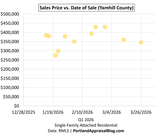
Most activity is concentrated between $350,000 to under $450,000.

Columbia County Q1 2026 Stats

The table below summarizes key metrics for Columbia County attached homes residential sales in Q1 2026 compared with Q1 2025.

CategoryQ1 2025Q1 2026Change
Total $ Volume$2,811,205$769,000-72.65%
Average Price$401,601$384,500-4.26%
Median Price$405,000$384,500-5.06%
Avg SP/OLP95.55%98.81%+3.41%
Avg PPSF (TSF)$248.84$246.68-0.87%
Avg HOA Dues$21.25
Median HOA Dues$21.25
Avg Lot Size (ac)0.080.08+6.25%
Avg Age (Yrs)19.8627.00+35.97%
Avg CDOM45.8613.00-71.65%
Avg Total SF1,6331,560-4.45%
Total # of Sales72-71.43%
# of New Constr.00
# of REOs00
# of Short Sales00
# Affordable62-4 homes
% Affordable85.71%100.00%+14.29 pts
Note: The calculated average HOA dues is for sales reporting nonzero HOA dues (2 sales for Q1 2025 & 0 sales for Q1 2026). All other metrics use the full dataset for each quarter.
Single-Family Attached Residential | Q1 2025 & Q1 2026
Data: RMLS | PortlandAppraisalBlog.com

Columbia County had very limited attached‑home activity in Q1 2026, with only two sales recorded for the quarter. This represents a decline of five sales year‑over‑year, and total dollar volume fell accordingly—from $2.81M to $769,000, a reduction of $2.04M. With such a small dataset, these changes reflect the absence of a few transactions rather than any meaningful shift in market conditions. There were no new‑construction units this quarter.

Overall, Columbia County’s attached‑home market remains extremely low‑volume, and the quarter’s results should be interpreted cautiously. The decline in sales and dollar volume is notable, but not indicative of a structural change; it simply reflects the sensitivity of small datasets to individual transactions.

Hood River County Q1 2026 Stats

The table below summarizes key metrics for Hood River County attached homes residential sales in Q1 2026 compared with Q1 2025.

CategoryQ1 2025Q1 2026Change
Total $ Volume$1,485,000$1,175,000-20.88%
Average Price$495,000$1,175,000+137.37%
Median Price$460,000$1,175,000+155.43%
Avg SP/OLP95.85%106.82%+11.44%
Avg PPSF (TSF)$356.60$645.95+81.14%
Avg HOA Dues$36.46$401.91+1002.48%
Median HOA Dues$36.46$401.91+1002.48%
Avg Lot Size (ac)0.05330.0300-43.78%
Avg Age (Yrs)12.6721.00+65.79%
Avg CDOM114.0025.00-78.07%
Avg Total SF1,5011,819+21.16%
Total # of Sales31-66.67%
# of New Constr.00
# of REOs00
# of Short Sales00
# Affordable10-1 home
% Affordable33.33%0.00%-33.33 pts
Note: The calculated average HOA dues is for sales reporting nonzero HOA dues (2 sales for Q1 2025 & 1 sale for Q1 2026). All other metrics use the full dataset for each quarter.
Single-Family Attached Residential | Q1 2025 & Q1 2026
Data: RMLS | PortlandAppraisalBlog.com

Hood River County had only one attached‑home sale in Q1 2026, down from three the year before. With such a small dataset, year‑over‑year comparisons are not meaningful. Total dollar volume declined from $1.49M to $1.18M, a net difference of $310,000. There were no new‑construction units this quarter.

Overall, Hood River County’s attached‑home market remains extremely low‑volume, and the quarter’s results should be interpreted cautiously. The decline in sales and dollar volume is notable, but not indicative of a structural change; it simply reflects the sensitivity of small datasets to individual transactions.

Closing Thoughts

Q1 2026 showed a region adjusting through lower prices, slightly improved interest rates, and builder‑driven shifts in product size, all of which combined to make attached homes more accessible to buyers. With softer pricing, overall activity increased: regional sales rose 10%, and total dollar volume edged up 4.4%, signaling steady demand as buyers responded to more attainable price points.

Affordability was the standout change. The share of affordable attached‑home sales jumped from 20% to 61%, adding 155 more affordable units compared with last year. This improvement was driven primarily by lower prices, better mortgage rates, and a clear builder pivot toward smaller units in counties like Washington and Clackamas. New construction rose 14.5%, and much of that growth came from projects intentionally designed to meet buyer qualification thresholds.

The county distribution remained familiar: Washington County accounted for just over half of all attached‑home sales, Multnomah contributed about a quarter, and Clackamas nearly a fifth. The remaining counties—Yamhill, Columbia, and Hood River—continued to show extremely low volumes, where individual sales can shift averages dramatically and trend analysis is not meaningful.

Taken together, the quarter reflects a market that is re‑calibrating rather than contracting. Prices softened, affordability expanded, and builders adapted quickly to buyer needs.

What trends do you expect to see in Q2 2026? I’d love to hear your thoughts—feel free to reply here or reach out directly.

Sources & Further Reading

All data presented in this quarterly update is sourced directly from RMLS and has been subjected to a rigorous cleaning and validation process to ensure reliability for attached homes residential analysis in the six-county Portland Region. The trends, comparisons, and commentary are the result of original appraisal expertise and independent analysis—not aggregated from secondary sources or news summaries.

Coda

Thanks for reading—I hope you found a useful insight or an unexpected nugget along the way. If you enjoyed the post, please consider subscribing for future updates.

Are you an agent in Portland who wonders why appraisers always do “x”?

A homeowner with questions about appraiser methodology?

If so, feel free to reach out—I enjoy connecting with market participants across Portland and the surrounding counties, and am always happy to help where I can.

And if you’re in need of appraisal services in Portland or anywhere in the Portland Region, we’d be glad to assist.

The 2025 Portland Region Attached Homes Market in Review

The 2025 Portland Region attached homes market saw median prices down 1.13% to $435k and CDOM up 14.13% to 68.4 days. New construction surged nearly 26%. The region recorded 1,646 sales, with Washington County accounting for 53.65% of activity. Regional overview, county trends, analytical insights, and more.

The Portland White Stag sign during the golden hour.
The White Stag Sign in late afternoon.
Photo: Abdur Abdul-Malik, Portland Appraisal Blog (CC BY-SA 4.0)

The 2025 Portland Region attached homes market entered the year on solid footing, supported by steady demand, a consistent flow of new construction, and a segment that has largely settled into its post-rate-shock rhythm. After several years of adjustment to higher borrowing costs, attached homes now behave in a more predictable way: functional, resilient, and shaped as much by deliberate buyer selectivity as by broader economic conditions.

This segment occupies a distinctive middle ground in the region’s housing landscape. Fee-simple ownership of both the dwelling and underlying land provides a measure of autonomy and equity-building potential similar to detached homes, while the high prevalence of mandatory HOA dues introduces condominium-like shared responsibilities and carrying-cost considerations. This hybrid nature influences buyer decision-making, particularly when association fees, maintenance obligations, or restrictions factor into total ownership affordability.

New construction remained a key stabilizing force, infusing the market with modern townhomes and rowhouses that appealed to buyers seeking updated features and efficiency in suburban and edge-urban locations. At the same time, resale inventory reflected greater heterogeneity—from older rowhouses to newer planned-unit developments—requiring careful attention to comparable selection and valuation adjustments.

Buyers exercised greater selectivity, prioritizing pricing alignment, condition, location, and overall carrying costs. This manifested in extended marketing times for some properties and a subtle shift toward more balanced conditions, though the market avoided the sharper softening observed in the condominium segment. Affordability for attached homes held near equilibrium, with the Portland Appraisal Blog Affordability Index (PABAI) indicating that typical household income was nearly sufficient to qualify under prevailing rates, taxes, insurance, and HOA dues—placing the segment more attainable than detached homes but not as affordable as condominiums.

Taken together, 2025 reads as a transition year for attached homes: a market still on stable ground, but beginning to lean toward buyers as supply loosens and selectivity increases. The sections that follow document these dynamics in detail, drawing on cleaned RMLS data to provide a clear, reference-grade record of the year.

Table of Contents

Data Housekeeping

The Portland Region in this update comprises the six Oregon counties of Columbia, Clackamas, Hood River, Multnomah, Washington, and Yamhill. These counties form a contiguous housing ecosystem centered on Portland—Multnomah as the core home county, with the others tightly integrated through commuting patterns, economic ties, and shared market dynamics (e.g., Yamhill’s strong connection via Highway 99W and wine-country adjacency). Beyond Yamhill, the MLS system changes, further distinguishing this six-county area from broader geographic aggregations. For a detailed overview—including county profiles, population data, key value influencers, and why this definition differs from the official seven-county Portland–Vancouver–Hillsboro MSA—see my dedicated page: The Portland Region – Six-County Market Area Overview.

Colored map of the six counties comprising the Portland Region: Clackamas, Columbia, Hood River, Multnomah, Washington, and Yamhill.
The six-county Portland Region
Via SunCatcherStudio
All data is sourced from RMLS and reflects open-market attached single-family residential sales (excluding condominiums, detached homes, and multifamily). SNL (“Sold Not Listed”) entries—off-market transactions entered retroactively—have been excluded to preserve consistency with true market activity.
All figures have undergone my standard cleaning process to address common RMLS accuracy challenges, including misclassifications (e.g., condos listed as attached), square footage/price typos, incomplete fields, status/date mismatches, and non-representative entries. For a detailed overview of these issues, their impact on market analysis, and how I mitigate them through automated flagging, cross-verification, and manual review, see my dedicated page: RMLS Data Accuracy Challenges.

It is important to note that attached homes are just that: attached; whether on just one or both sides. They also entail ownership of the land the structure sits on. This makes them distinct from condominiums. They are also differentiated from multifamily properties in that each unit is individually owned. With a duplex, for example, there is a single owner, although the owner may rent or occupy each unit as they see fit. The owner cannot sell half of a duplex (one unit). It can get confusing, and the data in RMLS reflects that.

An attached home is just like a single-family detached home in rights and responsibilities; the principal difference is whether the structure is completely freestanding or joined at the hip with a neighbor or two. While an attached home is often located in an HOA and may even be physically indistinguishable from a townhome-style condominium, they are not condos, and are more similar to detached homes in all the categories that matter.

Portland Region 2025 Overview

Splash card with text.

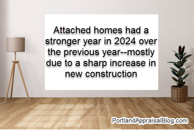
2025 saw a continuation in the surge of new construction in the attached home segment. Despite the greater share of new units, average and median prices softened.

Overall Regional Trends

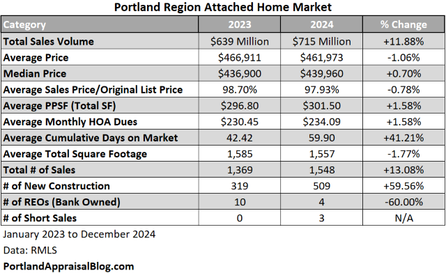
The table below summarizes key metrics for attached single-family residential sales in the Portland Region (Columbia, Clackamas, Hood River, Multnomah, Washington, and Yamhill counties) for 2025 compared with 2024.

Category20242025% Change
Total $ Volume$715.1 Million$758.4 Million+6.05%
Average Price$461,973$460,764-0.26%
Median Price$439,960$435,000-1.13%
Avg SP/OLP97.93%97.00%-0.94%
Avg PPSF (TSF)$301.50$291.76-3.23%
Avg HOA Dues$234.09$236.84+1.18%
Avg Age (Yrs)16.2915.69-3.67%
Avg CDOM59.9068.36+14.13%
Avg Total SF1,5571,598+2.60%
Total # of Sales1,5481,646+6.33%
# of New Constr.509640+25.74%
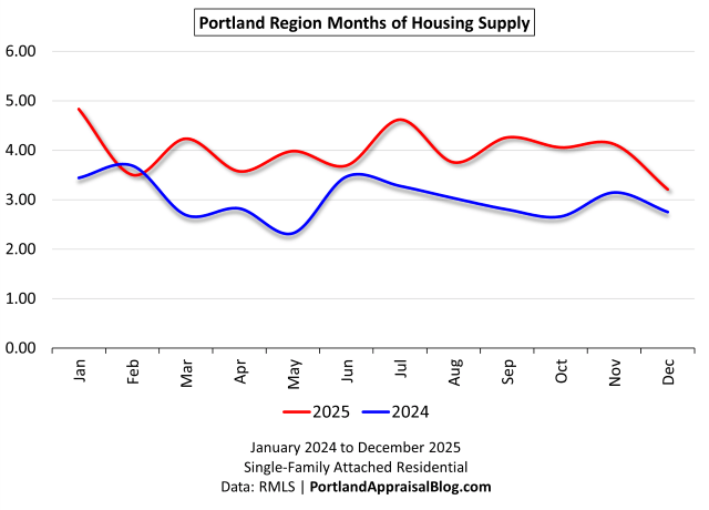
Avg Supply (Mos.)3.003.98+32.54%
# of REOs47+75.00%
# of Short Sales32-33.33%
Note: The calculated average HOA dues is for units reporting HOA dues (1,295 sales). All other metrics use the full dataset (1,646 sales).
Single-Family Attached Residential | 2024 & 2025
Data: RMLS | PortlandAppraisalBlog.com

Key Observations From the Aggregate Data

The 2025 attached‑home market remained functional and well‑supplied, with new construction shaping both the composition of sales and the overall performance of the segment. Several themes stand out when interpreting the year‑over‑year changes:

  • New construction was the primary engine of market stability. The segment saw a meaningful increase in total sales, and roughly a quarter more new‑construction units closed compared to the prior year. These newly built townhomes and rowhouses made up a substantial share of all 2025 activity and were largely responsible for keeping overall volume in positive territory. Without this influx of fresh inventory, total sales would likely have been flat.
  • The average age of sold homes declined due to the shift in mix. With so many new units entering the pipeline, the average age of attached homes sold moved several percent lower. This reflects a compositional shift toward recently completed properties rather than any broad change in the region’s existing housing stock.
  • Average and median prices edged down as supply loosened. Both measures posted low‑single‑digit declines, consistent with a market where buyers had more options and more time. The combination of increased new‑construction supply and a noticeable rise in months of housing supply placed gentle downward pressure on pricing. These movements reflect a shift toward balance rather than any sign of distress.
  • Price per square foot fell more sharply, influenced partly by larger average unit sizes. PPSF declined by a few percentage points, outpacing the modest softening in overall prices. Part of this movement stems from slightly larger average square footage—an expected outcome when new construction makes up a bigger share of the sold mix. In years with size stability, PPSF tracks price movement more directly; in 2025, the compositional effect played a meaningful role.
  • HOA dues showed minimal upward movement—a notable bright spot for affordability. Average dues increased by just over one percent, a restrained change compared to the sharper increases seen in the condominium segment. For the majority of attached homes with mandatory dues, this stability helped keep total ownership costs predictable and prevented additional affordability pressure.
  • Distressed sales remained negligible. REO and short‑sale activity together amounted to single‑digit counts in a market with more than 1,600 closings. Their minimal presence reinforces the broader picture of a segment without systemic financial strain, even as marketing times lengthened and supply increased.

Portland Region Scatter Plots

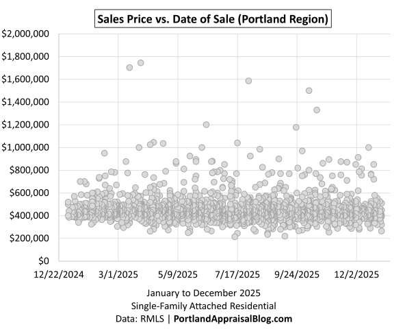
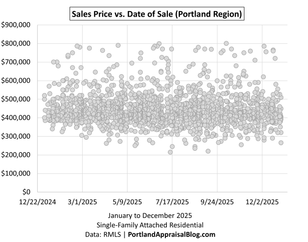
To visualize the distribution of individual attached homes sales prices across 2025, the following scatter plots show sales price against date of sale. The first graph displays the full range of transactions, while the second focuses on the $800k or less range.

Scatter plot showing individual attached home sales in the Portland Region during 2025. Each dot represents a closed sale, plotted by date on the x-axis and price on the y-axis. The data is sourced from RMLS.

The full‑market scatter of 2025 attached‑home sales offers a clear visual sense of how this segment behaved across the year. Most sales cluster in a tight horizontal band between the mid‑$400s up to $600k, reflecting the segment’s characteristic price stability and relatively narrow product range. Unlike detached homes, which stretch from distressed fixers to luxury outliers, or condos, which include everything from micro‑units to penthouses, attached homes tend to occupy a consistent middle band. That uniformity is immediately visible here.

One of the most notable features of the scatter is the absence of deep entry‑level pricing. No sales fall below the $200,000 mark, and the lower edge of the distribution remains remarkably stable throughout the year. This is a structural trait of the segment: attached homes rarely include the very small, distressed, or legacy units that populate the lower ends of the condo and detached markets. The result is a natural price floor that keeps the distribution compact and predictable.

Within that band, a subtle downward drift emerges as the year progresses. Early‑year sales tend to sit slightly higher in the cluster, while late‑year sales settle modestly lower. The slope is gentle, but it aligns with the broader story of 2025: more supply, more new construction, and more buyer selectivity. The scatter shows a market that remained functional and well‑supplied, but one that softened at the margins as the year moved on.

A handful of higher‑priced outliers appear above the main band, many of them tied to new construction. But even these upper‑end sales do not distort the overall pattern. The segment’s pricing structure remains anchored in the middle of the market, with new construction reinforcing that center rather than pulling it upward.

Zooming in on sales priced at $800,000 or less we have:

Scatter plot showing individual attached home sales in the Portland Region during 2025, with a focus on sales at or below $800k. Each dot represents a closed sale, plotted by date on the x-axis and price on the y-axis. The data is sourced from RMLS.

When the scatter is narrowed to sales at $800,000 or less, the shape of the attached‑home market becomes even clearer. Nearly the entire dataset remains intact—97.6% of all 2025 attached sales fall at or below $800k—which means this zoomed‑in view isn’t a subset so much as a more legible rendering of the full market. The upper‑end outliers fall away, but the core structure of the distribution stays exactly the same.

What emerges is a dense, disciplined band of activity stretching from the low‑$300s to the upper‑$700s, with the vast majority of sales clustering between roughly $400,000 and $600,000. This is the heart of the attached segment.

The downward tilt that was only faintly visible in the full‑range scatter becomes more apparent here. Early‑year sales sit slightly higher within the band, while late‑year sales drift modestly lower. It’s a gentle slope, but it reinforces the broader theme of 2025: a market still on solid footing, but gradually softening as supply increased and buyers became more selective. The scatter shows this visually in a way that tables alone cannot.

Bottom-line Summary

The attached‑home segment in 2025 presents a clear, consistent picture: a market still functioning well, but gradually shifting under the weight of expanded supply and persistently high interest rates. The regional overview table shows modest price erosion, a noticeable rise in months of housing supply, and a meaningful increase in new‑construction deliveries—all signals that the tight conditions of prior years have begun to ease. The scatterplots reinforce this story visually. The segment maintained a firm price floor and a concentrated middle band, but the gentle downward drift across the year reflects buyers taking more time, exercising more discretion, and benefiting from a wider set of options.

New construction played a central role in this transition. It supported overall sales volume and refreshed the inventory, yet it did so without distorting the pricing structure; most new units landed squarely within the core price band. The result is a market that remains orderly and well‑supplied, but one that is unmistakably edging toward buyer‑favored conditions. Prices have not broken sharply, and the segment is not yet in a buyer’s market, but the combination of elevated rates, increased choice, and softening at the margins points to a landscape where buyers hold a bit more leverage than they did a year ago.

Sales Volume

A treemap visualizing the distribution of attached homes sales by county in 2025 clearly illustrates the market’s geographic concentration.

This treemap graph illustrates the sales volume of single-family attached homes in the Portland Region for 2025. The data is sourced from RMLS.

The sales‑volume treemap underscores how geographically concentrated the attached‑home market remains. Washington County once again carried the segment, accounting for more than half of all 2025 attached sales. Its dominance reflects both the depth of its attached‑home inventory and the steady stream of new construction that continued to shape the year’s activity. Multnomah County followed at roughly a quarter of all sales, with Clackamas contributing another meaningful share. Together, these three counties made up more than ninety‑six percent of the region’s attached‑home transactions—a level of concentration that has become a defining feature of this segment.

The remaining counties—Yamhill, Columbia, and Hood River—registered only small numbers of sales, consistent with their limited attached‑home stock and slower pace of new development. Their presence in the treemap is more about completeness than influence; they round out the regional picture but do not materially shape the segment’s behavior.

The following bar chart shows monthly sales volume for 2025:

This bar graph shows the number of single-family attached residential sales in the Portland Region for each month of 2025. The data is sourced from RMLS.

Monthly sales activity in 2025 followed a seasonal arc, with a slow winter start, a steady rise into late spring, and a clear peak in early summer. June marked the high point for the year, reflecting the traditional convergence of buyer activity, new listings, and new‑construction deliveries. From April through October, the market moved in a remarkably stable band.

What stands out in this cycle is the strength of the late‑year months. November and December often taper more sharply, but in 2025 they held up better than expected. A significant share of that resilience came from new construction, which made up a large portion of the closings in those months and helped offset the seasonal slowdown. This pattern aligns with the broader theme of the year: increased supply—especially from new deliveries—gave buyers more options and kept transaction volume moving even as higher interest rates continued to weigh on affordability.

The line graph below compares monthly sales volume across the twelve months for 2024 and 2025.

Double line graph comparing the number of attached home sales per calendar month between 2024 (blue line) and 2025 (red line).

The year‑over‑year comparison highlights the greater 2025 attached segment activity, even though both years followed broadly similar seasonal patterns. The two lines track closely through the early months, but 2025 begins to pull ahead in February and maintains that advantage through most of the year. The spring and early‑summer stretch is where the difference is most visible: April, June, and August all posted noticeably higher volumes in 2025, reflecting the impact of expanded inventory—particularly from new construction—and a buyer pool that remained engaged despite elevated interest rates.

What’s striking is that 2025 didn’t outperform 2024 because of a single outsized month. Instead, it was a series of steady, incremental gains across the middle of the year that pushed the annual total higher. Even in months where 2025 dipped slightly below 2024—May, September, October, and November—the differences were modest and quickly offset by stronger performance elsewhere. December 2025 finished ahead of the prior year, helped by a substantial share of new‑construction closings that kept volume slightly above 2024.

Sales Price

The following bar chart shows average monthly sales price for 2025:

This bar graph shows the average sales price of single-family attached residential sales in the Portland Region for each month of 2025. The data is sourced from RMLS.
Note: The y-axis starts at $420,000 to allow better examination of monthly differences.

Average pricing in 2025 moved within a remarkably narrow range, which is one of the defining characteristics of the attached segment. Monthly averages hovered close to the annual mean of roughly $461,000, with only modest fluctuations from one month to the next. The early spring months posted the highest averages of the year, but even those peaks were measured rather than dramatic. As the year progressed, prices drifted gently lower, reflecting the same softening seen in the scatterplots and the broader regional metrics.

What’s notable is how contained the movement is. Even in months where the average dipped—most visibly in August and November—the declines were incremental rather than abrupt. This stability mirrors the segment’s structural consistency: attached homes tend to be more uniform in size, age, and configuration, and the market rarely experiences the sharp swings that can appear in detached or condo segments. The late‑year averages also show the influence of new construction, which helped support pricing even as the market tilted toward buyers.

The line graph below compares average monthly sales prices across the twelve months for 2024 and 2025.

Double line graph comparing the monthly average sales price of attached home sales per calendar month between 2024 (blue line) and 2025 (red line). The y-axis starts at zero.

The year‑over‑year comparison shows just how stable pricing has been in the attached segment. The two lines move almost in unison, with only modest month‑to‑month differences and no meaningful divergence across the calendar year. Both years follow the same gentle seasonal rhythm, and both remain anchored within a narrow price band that reflects the segment’s structural consistency. At this scale, the line appears almost flat, underscoring how little volatility the market experienced despite elevated interest rates and shifting supply conditions.

 Zooming in we have:

Double line graph comparing the monthly average sales price of attached home sales per calendar month between 2024 (blue line) and 2025 (red line). The y-axis starts at $430,000 for better viewing of monthly differences.
Note: The y-axis starts at $430,000 to allow better examination of monthly differences.

Once the scale tightens, the subtle differences between 2024 and 2025 come into focus. Both years still move within a narrow band, but the month‑to‑month shifts become more visible. In 2025, prices rise a bit more sharply the first three months before easing through spring, summer and early fall, while 2024 shows a smoother arc with a gentler spring peak and a more pronounced slide into year‑end. 2024 was ahead of 2025 seven out of twelve months, with average and median prices slightly down in 2025.

New Construction

The bar graph below shows monthly total attached homes sales for 2025, with new construction volume nested within each bar to illustrate the portion of sales that were newly built.

This bar graph shows the number of single-family attached residential sales in the Portland Region for each month of 2025 with the number of new constructions sales embedded within as a different colored bar. The data is sourced from RMLS.

The comparison between new‑construction closings and total monthly sales makes clear just how central new deliveries were to the attached segment in 2025. New construction consistently accounted for a substantial share of activity throughout the year, often representing a third or more of all monthly sales. In several months—most notably October, November, and December—new construction made up close to half of all closings, providing a meaningful buffer against the seasonal slowdown that typically appears late in the year.

What stands out is the steadiness of this contribution. Rather than appearing in isolated bursts, new‑construction sales were present in every month and moved in tandem with the broader market. This pattern reflects both the ongoing build‑out of attached housing in the region and the role these units played in keeping transaction volume healthy despite elevated interest rates. The segment’s overall resilience in 2025 is closely tied to this pipeline of new supply, which expanded buyer choice and helped maintain momentum even as the market tilted gradually toward buyer‑favored conditions.

The chart ultimately reinforces a theme that appears throughout the annual: new construction didn’t distort the pricing structure, but it did shape the year’s activity. It supported volume, refreshed inventory, and played an outsized role in the late‑year months, helping the market finish stronger than it otherwise might have.

The bar graph below shows the number of new construction closings by county, with side-by-side bars for 2024 and 2025.

This bar graph compares the number of new construction single-family attached residential sales in the Portland Region for 2024 and 2025 broken out by county. The data is sourced from RMLS.

The county‑level comparison highlights how unevenly distributed new‑construction activity is across the region—and how much of the segment’s growth in 2025 came from just two counties. Washington and Multnomah together accounted for virtually all of the increase in new‑construction closings, with both counties posting strong year‑over‑year gains. Washington County, in particular, expanded its lead, reflecting the depth of its development pipeline and its role as the region’s primary engine for attached‑home production. Multnomah also saw a meaningful increase, driven by infill projects and the continued build‑out of attached housing in its growth corridors.

The remaining counties played only a marginal role. Clackamas saw a modest decline, while Columbia and Hood River posted very small numbers that reflect their limited attached‑home inventory rather than any meaningful shift in market conditions. Yamhill recorded no new‑construction closings in 2025, consistent with its historically small footprint in this segment.

What the chart ultimately shows is a highly concentrated pattern: nearly all new‑construction activity occurred in the three core counties, and within that group, Washington and Multnomah carried almost the entire load. This concentration mirrors the broader sales‑volume distribution and reinforces a central theme of the annual—new construction was a major driver of 2025 activity, but its impact was geographically focused, shaping the market most strongly where development pipelines were already established.

The table below shows new construction sales volume by dollar amount for 2025 compared with 2024.

County2024 $ Amount2025 $ Amount% Change% of Total 2025 $ Amount
Clackamas$40,515,719$38,358,610-5.32%5.05%
Columbia$0$1,344,8000.18%
Hood River$1,393,303$0-100.00%0.00%
Multnomah$50,170,781$73,147,41245.80%9.64%
Washington$142,679,777$183,397,93428.54%24.16%
Yamhill$1,126,000$0-100.00%0.00%
Sum$235,885,580$296,248,756+25.59%39.03%
Single-Family Attached Residential | 2024 & 2025
Data: RMLS | PortlandAppraisalBlog.com

The following double bar chart provides the above table information at a glance:

This bar graph compares the dollar amount of new construction single-family attached residential sales in the Portland Region for 2024 and 2025 broken out by county. The data is sourced from RMLS.

The dollar‑volume comparison shows just how much financial weight new construction carried in 2025. Builders collectively brought in roughly $60 million more than the prior year—a substantial jump that reflects both higher unit counts and the continued shift toward more affordable attached‑home formats. Washington and Multnomah counties were responsible for nearly all of that increase. Washington alone accounted for about 62% of all new‑construction dollars, and nearly a quarter of the region’s entire attached‑home dollar volume, underscoring its role as the center of gravity for new development.

Multnomah also posted a strong gain, driven by steady infill activity and the ongoing build‑out of attached housing in its established corridors. Clackamas softened slightly, and the remaining counties contributed only marginal amounts, reinforcing the highly concentrated nature of new‑construction activity in this segment.

New construction represented nearly 39% of all attached‑home sales in 2025—far higher than the roughly 11% share seen in the detached segment. That disparity speaks to a clear market pivot: with elevated rates and inflation pressuring affordability, buyers gravitated toward smaller, more attainable new homes, and builders responded accordingly. The attached segment became the primary outlet for new supply that could meet buyers at a workable price point.

Average prices add another layer to the story. Washington County—the dominant producer—actually saw its average new‑construction price dip year over year. Given its outsized influence, that decline helped pull down the aggregate pricing trend for the entire segment. Some of this softening may reflect the broader economic backdrop, including the localized effects of the Intel layoffs in Hillsboro, which introduced additional caution into the westside market. When the county that produces the majority of new attached homes experiences even a modest price shift, the impact shows up in the regional numbers.

Cumulative Days on Market

The bar chart below compares average cumulative days on market (CDOM) throughout 2025.

This bar graph shows the average cumulative days on market for single-family attached residential sales in the Portland Region for each month of 2025. The data is sourced from RMLS.

Average CDOM in 2025 followed a familiar seasonal pattern, but with a slightly longer tail than in tighter years. The winter months opened with elevated market times, reflecting both leftover 2024 inventory and the slower pace typical of the season. Conditions improved sharply in April—the low point for the year—as new listings were priced more competitively and buyers were more active. From there, CDOM settled into a middle band through summer and early fall, with only modest month‑to‑month movement.

The late‑year uptick is notable but not alarming. October posted one of the higher averages of the year, and November and December remained elevated compared to the spring lows. This pattern aligns with the broader dynamics shaping the segment: increased supply, more new‑construction options, and buyers taking more time to evaluate choices in a higher‑rate environment. The attached segment remained functional and well‑supplied, but the longer market times—especially compared to the spring trough—signal a market gradually easing toward buyer‑favored conditions.

The bar chart below compares cumulative days on market for 2024 and 2025.

This bar graph compares the average days on market (CDOM) for single-family attached residential homes in the Portland Region for 2024 and 2025. The data is sourced from RMLS.

The year‑over‑year comparison shows a clear shift toward longer market times in 2025. While both years follow the same seasonal rhythm—winter highs, a sharp spring improvement, and a gradual rise into fall—the 2025 bars sit noticeably higher through most of the calendar. The spring trough is still present, but it’s not as deep, and the summer and early‑fall months show some of the largest gaps between the two years. August, in particular, stands out as a moment where buyers took significantly more time than they did the year before.

This pattern aligns with the broader dynamics shaping the segment. Expanded inventory, a heavier flow of new‑construction options, and persistently high interest rates all contributed to a more deliberate pace among buyers. Homes still sold, but they required more exposure, more showings, and more patience from sellers. The late‑year months illustrate this well: 2025 remained elevated relative to 2024 even as new‑construction closings helped keep overall activity moving.

The following dual-axis chart illustrates two interrelated indicators of market health for single-family attached homes in the Portland Region throughout 2025: the number of active listings each day (green line, right axis) and the average daily Days on Market (DOM) of those active listings (red line, left axis):

Double line graph comparing the daily number of active listings with the average daily day on market for 2025. The graph has two y-axes. The y-axis for the daily number of active listings (green) starts at 300 for better viewing of daily differences. The y-axis for the average daily days on market (red) starts at 80 for better viewing of daily differences.

This metric reflects the average current listing history (DOM) of the active inventory pool only—typically ranging from 400 to 650 units on any given day—and is distinct from cumulative DOM or final time-to-sale for closed transactions.

Because well-priced and competitively positioned properties sell quickly and exit the active pool, the average DOM is disproportionately influenced by lingering inventory. The chart therefore serves as a real-time snapshot of stale inventory levels, pricing discipline, and buyer selectivity across the year.

The chart reveals a clear inverse seasonal pattern between active inventory volume and average daily DOM.

Active listings (green) started the year relatively low (~400–450 units in January–February), rose steadily through spring and early summer to a peak of approximately 650–680 units (mid-May through July), then gradually declined into the 450–500 range by December. This mid-year swell reflects the typical seasonal influx of new listings, including a significant portion of newly completed townhomes and rowhouses.

Average daily DOM (red) moved in the opposite direction: beginning around 140 days in early January, it declined sharply through spring to a trough of ~90–95 days in late spring/summer, remained relatively stable through early fall, then rose gradually to ~110–115 days by year-end (with a brief dip in mid-November before the final uptick).

This inverse relationship is driven by compositional effects in the active pool. During the peak listing/closing season (late spring through summer), a higher volume of fresh, competitively priced units entered the market. These sold quickly, contributed little to the average DOM, and kept the metric low. In contrast, fall and winter saw fewer new listings and more selective buyers, allowing properties to linger longer. These stale units accumulated in the shrinking active pool and pulled the average DOM higher—particularly noticeable in the late-year rise despite thinning supply.

The pattern underscores a key takeaway for sellers and listing agents: misalignment on pricing or presentation can result in extended exposure, especially during lower-volume seasons.

Housing Supply

Months of supply (MOS) represents the number of months it would take to absorb current active inventory at the prevailing sales pace, assuming no new listings enter the market. The following bar chart shows MOS by calendar month for 2025:

This bar graph shows the months of housing supply for single-family attached residential sales in the Portland Region for each month of 2025. The data is sourced from RMLS.

Months of supply in 2025 moved within a relatively tight band, but the overall pattern points to a market operating with more breathing room than in prior years. The year opened with elevated supply levels, reflecting both leftover winter inventory and the steady flow of new construction that has become a defining feature of the attached segment. Conditions tightened briefly in February and April, but the broader trend is one of stability rather than compression.

Through the middle of the year, supply hovered around the four‑month mark—high enough to give buyers meaningful choice, but not so high as to signal oversupply. July and September posted some of the higher readings of the year, consistent with the slower pace reflected in the CDOM charts and the gradual softening seen in the pricing metrics. Even so, the market remained functional: listings continued to move, and the supply levels never drifted into territory that would indicate a breakdown in demand.

The late‑year dip in December is typical for the season, but it also reflects the influence of new‑construction closings, which helped keep inventory from accumulating as sharply as it might have in a purely resale‑driven environment.

The line graph below compares months of supply for 2024 (blue line) and 2025 (red line), with a full y-axis scale to show true proportional differences:

This line graph shows the months of housing supply for homes in the Portland Region for 2024 and 2025.

The year‑over‑year comparison shows a clear expansion in supply throughout 2025. While both years follow the same seasonal pattern—tightening in early spring, loosening through summer, and a modest late‑year dip—the 2025 line sits noticeably higher in nearly every month. The difference is especially pronounced from March through November, where supply levels in 2025 consistently ran one to two months above the prior year.

This shift reflects the combined influence of expanded inventory, a heavier flow of new‑construction listings, and a more deliberate pace among buyers navigating elevated interest rates. The attached segment remained orderly and functional, but the additional supply gave buyers more choice and more time, contributing to the longer market times seen in the CDOM charts. Even the December reading, while lower than the fall peak, remained above 2024 levels, underscoring how persistent the year‑over‑year increase was.

Overall, the comparison reinforces the broader theme of the annual: 2025 was a year where the attached segment operated with more breathing room. Supply didn’t spike into overshoot territory, but it expanded enough to shift the balance of leverage subtly toward buyers and to support the gradual softening visible in the pricing metrics.

HOA Dues

While not all attached homes are located in an HOA with mandatory dues, a significant number are:

# of Attached Homes Reporting HOA Dues
1,295
78.68% of Sales

The bar chart below compares average monthly HOA dues (for reporting sales) for 2024 and 2025:

This bar graph compares the average monthly HOA dues for reporting properties only in the single-family attached homes market in the Portland Region for 2024 and 2025 broken out by county. The data is sourced from RMLS.

HOA dues in the attached segment remained remarkably stable in 2025, especially compared to the sharp increases seen in the condo market. With nearly 79% of all attached‑home sales reporting dues, this is a meaningful metric for understanding the real carrying cost of the segment—and the year‑over‑year changes were modest. Most counties saw only small adjustments, and the regional pattern reflects a market where dues are largely predictable and tied to routine maintenance rather than major capital projects.

The county‑level shifts tell a nuanced story. Washington and Clackamas posted slight increases, consistent with normal operating‑cost inflation. Multnomah, by contrast, saw a small decline, which helped offset increases elsewhere and contributed to the segment’s overall affordability profile. The outlier counties—Columbia, Hood River, and Yamhill—show more volatility, but their sample sizes are too small to influence regional trends in any meaningful way.

What stands out most is how restrained these changes are. In a year where interest rates and inflation continued to pressure buyers, the stability of HOA dues provided a measure of predictability that helped support demand. This is especially important in a segment where dues are common and where buyers are often comparing attached homes not only to detached options but also to townhome‑style condos with much higher monthly obligations.

Overall, the HOA landscape in 2025 reinforces the broader theme of the annual: the attached segment remained one of the most accessible pathways into new or newer housing, with dues that stayed manageable even as other cost pressures mounted.

Histograms

Histograms offer a unique and powerful perspective on the attached homes market that traditional summary statistics and bar charts cannot fully capture: they reveal the underlying shape, spread, and clustering of the data, exposing patterns, skewness, tails, and bifurcations that averages and medians alone obscure.

The following histogram shows the distribution of sales price as a percentage of original list price in 2025:

Histogram showing the distribution of sales for the category "sales price/original list price" for attached homes properties across 20 bins.

The histogram of Sales Price to Original List Price (SP/OLP) ratios for 2025 attached home sales in the Portland Region reveals a strongly right-skewed distribution centered on high negotiation success for sellers, with the overwhelming majority of transactions closing at or very close to asking price.

The peak bin—98.0%–99.9% SP/OLP—contains 587 sales, or 35.66% of the total 1,646 transactions. This single bin alone accounts for more than one-third of all closings, underscoring how competitively positioned attached homes moved in 2025. The adjacent bins reinforce this: 96.0%–97.9% (229 sales, 13.91%), 94.0%–95.9% (194 sales, 11.79%), and 100.0%–101.9% (162 sales, 9.84%) together push the concentration around the 96–102% range to nearly half the market.

Cumulatively:

  • Approximately 46.8% of sales closed below 98% SP/OLP (771 transactions), indicating some level of negotiation or concessions in nearly half the market.
  • Roughly 45.5% closed between 98% and under 102% (a tight band around full price or slight premiums).
  • Only 7.65% was at or above 102% SP/OLP (above full asking), and just 0.79% reached ≥108%—showing limited instances of bidding wars or aggressive over-asking closes.

The left tail (below 90% SP/OLP) is thin: only ~10% of sales fell below 90%, and the extreme low end (<80%) is negligible (15 transactions total). This distribution reflects good seller leverage in the attached segment overall, but with clear evidence of buyer pushback in a softening environment: the modal (peak) outcome is 98–99.9% (modest concessions), and the right tail thins rapidly above 101.9%.

The following histogram shows the distribution of sales prices of attached homes in 2025:

Histogram showing the distribution of sales for the category "sales price" for attached homes properties across 20 bins.

The histogram of sales prices for single-family attached residential properties in the Portland Region during 2025 shows a classic bell-shaped distribution centered firmly in the mid-$400k range. The largest share of transactions—425 sales, or 25.82% of the total 1,646—closed in the $400,000–$439,999 bin, marking this as the clear peak for townhomes and rowhouses in suburban and edge-urban locations.

The distribution remains tightly concentrated around this peak. The bins immediately below and above—$360,000–$399,999 (274 sales, 16.65%) and $440,000–$479,999 (310 sales, 18.83%)—together account for an additional 35.48% of sales, meaning roughly 61% of all attached homes sold between $360,000 and $479,000. This narrow ~$120k window captures the vast majority of the market.

Lower price ranges taper off quickly. Below $400,000, only about 27.3% of sales occurred (449 transactions), and activity below $320,000 was minimal at just 3.58% (59 sales). The segment shows no meaningful volume in the low $200k range, with only 3 sales falling in the $200,000–$239,999 bin. On the upper end, volume in prices drop off sharply at or above $600,000, where just 7.9% of sales (130 transactions) took place, and only 16 sales reached or exceeded $960,000 (0.97%).

The slight left skew within the mid-range—more volume below $440,000 than above—aligns with the modest downward pressure seen in average and median prices and the more noticeable PPSF decline. This pattern reflects the influence of competitively priced new construction units entering the market and increased buyer selectivity amid higher months of supply and longer average marketing times.

The consistent floor at or above $320,000 for the dense portion of the distribution highlights the structural support in attached homes: fee-simple ownership of land and structure, minimum practical sizes for townhomes and rowhouses, and HOA/maintenance responsibilities that prevent the deep low-end pricing occasionally seen in condominiums or distressed detached properties.

The following histogram shows the distribution of price per square foot for attached homes in 2025:

Histogram showing the distribution of sales for the category "price per square foot" for attached homes properties across 20 bins.

The histogram of price per square foot (PPSF, based on total square footage) for single-family attached residential sales in the Portland Region during 2025 shows a strong central peak in the $250 to under $290 range, with the distribution skewed slightly left.

The two highest bins are tied: $250–$269 and $270–$289, each with 315 sales and 19.14% of the total 1,646 transactions. These two adjacent ranges together capture 38.28% of all closings, making the $250–$289 PPSF interval the clear core of the market for attached homes.

The peak concentration extends on either side:

  • Below the peak, the $230–$249 bin has 189 sales (11.48%), and the $290–$309 bin has 218 sales (13.24%).
  • Taken together, the four bins from $230 to $309 account for 63% of sales (1,037 transactions).

Lower PPSF ranges fall off steadily. Below $230 per square foot, only about 8.2% of sales occurred (135 transactions), with activity below $210 minimal at just 2.43% (40 sales). The extreme low end ($150–$169) has only 1 sale (0.06%).

On the upper end, PPSF drops off more quickly at $330. Sales at or above $330 per square foot represent roughly 18.53% of the market (305 transactions), with very thin volume above $410 (only 1.15% at $410–$429 and lower thereafter). Only 3 sales reached or exceeded $530 per square foot (0.18%).

The modest left skew within the mid-range—more volume in the $250–$289 peak and below than above—aligns with the compositional effects discussed earlier: average total square footage rose +2.60% to 1,598 SF, and the influx of newer, slightly larger units from construction helped pull representative PPSF levels lower.

The following histogram shows the distribution of age for attached homes in 2025:

Histogram showing the distribution of sales for the category "age"  for attached homes properties across 20 bins.

The histogram of actual age (years since original construction) for single-family attached residential sales in the Portland Region during 2025 shows a strongly unimodal distribution with an overwhelming peak in very recent construction and a noticeable secondary concentration in properties originally built 18–26 years ago.

The dominant bin—0–2 years—contains 653 sales, or 39.67% of the total 1,646 transactions. This single range accounts for nearly 40% of all closings, reflecting the significant role new construction played in sustaining volume and freshness in the attached segment throughout 2025. The next few bins remain modest: 3–5 years (46 sales, 2.79%), 6–8 years (64 sales, 3.89%), 9–11 years (79 sales, 4.80%), and 12–14 years (31 sales, 1.88%). Together, properties 14 years old or newer represent roughly 53.04% of sales (873 transactions), underscoring how recent inventory dominated the market.

A secondary cluster appears in the 18–26 year range (original construction roughly 1999–2007), with notable peaks at 18–20 years (133 sales, 8.08%), 21–23 years (152 sales, 9.23%), and 24–26 years (121 sales, 7.35%). These three bins alone account for 24.66% of sales (406 transactions), representing the largest group of older attached homes that traded.

Beyond 26 years, volume drops off sharply and remains thin. Properties 27 years and older make up only 19.81% of sales (326 transactions), with no single bin exceeding 62 sales (27–29 years, 3.77%). The oldest group (≥57 years) has just 8 sales (0.49%), showing very limited turnover among truly vintage attached structures.

This unimodal pattern—39.67% under 3 years old—directly ties to the new construction influx discussed earlier: the surge in fresh units lowered average age to 15.69 years. The relative scarcity of mid-age (15–17 years) and older (27+ years) sales highlights how attached homes tend to cluster around building cycles rather than a smooth age distribution.

The following histogram shows the distribution of total square footage for attached homes in 2025:

Histogram showing the distribution of sales for the category "total square footage" for attached homes properties across 20 bins.

The histogram of total square footage for single-family attached residential sales in the Portland Region during 2025 shows a clear central peak in the 1,500–1,599 SF range, with the distribution skewed slightly left within the mid-size band.

The dominant bin—1,500–1,599 SF—contains 335 sales, or 20.35% of the total 1,646 transactions. This single range captures the largest share of closings, reflecting the typical size for modern townhomes and rowhouses in the region.

The peak concentration extends on either side. The adjacent bins of 1,400–1,499 SF (198 sales) and 1,600–1,699 SF (207 sales) add another 24.61%. Taken together, the three bins from 1,400 to 1,699 SF account for 44.96% of sales (740 transactions), forming the core mid-size heart of the segment.

Lower square footage ranges taper off steadily. Below 1,400 SF, roughly 25.15% of sales occurred (414 transactions), with activity below 900 SF minimal.

On the upper end, square footage drops off more quickly above 1,700 SF. Sales at or above 1,700 SF represent 29.89% of the market (492 transactions), with volume thinning further at or above 2,000 SF to 11.66% (192 sales).

The consistent concentration around 1,400–1,699 SF highlights the practical size norms for attached homes: efficient layouts that balance livability, land constraints, and HOA/shared-element considerations without extending into the larger footprints common in detached single-family properties.

The following histogram shows the distribution of cumulative days on market for attached homes in 2025:

Histogram showing the distribution of sales for the category "cumulative days on market" for attached homes properties across 20 bins.

The histogram of cumulative days on market (CDOM) for single-family attached residential sales in the Portland Region during 2025 shows a distribution with a pronounced left-side peak in very short marketing times and a secondary spike in extremely long exposure, giving the appearance of bimodality when binned into 20 groups.

The dominant left-side peak falls in the 0–6 CDOM bin, with 314 sales or 19.08% of the total 1,646 transactions. This reflects the segment’s core of well-priced, competitively positioned properties that sell very quickly, often within the first week of listing.

The core short-to-moderate range (0–55 days) accounts for 59.17% of sales (974 transactions). This broad group covers everything from immediate sales to marketing times that draw closer to the regional average CDOM of 68.36 days.

Marketing times that approach the regional average and extend to about double that level (56–132 days) represent 25.09% of sales (413 transactions). These properties experienced extended exposure—often due to pricing, condition, location, or HOA-related factors—but still closed without reaching the extreme tail.

The long right-side tail (≥133 days) contains 259 sales or 15.74% of transactions. This extreme marketing time bookend captures the properties that lingered well beyond double the regional average, sometimes for hundreds of days (with the full spread in this bin reaching up to 2,017 days). When binned coarsely, this tail creates the visual appearance of a secondary mode at the far right, even though the underlying data is a long, continuous tail rather than a true symmetric peak.

The overall shape—strong concentration in very short CDOM, a moderate middle tail of extended but not extreme marketing times, and a notable spike in the long-tail extreme—reflects buyer selectivity in a softening environment. Well-positioned properties moved fast, while mispriced or challenged units (high HOA dues, outdated features, or location drawbacks) accumulated longer exposure, particularly in the ≥133 day group.

The following histogram shows the distribution of monthly HOA dues for attached homes in 2025:

Histogram showing the distribution of sales for the category "monthly HOA dues" for reporting attached homes properties across 20 bins.

The histogram of monthly HOA dues (for properties reporting non-zero dues) in single-family attached residential sales in the Portland Region during 2025 shows a strong central peak in the $150–$179 range, with the distribution skewed slightly right within the mid-to-higher dues band.

The dominant bin—$150–$179—contains 245 sales, or 18.92% of the 1,295 transactions reporting non-zero HOA dues. This single range captures the largest share of closings, reflecting the typical monthly fee level for attached homes with mandatory associations in the region.

The peak concentration extends on either side. The adjacent bins of $120–$149 (59 sales, 4.56%) and $180–$209 (166 sales, 12.82%) add another 17.37%. Taken together, the three bins from $120 to $209 account for 36.29% of reported dues sales (470 transactions), forming the core mid-range heart of the distribution.

Lower dues ranges taper off steadily. Below $150 per month, roughly 21.31% of sales occurred (276 transactions), with activity below $90 minimal.

On the higher end, dues drop off more quickly above $300. Sales at or above $300 per month represent 25.87% of the market (335 transactions), with volume thinning further at or above $420 (only 9.96%, 129 sales). Only 33 sales reached or exceeded $570 per month (2.55%).

The distribution is left-skewed—more volume in the $150–$209 peak and below than above—aligns with the modest HOA increase observed earlier (+1.18% to $236.84 average). This pattern reflects the prevalence of moderate dues in newer and suburban attached communities, where associations provide amenities without escalating to condo-like levels.

The consistent concentration around $150–$209 highlights the practical dues norms for attached homes: fees that cover shared maintenance and amenities while remaining manageable for buyers, especially compared to the sharper increases seen in the condominium segment.

Miscellaneous Statistics & Standout Transactions

Splash card with miscellaneous stats for attached homes in the Portland Region for 2025.

Here are some of the most notable outliers and extremes from the 2025 Portland Region attached homes market—numbers that illustrate the full range of the data and the extremes buyers and appraisers encounter.

Lowest Sales Price: $215,000—3-bedroom, 2.1-bathroom unit. The lowest price was obtained by a fixer townhouse in Portland that closed as a cash sale. Unlike the condo and detached segments of the housing market, attached homes have a much higher “floor” of prices. The 1,224-sq. ft. home was purchased by a flipper and renovated. Photos of this property (in its renovated state) are currently available online.

Highest Sales Price: $1,745,000—The highest price obtained by an attached home in 2025 was a new construction property in Lake Oswego. The attached home is 3,390 sq. ft. and has 4 bedrooms and 5 bathrooms. The interior has high-quality finishes. Photos of this property are currently available online.

Lowest Price Per Square Foot: $154.99—The lowest price was obtained by a fixer townhouse in Portland that sold for $460,000. The property is 2,968 sq. ft. and has 3 bedrooms and 3.1 bathrooms. The home needed a lot of work and sold to a flipper who later obtained $759,490 for the renovated townhome. Photos of this property (in its renovated state) are currently available online.

Highest Price Per Square Foot: $597.61—5-bedroom, 2.1-bathroom. The highest price was obtained by a modern townhouse in Hood River that sold for $1,500,000. The property has good views of the Columbia River. Photos of this property are currently available online.

Longest CDOM: 2,017 days—3-bedroom, 2.1-bathroom end-unit townhome-style in Sandy (Clackamas County). This property had a curious listing history. It was a new construction in a subdivision but apparently was held back from sale by the builder; perhaps as a model to show as the other units sold. Portland Appraisal Blog tried to reach out to the agents. The buyer’s agent did respond, but didn’t have much information to share. The agent did confirm the unit was rented at the time of the sale. So, it’s possible someone connected to the builder was occupying the unit as a rental until the subdivision finally sold out. Photos of this property are currently available online.

Smallest Attached Home: 655 SF—1-bedroom, 1-bathroom unit in King City (Washington County). This property sold in an age-restricted (55+) community. The home sold for $245,000 and had reported monthly HOA dues of $186. Photos of this property are currently available online.

Largest Attached Home: 3,510 SF—4-bedroom, 4.2-bathroom townhouse in Lake Oswego. This property is a newer construction and sold for $1,585,000. The townhome has quality finishes. Photos of this property are currently available online.

Largest Lot: 0.26 acres—2-bedroom, 2-bathroom townhouse in Wilsonville (Clackamas County). The property is located in the the golf course community Charbonneau and sold for $750,000. Photos of this property are currently available online.

Highest Monthly HOA Dues: $840—3-bedroom, 2.1-bathroom attached home in Portland. The home is 3,373 sq. ft. The high dues cover exterior elements of the property, such as stucco siding and the roof, as well as landscaping. In addition, there is a semiannual $400 charge that covers trails, playground, and community events. Photos of this property are currently available online.

Highest Monthly HOA Dues Per SF: $0.63—2-bedroom, 1-bathroom end-unit property. The home is 1,092 sq. ft. with monthly HOA dues of $693. While the home sold for $262,400, the HOA dues are a reminder that monthly carrying costs for some relatively low-priced units can be drastically affected by HOA dues. Photos of this property are currently available online.

With the regional aggregate trends, graphs, monthly patterns, histogram analysis, and notable outliers covered, the remainder of this update turns to a county-level breakdown. The following sections present year-over-year comparisons for each of the six counties in the Portland Region—Multnomah, Washington, Clackamas, Yamhill, Columbia, and Hood River. Each county snapshot includes key metrics, commentary on local drivers, and any segment-specific observations that help explain broader regional patterns.

Multnomah County 2025 Stats

Multnomah County, encompassing the City of Portland and its immediate surroundings, accounted for 24.97% of all attached‑home sales in the region in 2025, making it the second‑largest contributor behind Washington County and serving as the secondary hub of the regional attached homes segment.

The table below summarizes key metrics for Multnomah County attached single-family residential sales in 2025 compared with 2024.

Category20242025% Change
Total $ Volume$169.0 Million$190.3 Million+12.64%
Average Price$445,867$463,103+3.87%
Median Price$399,900$415,995+4.02%
Avg SP/OLP97.30%97.62%+0.33%
Avg PPSF (TSF)$311.47$299.50-3.85%
Avg HOA Dues$244.45$225.72-7.66%
Avg Age (Yrs)17.0014.34-15.67%
Avg CDOM65.3859.98-8.26%
Avg Total SF1,4761,582+7.18%
Total # of Sales379411+8.44%
# of New Constr.125169+35.20%
# of REOs23+50.00%
# of Short Sales10-100.00%
Note: The calculated average HOA dues is for units reporting HOA dues (216 sales). All other metrics use the full dataset (411 sales).
Single-Family Attached Residential | 2024 & 2025
Data: RMLS | PortlandAppraisalBlog.com

The segment posted a solid year overall, with both sales volume and prices moving higher. Total dollar volume rose nearly 13%, supported by an 8% increase in closed sales and a modest gain in both average and median prices. (Newer and slightly larger homes also contributed to the increase.) The pricing environment here was steadier than in some of the surrounding counties, reflecting a mix of infill development, established neighborhoods, and a broad range of attached‑home types. The yearly gains meant that sellers netted nearly an additional $22 million—almost the exact increase in new construction dollar volume gains.

A few metrics stand out. New‑construction activity increased sharply, rising more than 35% year over year, and helped pull the average age of sold homes down meaningfully. That younger inventory mix also contributed to the increase in average square footage, which climbed more than 7%. Market times improved as well, with average CDOM falling by about 8%, suggesting that buyers responded to the refreshed inventory and more competitive pricing.

Multnomah was also one of the few counties where HOA dues declined, offering a small but notable affordability offset in a year where carrying costs remained top of mind for buyers. The slight improvement in the average sale‑to‑original‑list‑price ratio reinforces the picture of a segment that remained orderly and well‑priced, even as the broader market shifted toward more balanced conditions.

Overall, Multnomah’s attached‑home market in 2025 was defined by steady demand, a meaningful infusion of newer product, and pricing that moved upward without overheating—an environment that helped anchor the region’s overall performance.

The following table shows the geographic distribution of attached homes sales in Multnomah County:

CityAvg PriceAvg PPSF# of Sales% of Sales
Fairview$366,808$232.37153.65%
Gresham$404,927$250.6713833.58%
Lake Oswego$559,760$247.0651.22%
Portland$502,040$333.4324659.85%
Troutdale$378,971$251.0071.70%
Avg/Sum$463,103$299.50411
Single-Family Attached Residential | 2024 & 2025
Data: RMLS | PortlandAppraisalBlog.com

The city distribution inside Multnomah County shows a market anchored almost entirely by Portland and Gresham, which together account for more than 93% of all attached‑home sales in 2025. Portland represents nearly 60% of the county’s activity and continues to set the pricing tone. Its higher average price and significantly higher PPSF reflect closer‑in locations, infill townhome development, and a broader mix of attached product types. The size profile of Portland’s inventory adds important context: resales averaged 1,654 square feet, while new‑construction attached homes averaged 1,233 square feet. That gap helps explain why Portland’s PPSF remains elevated even as its average price sits between the region’s most expensive and most affordable cities. The newer product coming online is smaller and designed to meet buyers at a more attainable price point. Because all new construction outside Gresham occurred in Portland, this mix of smaller new units and larger resale units plays a direct role in shaping the countywide averages for age, size, and PPSF.

Gresham plays a very different but equally important role. It contributed 138 sales, representing more than a third of the county’s total, and delivered 105 new‑construction closings in 2025. That pipeline makes Gresham the county’s primary source of newer, larger, and more affordably priced attached homes. The size profile here moves in the opposite direction of Portland: new‑construction attached homes averaged 1,652 square feet, while resales averaged 1,543 square feet. The newer product is not only larger but also positioned at a lower price point, which helps explain Gresham’s lower average price and PPSF despite its substantial share of total sales. It is the part of the county where buyers can still find newer, larger homes at approachable price levels, and that affordability profile is a major reason Gresham continues to carry so much of the county’s volume.

Fairview, Troutdale, and Lake Oswego contribute only small numbers of sales, and their averages move around more because of their limited sample sizes. They do not materially influence the countywide trends, but they round out the picture of a county where the attached‑home market is highly concentrated in two cities with distinct roles. Portland drives pricing and sheer volume, while Gresham drives new‑construction activity and affordability. Together, they explain the shape and direction of Multnomah County’s attached‑home segment in 2025, and the size differentials between new and resale product in each city help clarify why the countywide metrics moved the way they did.

The following is a scatter plot of all Multnomah County sales in 2025 (sales price vs. date of sale):

Scatter plot showing individual home sales in Multnomah County during 2025. Each dot represents a closed sale, plotted by date on the x-axis and price on the y-axis. The data is sourced from RMLS.

The scatter plot for Multnomah County shows why the county’s pricing metrics can rise year over year while PPSF still trends downward. The overall level of prices is higher than in 2024, and the upper half of the distribution remains well populated throughout the year. But the tilt in the cloud of points is unmistakable: the early‑year sales sit slightly higher on the vertical axis, while the later‑year sales settle into a lower band. That downward slope mirrors the modest softening seen in the regional charts and helps explain why PPSF declined even as average and median prices increased.

The pattern suggests that the market was still capable of producing higher‑end sales, but those sales were more common earlier in the year. As the year progressed, the mix shifted toward more mid‑range transactions, and the upper‑end outliers became less frequent. Because PPSF is sensitive to both price and size, this subtle change in the distribution is enough to pull the metric down even in a year where total dollar volume and average price moved higher.

Washington County 2025 Stats

Washington County is the largest attached‑home market in the region, accounting for over half of all attached‑home activity.

The table below summarizes key metrics for Washington County attached single-family residential sales in 2025 compared with 2024.

Category20242025% Change
Total $ Volume$368.1 Million$393.4 Million+6.88%
Average Price$454,999$445,530-2.08%
Median Price$444,900$438,500-1.44%
Avg SP/OLP98.17%96.88%-1.31%
Avg PPSF (TSF)$298.25$289.02-3.09%
Avg HOA Dues$232.82$238.75+2.55%
Avg Age (Yrs)15.6115.30-1.95%
Avg CDOM53.6667.35+25.50%
Avg Total SF1,5461,562+1.06%
Total # of Sales809883+9.15%
# of New Constr.295393+33.22%
# of REOs13+200.00%
# of Short Sales01
Note: The calculated average HOA dues is for units reporting HOA dues (807 sales). All other metrics use the full dataset (393 sales).
Single-Family Attached Residential | 2024 & 2025
Data: RMLS | PortlandAppraisalBlog.com

Washington County is the dominant attached‑home market in the region, accounting for 883 of the 1,646 attached‑home sales in 2025, or 53.65% of all activity. Total dollar volume rose to $393.4 million, an increase of $25.3 million from 2024, even though both the average and median prices declined slightly. The average price dipped to $445,530, and the median settled at $438,500, reflecting a shift in the mix and a softer demand environment. The county’s pricing metrics were likely influenced in part by the well‑publicized Intel layoffs, which introduced uncertainty into the westside employment base. Buyers facing job instability or reduced confidence are less likely to enter the market, and that dynamic can reduce upward pricing pressure even when sales volume remains strong.

Sales activity itself increased by 74 transactions, and new‑construction closings rose from 295 to 393, showing that supply continued to expand. But pricing softened across several indicators. The average sale‑to‑original‑list‑price ratio declined from 98.17% to 96.88%, and average PPSF fell from $298.25 to $289.02. Market times lengthened meaningfully, with average CDOM rising from 53.66 to 67.35 days. These shifts align with a market where buyers had more options, sellers had to price more competitively, and some households delayed purchases due to employment uncertainty.

The following table shows the geographic distribution of attached homes sales in Washington County:

CityAvg PriceAvg PPSF# of Sales% of Sales
Beaverton$408,094$288.7320022.65%
Cornelius$411,946$271.49353.96%
Forest Grove$423,374$281.61394.42%
Hillsboro$455,385$287.3027531.14%
King City$378,550$309.58101.13%
North Plains$414,390$276.66202.27%
Portland$473,309$304.0415016.99%
Sherwood$420,754$278.29283.17%
Tigard$477,425$294.01879.85%
Tualatin$493,246$265.78394.42%
Avg/Sum$445,530$289.03883

The city‑level distribution shows how varied Washington County’s attached‑home segment is. Hillsboro and Beaverton together produced 475 sales, more than half of the county’s total. Hillsboro alone delivered 275 sales, including 175 new‑construction closings, making it the county’s largest source of new supply. Beaverton contributed 200 sales, with 29 of them new construction, and posted an average price of $408,094. The unincorporated portion of Washington County with a Portland address added 150 sales at an average of $473,309, and Tigard contributed 87 sales at $477,425. The remaining cities—Cornelius, Forest Grove, King City, North Plains, Sherwood, and Tualatin—each play smaller roles but collectively round out the county’s mix of attached‑home product.

New construction is central to understanding Washington County’s 2025 results. The county delivered 393 new‑construction sales, and those units averaged 1,631 square feet, compared to 1,507 square feet for resales. The size differential is consistent across most cities. Hillsboro’s new construction averaged 1,627 square feet, while its resales averaged 1,564. Tigard’s new construction averaged 1,685 square feet, compared to 1,597 for resales. Tualatin’s new construction averaged 1,900 square feet, while its resales averaged 1,653. These larger new units help explain why the countywide average square footage increased slightly even as prices softened. The age profile also reflects this dynamic: the average year built for new construction was 2025, while the resale stock averaged 1998, producing a blended countywide age of 15.30 years.

The PPSF patterns across cities align with the size and age mix. Portland, Tigard, and King City posted the highest PPSF figures—$304.04, $294.01, and $309.58, respectively—while Cornelius, Forest Grove, and Tualatin posted lower PPSF values tied to larger average sizes and newer construction. The countywide PPSF decline of $9.23 year over year reflects a shift toward larger, newer units and a softer demand environment rather than a broad price reset.

Overall, Washington County’s attached‑home market in 2025 was defined by expanding new‑construction activity, a modest softening in pricing metrics, and a meaningful increase in market times. As the region’s largest and most diverse attached‑home segment, Washington County’s mix of substantial new supply, shifting buyer sentiment, and employment‑related uncertainty explains nearly all of the year‑over‑year changes in price, PPSF, size, and CDOM.

The following is a scatter plot of all Washington County sales in 2025 (sales price vs. date of sale):

Scatter plot showing individual home sales in Washington County during 2025. Each dot represents a closed sale, plotted by date on the x-axis and price on the y-axis. The data is sourced from RMLS.

The Washington County scatter plot shows a pattern that aligns closely with the county’s year‑over‑year pricing results. Prices are still capable of reaching the upper ranges, but the distribution of sales shifts noticeably as the year progresses. Early‑year transactions include more sales in the higher price bands, while the later months show a denser cluster in the mid‑range. That subtle downward tilt in the cloud of points mirrors the countywide decline in both average price and PPSF.

The shape of the scatter also reflects the softer demand environment that emerged during the year. Washington County absorbed a significant number of Intel‑related layoffs, and employment uncertainty tends to reduce the number of buyers willing to stretch into higher price tiers. Even though total sales increased to 883, the composition of those sales changed. Fewer upper‑end transactions later in the year, combined with a larger share of mid‑range new‑construction closings, naturally pulled the averages down.

This shift in the distribution helps explain why PPSF fell from $298.25 to $289.02 even as the county delivered 393 new‑construction units averaging 1,631 square feet. Larger new homes at mid‑range prices, paired with fewer late‑year high‑end sales, create exactly the kind of tilt visible in the scatter.

Taken together, the scatter reinforces the broader story: Washington County remained active and productive, but the momentum softened as the year went on, and the mix of sales shifted just enough to influence the countywide pricing metrics.

Clackamas County 2025 Stats

Clackamas County is the region’s third‑largest attached‑home market.

The table below summarizes key metrics for Clackamas County attached single-family residential sales in 2025 compared with 2024.

Category20242025% Change
Total $ Volume$155.2 Million$146.0 Million-5.96%
Average Price$500,739$506,874+1.23%
Median Price$464,980$454,993-2.15%
Avg SP/OLP98.21%96.79%-1.45%
Avg PPSF (TSF)$297.67$288.54-3.07%
Avg HOA Dues$243.36$252.08+3.58%
Avg Age (Yrs)16.5917.75+7.03%
Avg CDOM69.8484.50+20.98%
Avg Total SF1,6931,747+3.21%
Total # of Sales310288-7.10%
# of New Constr.8474-11.90%
# of REOs01
# of Short Sales110.00%
Note: The calculated average HOA dues is for units reporting HOA dues (249 sales). All other metrics use the full dataset (288 sales).
Single-Family Attached Residential | 2024 & 2025
Data: RMLS | PortlandAppraisalBlog.com

Clackamas County accounted for 288 of the 1,646 attached‑home sales in 2025, or 17.50% of all activity, and about 19.25% of total dollar volume at $146.0 million. Compared to 2024, total volume slipped by $9.2 million, and sales declined from 310 to 288, even as the average price edged up from $500,739 to $506,874. The median price moved the other direction, dipping from $464,980 to $454,993, which points to a subtle shift in the mix rather than a broad upward push in pricing. At the same time, the average sale‑to‑original‑list‑price ratio eased from 98.21% to 96.79%, average PPSF fell from $297.67 to $288.54, and average CDOM stretched from 69.84 to 84.50 days, all consistent with a market that required more negotiation and more time to get to closing.

The following table shows the geographic distribution of attached homes sales in Clackamas County:

CityAvg PriceAvg PPSF# of Sales% of Sales
Canby$354,600$276.37144.86%
Clackamas$448,586$270.67144.86%
Damascus$402,873$244.02113.82%
Happy Valley$457,235$273.097325.35%
Lake Oswego$741,039$358.453411.81%
Milwaukie$464,130$260.87186.25%
Oregon City$450,318$263.42227.64%
Sandy$369,457$237.722910.07%
West Linn$533,103$285.32186.25%
Wilsonville$615,189$334.385017.36%
Other$479,800$279.3851.74%
Avg/Sum$506,874$288.55288
Single-Family Attached Residential | 2024 & 2025
Data: RMLS | PortlandAppraisalBlog.com

The city‑level distribution shows how segmented the Clackamas attached‑home market is. Happy Valley is the clear volume anchor, with 73 sales and 25.35% of the county’s activity at an average price of $457,235. Wilsonville follows with 50 sales and 17.36% of the market at a much higher average price of $615,189 and an average PPSF of $334.38. Lake Oswego contributes 34 sales at the top of the price spectrum, with an average of $741,039 and the highest PPSF in the public table at $358.45. Sandy adds 29 sales at an average of $369,457, while Oregon City, Milwaukie, and West Linn each contribute between 18 and 22 sales, with average prices ranging from the mid‑$400,000s to the low‑$500,000s. Canby, Clackamas, and Damascus round out the core group with smaller shares and more moderate pricing. Together, these cities create a county profile that spans everything from more affordable suburban product to some of the region’s highest‑priced attached homes.

New construction plays a smaller but still important role in Clackamas than in Washington County. Countywide, new‑construction closings declined from 84 in 2024 to 74 in 2025. New‑construction activity was highly concentrated: Happy Valley delivered 49 new‑construction sales, Milwaukie added 16, and smaller numbers appeared in Lake Oswego, Molalla, Oregon City, West Linn, and Wilsonville. On average, new‑construction attached homes in Clackamas closed at $518,360, with an average size of 1,776 square feet and an average PPSF of $286.66. Resales, by comparison, averaged $502,902, 1,737 square feet, and $289.20 per square foot. The countywide averages—$506,874, 1,747 square feet, and $288.54 per square foot—sit right between those two cohorts, which is exactly what you would expect from a blend of slightly larger, newer units and a somewhat older resale stock. The average year built for resales is 2001 and 2025 for new construction, which translates to a combined average age of 17.75 years in the county summary.

Overall, Clackamas County’s attached‑home market in 2025 was defined by slightly higher average prices, softer PPSF, longer market times, and a modest pullback in both total sales and new‑construction volume. The county remains a meaningful share of the regional attached‑home segment, offering a wide range of price points and product types, from more affordable options in places like Canby, Sandy, and Damascus to high‑end attached homes in Lake Oswego and Wilsonville that sit near the top of the regional price spectrum

The following is a scatter plot of all Clackamas County sales in 2025 (sales price vs. date of sale):

Scatter plot showing individual home sales in Clackamas County during 2025. Each dot represents a closed sale, plotted by date on the x-axis and price on the y-axis. The data is sourced from RMLS.

The Clackamas County scatter plot shows a distribution that aligns closely with the county’s year‑over‑year results. Prices remain capable of reaching the upper ranges—including a handful of sales above the one‑million‑dollar mark—but the bulk of activity sits between the mid‑$300,000s and the mid‑$600,000s. What stands out is the subtle shift in the mix as the year progresses. Early‑year sales include more transactions in the higher price bands, while the later months show a denser cluster in the middle of the range. That tilt in the cloud of points mirrors the countywide decline in PPSF from $297.67 to $288.54, even as the average price increased slightly to $506,874.

The scatter also reflects the broader softening visible in the county’s other metrics. Market times lengthened to 84.50 days, the sale‑to‑original‑list‑price ratio eased to 96.79%, and total sales slipped from 310 to 288. Fewer upper‑end transactions later in the year, combined with a modest reduction in new‑construction closings, naturally pull the averages down and help explain why PPSF declined despite a small increase in average square footage.

Taken together, the scatter reinforces the same theme present throughout the Clackamas section: the market remained active and capable of producing higher‑end sales, but the momentum softened as the year went on, and the composition of sales shifted just enough to influence the countywide pricing metrics.

Yamhill County 2025 Stats

Yamhill is a largely rural county and consequently had less than 2% of the attached home sales volume.

The table below summarizes key metrics for Yamhill County attached single-family residential sales in 2025 compared with 2024.

Category20242025% Change
Total $ Volume$12.47 Million$10.16 Million-18.47%
Average Price$389,559$390,922+0.35%
Median Price$397,500$379,305-4.58%
Avg SP/OLP96.54%97.22%+0.70%
Avg PPSF (TSF)$276.62$294.25+6.37%
Avg HOA Dues$108.16$125.12+15.69%
Avg Age (Yrs)24.2527.96+15.31%
Avg CDOM64.8457.85-10.79%
Avg Total SF1,4541,370-5.74%
Total # of Sales3226-18.75%
# of New Constr.30-100.00%
# of REOs10-100.00%
# of Short Sales10-100.00%
Note: The calculated average HOA dues is for units reporting HOA dues (14 sales). All other metrics use the full dataset (26 sales).
Single-Family Attached Residential | 2024 & 2025
Data: RMLS | PortlandAppraisalBlog.com

Yamhill County is a very small slice of the regional attached‑home market, with 26 sales in 2025, or 1.58% of all attached‑home transactions and about 1.34% of total dollar volume at $10.16 million. With such a limited sample, year‑over‑year changes need to be read cautiously, but a few patterns are still clear. Total sales fell from 32 to 26, and volume declined by about $2.3 million, yet the average price held essentially flat at $390,922, and the median price slipped to $379,305. At the same time, average PPSF increased from $276.62 to $294.25, average size declined from 1,454 to 1,370 square feet, and average CDOM improved from 64.84 to 57.85 days, suggesting that the smaller number of sales that did occur tended to be slightly smaller, higher‑priced on a per‑square‑foot basis, and reasonably well absorbed.

The following table shows the geographic distribution of attached homes sales in Yamhill County:

CityAvg PriceAvg PPSF# of Sales% of Sales
Dayton$334,500$273.0627.69%
McMinnville$419,444$295.671453.85%
Newberg$363,050$303.01830.77%
Sheridan$375,000$217.7713.85%
Yamhill$343,375$323.3313.85%
Avg/Sum$390,922$294.2626
Single-Family Attached Residential | 2024 & 2025
Data: RMLS | PortlandAppraisalBlog.com

The city breakdown underscores how concentrated the activity is. McMinnville accounts for 14 of the 26 sales at an average price of $419,444 and an average PPSF of $295.67, while Newberg adds 8 sales at $363,050 and $303.01 per square foot. Dayton contributes 2 sales, and Sheridan and Yamhill each contribute 1, with averages that can move significantly based on a single transaction. Across the county, the average year built is 1997, the average home size is 1,370 square feet, and there were no new‑construction closings in 2025, so all of the metrics reflect a purely resale market.

The following is a scatter plot of all Yamhill County sales in 2025:

Scatter plot showing individual home sales in Yamhill County during 2025. Each dot represents a closed sale, plotted by date on the x-axis and price on the y-axis. The data is sourced from RMLS.

The Yamhill County scatter plot reflects the realities of a very small market, where individual transactions can influence the yearly metrics more than in larger counties. Most sales cluster between the low‑$300,000s and the mid‑$400,000s, with only a few points extending above that range. The distribution remains relatively steady throughout the year, without a pronounced early‑year or late‑year tilt, which is consistent with the county’s stable average price of $390,922 and the modest decline in median price. With no new‑construction closings in 2025, every point on the chart represents resale activity.

Overall, the scatter reinforces the same theme present in the county tables: Yamhill’s attached‑home segment is small, steady, and shaped more by the specific properties that come to market than by large‑scale trends.

Columbia County 2025 Stats

Columbia is a largely rural county and therefore had little of the attached home sales volume.

The table below summarizes key metrics for Columbia County attached single-family residential sales in 2025 compared with 2024.

Category20242025% Change
Total $ Volume$3.71 Million$8.42 Million+127.06%
Average Price$412,222$366,253-11.15%
Median Price$385,000$370,000-3.90%
Avg SP/OLP98.39%95.72%-2.72%
Avg PPSF (TSF)$262.59$254.94-2.91%
Avg HOA Dues$118.33$21.25-82.04%
Avg Age (Yrs)17.4416.52-5.29%
Avg CDOM54.7858.74+7.23%
Avg Total SF1,5701,451-7.56%
Total # of Sales923+155.56%
# of New Constr.04
# of REOs00
# of Short Sales00
Note: The calculated average HOA dues is for units reporting HOA dues (2 sales). All other metrics use the full dataset (23 sales).
Single-Family Attached Residential | 2024 & 2025
Data: RMLS | PortlandAppraisalBlog.com

Columbia County’s attached‑home market is still very small in absolute terms, but it was noticeably more active in 2025. The county recorded 23 sales, up from 9 the prior year, which works out to 1.40% of all attached‑home sales in the region and about 1.11% of total dollar volume at $8.42 million. Because the 2024 baseline was so low, the jump in volume and sales count produces large percentage increases, even as the average price moved down from $412,222 to $366,253 and the median price slipped to $370,000. Average PPSF edged down to $254.94, the sale‑to‑original‑list‑price ratio softened to 95.72%, and average CDOM rose slightly to 58.74 days, all consistent with a market that had more activity but also required a bit more flexibility from sellers.

The following table shows the geographic distribution of attached homes sales in Columbia County:

CityAvg PriceAvg PPSF# of Sales% of Sales
Columbia City$505,000$336.2214.35%
Rainier$352,500$282.21417.39%
Scappoose$404,051$237.18417.39%
St. Helens$349,472$246.431460.87%
Avg/Sum$366,253$254.9523

Most of the county’s attached‑home sales occurred in St. Helens, which accounted for 14 of the 23 closings at an average price of $349,472. Rainier and Scappoose each added 4 sales, and Columbia City contributed a single transaction at a higher price point of $505,000. New construction appeared in the segment, with 4 new‑construction closings split between Rainier and St. Helens, but the market remains predominantly resale. With such a small sample, individual projects and one‑off sales can move the averages more than in the larger counties, so the Columbia County figures are best read as a snapshot of activity rather than a definitive trend.

The following is a scatter plot of all Columbia County sales in 2025:

Scatter plot showing individual home sales in Columbia County during 2025. Each dot represents a closed sale, plotted by date on the x-axis and price on the y-axis. The data is sourced from RMLS.

The Columbia County scatter plot reflects a small but more active market in 2025. With only 23 sales, each transaction has a noticeable influence on the overall pattern, and the chart shows a fairly even spread of prices throughout the year. Most sales cluster between the mid‑$200,000s and the mid‑$400,000s, with a few points extending above that range. There isn’t a clear early‑year or late‑year shift, which aligns with the county’s average price of $366,253 and the modest change in median price.

The appearance of a few new‑construction sales is visible in the upper portion of the scatter, but the market remains predominantly resale, and the distribution largely reflects the specific homes that happened to close rather than any broader trend. The slight increase in market times and the softer sale‑to‑list‑price ratio are consistent with what the chart shows: steady activity, modest variability, and no pronounced directional movement.

Overall, the scatter simply illustrates a small segment that became more active in 2025 without showing a strong price trajectory in either direction.

Hood River County 2025 Stats

Hood River is a largely rural county and therefore had little of the attached home sales volume.

The table below summarizes key metrics for Hood River County attached single-family residential sales in 2025 compared with 2024.

Category20242025% Change
Total $ Volume$6.65 Million$10.11 Million+52.04%
Average Price$738,981$674,147-8.77%
Median Price$645,000$650,000+0.78%
Avg SP/OLP96.70%92.90%-3.93%
Avg PPSF (TSF)$433.30$354.77-18.12%
Avg HOA Dues$118.04$103.68-12.17%
Avg Age (Yrs)8.3313.80+65.60%
Avg CDOM34.8981.33+133.12%
Avg Total SF1,7471,902+8.88%
Total # of Sales915+66.67%
# of New Constr.20-100.00%
# of REOs00
# of Short Sales00
Note: The calculated average HOA dues is for units reporting HOA dues (7 sales). All other metrics use the full dataset (15 sales).
Single-Family Attached Residential | 2024 & 2025
Data: RMLS | PortlandAppraisalBlog.com

Hood River County is a tiny but high‑priced slice of the attached‑home market, with 15 sales in 2025—about 0.91% of regional transactions and 1.33% of total dollar volume at $10.11 million. Compared to 2024, both sales count and volume increased (from 9 to 15 closings and from $6.65 million to $10.11 million), but the average price moved down from $738,981 to $674,147, while the median price held essentially flat at $650,000. Average PPSF declined from $433.30 to $354.77, average size increased to 1,902 square feet, and average CDOM more than doubled to 81.33 days, all consistent with a small market that saw more, larger sales but required more time and negotiation to get them closed.

The following table shows the geographic distribution of attached homes sales in Hood River County:

CityAvg PriceAvg PPSF# of Sales% of Sales
Cascade Locks$414,640$235.65533.33%
Hood River$803,900$414.331066.67%
Avg/Sum$674,147$354.7715
Single-Family Attached Residential | 2024 & 2025
Data: RMLS | PortlandAppraisalBlog.com

Activity is split between just two locations. Hood River accounts for 10 of the 15 sales at an average price of $803,900 and an average PPSF of $414.33, while Cascade Locks contributes 5 sales at a much lower average price of $414,640 and $235.65 per square foot. There were no new‑construction closings in 2025, so all of the metrics reflect resale activity. With such a limited sample, the county’s figures are best read as a snapshot of what happened to sell in a given year rather than a definitive statement about long‑term trends.

The following is a scatter plot of all Hood River County sales in 2025 (sales price vs. date of sale):

Scatter plot showing individual home sales in Hood River County during 2025. Each dot represents a closed sale, plotted by date on the x-axis and price on the y-axis. The data is sourced from RMLS.

The Hood River County scatter plot reflects a small but active segment, with 15 sales spread fairly evenly across the year. Most transactions fall between the mid‑$400,000s and the mid‑$900,000s, with a few higher‑priced outliers that are typical for this market. The distribution doesn’t show a pronounced early‑year or late‑year shift, which aligns with the county’s stable median price of $650,000 and the modest decline in the average.

Because all 2025 activity was resale and the sample size is limited, the scatter mainly illustrates the mix of properties that happened to close rather than a directional trend. The wider range of prices compared to the other small counties is consistent with Hood River’s higher overall price structure, but the chart itself remains steady and without a clear slope.

Overall, the scatter simply reinforces the nature of this segment: small, high‑priced, and shaped more by individual transactions than by broad market movement.

Closing Thoughts

Taken together, the 2025 attached‑home markets across the Portland Region tell a consistent story. Activity remained steady, but the momentum softened as the year went on, and most counties saw some combination of longer market times, lower sale‑to‑list ratios, and modest shifts in pricing. New construction played an outsized role in Washington and Clackamas Counties, while the smaller counties moved largely on the strength of whatever resale inventory happened to come to market. Prices didn’t collapse, but they also didn’t accelerate—instead, the region settled into a more balanced posture, shaped by higher inventory, more negotiation, and a clearer separation between early‑year and late‑year conditions.

The scatter plots reinforce this broader theme: the market was functional and capable of producing higher‑end sales, but the distribution of those sales changed over the course of the year. Some counties saw a tilt toward mid‑range transactions, others simply reflected their small sample sizes, and the larger counties showed the gradual easing that defined the regional trend.

Overall, 2025 was a year of normalization. The market remained active, but buyers had more room to move, sellers had to price with greater precision, and the data across all six counties points to a landscape that is stable, slower, and more sensitive to mix than in the years that preceded it.

What trends do you expect to see in 2026? I’d love to hear your thoughts—feel free to reply here or reach out directly.

Sources & Further Reading

All data presented in this annual review is sourced directly from RMLS and has been subjected to my rigorous cleaning and validation process to ensure reliability for single-family attached residential analysis in the six-county Portland Region. The trends, comparisons, and commentary are the result of original appraisal expertise and independent analysis—not aggregated from secondary sources or news summaries.

Coda

Thanks for reading—I hope you found a useful insight or an unexpected nugget along the way. If you enjoyed the post, please consider subscribing for future updates.

Are you an agent in Portland who wonders why appraisers always do “x”?

A homeowner with questions about appraiser methodology?

If so, feel free to reach out—I enjoy connecting with market participants across Portland and the surrounding counties, and am always happy to help where I can.

And if you’re in need of appraisal services in Portland or anywhere in the Portland Region, we’d be glad to assist.

The 2024 Portland Region Attached Housing Market in Review

Attached homes (townhomes and rowhouses on owned land) in the Portland Region showed resilience in 2024 despite higher rates. Appraiser insights on market performance, comp selection challenges, and segment-specific trends.

Photo: Abdur Abdul-Malik, Portland Appraisal Blog

We are well into 2025, but let’s review how the Portland Region’s attached home market performed in 2024. High mortgage interest rates have plagued most segments of the housing market, however, the attached home market was one of the few segments that saw a boost in 2024—largely due to an influx of new construction units.

We will examine how the Portland Region’s attached home market performed as a whole and by individual county. We already examined the 2024 single-family detached and condominium markets and will have a future post dealing with manufactured homes.

Let’s define the Portland Region as the following six counties: Columbia, Clackamas, Hood River, Multnomah, Washington, and Yamhill—essentially all counties contiguous with Portland’s home county of Multnomah, plus Yamhill.

Image of Portland Region counties.

DATA HOUSEKEEPING

The information in this post will be based on properties that sold on the open market, defined as listed in RMLS, the primary multiple listing service for the Portland Region. The data was parsed with tools created by the blog author to weed out/correct, among other things, listing errors and misclassifications (e.g. condominium sales hiding in other categories, such as in the attached or detached category).

It is important to note that attached homes are just that: attached; whether on just one or both sides. They also entail ownership of the land the structure sits on. This makes them distinct from condominiums. They are also distinguished from multifamily properties in that each unit is individually owned. With a duplex, for example, there is a single owner, although the owner may rent or occupy each unit as they see fit. The owner cannot sell half of a duplex (one unit). It can get confusing, and the data in RMLS reflects that.

RMLS has five major property categories:

Generally speaking, agents pick the correct property category when inputting a listing—although at times a multifamily property is advertised under the residential category. Where agents run into a bit (or a lot) of trouble is picking the appropriate property type (essentially a subcategory), particularly for residential. Here are the choices RMLS offers under the “Residential” category:

This breakdown seems innocuous enough, but it actually conflates descriptive property characteristics with property ownership types. For instance, condominium is a classification of ownership and condos come in many distinct varieties: detached, attached, townhome style, common wall, or even large converted apartment complexes. This often leads to agents inputting condominiums in many of the other property type categories, including attached.

The reason this is important is condominiums often have distinct mortgage underwriting guidelines and even different reporting forms. Again, with a condominium the property owner does not own the land or even the structure itself, but only the air space within the walls of the unit. The property owner also has an interest in the common elements on the site.

As stated before, attached homes involves ownership of the land under the structure and maintenance of the structure falls upon the owner. An attached home is just like a single-family detached home in rights and responsibilities; the principal difference is whether the structure is completely freestanding or joined at the hip with a neighbor or two.

The blog author has carefully separated out errors in classification. The attached category is full of them! Hundreds of misclassified homes “pollute” the dataset each year. It underscores relying on “raw” or unprocessed data from any MLS system can give a distorted picture and lead to incorrect conclusions.

Finally, RMLS has a listing category, SNL (Sold Not Listed), that allows agents to put properties that were sold off market into the database. Those properties have been excluded from the following analyses.

Portland Region 2024 Attached Homes Overview

The following table compares 2024 with 2023:

Total sales volume was $715 million, increasing almost 12% from the previous year. Average and median prices barely changed year over year, so the sales volume increase was purely a function of more sales in 2024 (a 13% jump from 2023). Most of that increase was due to nearly 200 more new construction units coming on the market—a nearly 60% jump over 2023!

Most of the other stats were flat: sales price to original list price; average price per square foot; monthly HOA dues; and average total square footage only had nominal changes. Attached homes averaged more than 17 extra days on market; confirmation that persistently high mortgage interest rates are making it harder and harder to move homes.

Bank owned sales decreased while three short sales occurred in 2024. Distressed sales represented less than 1% of the entire market.

Let’s dive into the rest of the data with some visuals.

SALES VOLUME

The following is a treemap of attached home sales volume in the Portland Region for the year 2024:

Washington County took the crown, representing 52.3% of the market. Multnomah and Clackamas counties were nearly equal, totaling 24.5% and 20% respectively. Columbia, Hood River, and Yamhill counties represented the crumbs of the market; barely getting over 3% of sales volume combined.

Sales followed a stairstep pattern, gradually increasing until October—with May being the only exception and the peak for the year:

As the following graph shows, 2024 beat 2023 ten out twelve months:

SALES PRICE

Prices were highest in spring and then gradually declined, with the year’s peak being in May:

Note: The y-axis starts at $410,000 to allow better examination of monthly differences.

2023 was ahead of 2024 for nine out of the twelve months, but generally the two years were close each month:

Note: The y-axis starts at $340,000 to allow better examination of monthly differences.

NEW CONSTRUCTION

New construction was strong the entire year in 2024, averaging between 22-44% of monthly sales:

Washington County had the biggest share of new attached homes while Multnomah County had the biggest yearly increase (92.3%):

CUMULATIVE DAYS ON MARKET

The average cumulative days on market was slightly above two months for the entire year of 2024. Marketing time varied seasonally, with the slowest months being in winter:

Average marketing time was up sharply in 2024 compared to 2023:

HOUSING SUPPLY

Housing supply tracks how long would it take the market to exhaust all available inventory at the current rate of absorption. For most of 2024 the months of housing supply was near or above 3 months:

2024 was significantly above 2023 in months of housing supply for nearly every month, with the only exception being the month of November:

HOA DUES

HOA dues for the region increased by only 1.6%, with the average being $234. Columbia, Hood River, and Yamhill counties are showing more year-over-year variation, but this is largely due to so few attached home sales in those counties.

MISC STATS

Before concluding our overview of the Portland Region as a whole, let’s look at some miscellaneous stats:

The most expensive attached home that sold on the open market in 2024 in the Portland Region was, surprisingly, a luxury townhome in Hood River with views of the Columbia River. The townhome sold for $1,450,000, has four bedrooms, three bathrooms, and is 2,472 sq. ft. Photos of the townhome are currently available online and may be viewed here.

The least expensive attached home in 2024 was a bank repossession that was actually in decent shape despite some repairs needed. The townhome sold for $157,000 in the Portland Maplewood neighborhood. Prices in the PUD averaged $276,000 over the last four years, so the unit was a good deal.

The most expensive ZIP code for 2024 was 97209. This area is located in the Portland Pearl District. While only 3 sales occurred in 2024, the average price was about $1,027,000:

The ZIP code with the highest volume of sales was 97123:

This ZIP code is in Washington County and covers nearly 56 sq. mi. and takes in part of Hillsboro. A total of 213 attached home sales occurred in this ZIP code in 2024.

An attached home in the Northwest Heights neighborhood in Portland took the number one spot for the highest monthly HOA dues at $808. The agent did mention that there is an additional $400 semiannual dues for trail maintenance, making the effective monthly HOA amount about $875. This property is only attached to its neighbor via the garage. The home is 3,403 sq. ft. and sold for $803,437. Photos of the attached home are currently available online and may be viewed here.

Let’s wrap up this post with a quick look at the individual counties comprising the Portland Region. We will examine the three largest counties individually, but will group the three smallest together, as they comprise about 3% of the overall attached home market.

Multnomah County 2024 Stats

Multnomah County contains most of the City of Portland. A sliver of the City of Portland is located in Clackamas and Washington counties. The following table summarizes important metrics for Multnomah County:

Multnomah County saw almost no change in the sales volume dollar amount. Total sales increased 6.5%, while average prices fell by more than almost 6%; this was almost entirely due to the average total square footage declining 7% in 2024. Marketing time spiked over 28%. New construction comprised a third of the market and was almost double the number over the previous year. HOA dues ticked upwards by 4.2% in 2024.

Washington County 2024 Stats

Washington County contains many properties with a Portland address that are outside official city limits and are under county control. The biggest city in Washington County, Hillsboro, saw 269 attached home sales in 2024. The following table summarizes important metrics for Washington County:

The total sales volume dollar amount increased by almost 20%, which is similar to the increase in the total number of sales (~18%). New construction sharply increased by 55% in 2024 compared to the previous year and was 36% of the overall attached home market. Average monthly HOA dues were flat year over year. Marketing time saw a 77% jump; however, this is distorted somewhat by the large percentage of new construction homes, which often have longer marketing times.

Clackamas County 2024 Stats

Clackamas County, despite having has many rural portions, has a decent amount of attached home activity. The cities of Happy Valley and Wilsonville had about 1/3rd of the sales. The following table summarizes important metrics for Clackamas County:

The Clackamas attached home sales volume dollar amount was up 11% in 2024. This tracks the increase in total sales (+12.7%). Average prices were slightly down, but so was the average total square footage of homes selling. Monthly HOA dues saw a nearly 4% bump (or about $10). There was very little distressed sale activity in this county over the last two years.

Columbia, Hood River, & Yamhill Counties 2024 Stats

Given how little of the attached market occurs in these three counties, they have been lumped together:

The total sales volume dollar amount slid nearly 4%, while the total square footage averaged 4.8% higher; this indicates a genuine decline in attached home prices in the three-county block. Marketing time was up by almost 20 days.

That wraps up our look at the Portland Region 2024 attached home market!

Thank you for reading the post! I hope you found some useful or interesting nugget of information. Please consider subscribing.

Question: Do you think 2025 will see more of the same in the attached home market or will prices increase for the region?

CODA

Are you an agent and wonder why appraisers always do “x”? Are you a homeowner that got a report and have a question or two about appraisal terminology or methodology? If so, please feel free to contact me. I enjoy interacting with various market participants and am always happy to help out where I can! And if you are in need of any appraisal services, feel free to reach out to us!