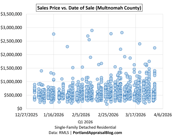
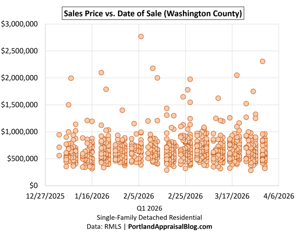
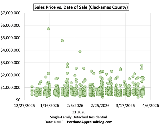
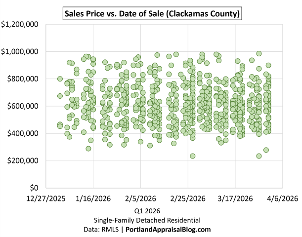
At today’s 6.49% mortgage rate, the monthly principal‑and‑interest payment on a Q1 2026 Portland Region median-priced detached home ($580,000) with 20% down is $2,930, up from $2,776 at February’s low. Lifetime interest rises to $590,708, and repricing all Q1 loans at today’s rate adds $156M in regional interest.
What Happened This Week
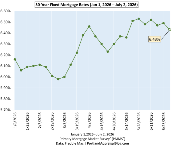
Mortgage rates moved higher this week, with the 30‑year fixed returning to 6.49%—a 6 bps increase from last week and sitting very close to the year‑to‑date highs. The broader 2026 pattern remains intact: rates bottomed on February 26th, climbed sharply through early April, cooled briefly, and then resumed their upward drift beginning April 23. With this week’s move, we remain near the top of the 2026 range, and the past seven weeks have been defined by a narrow, high‑pressure band of rate movement that had been drifting downward but snapped upward this week, breaking the short‑term pattern.
Affordability remains strained at these elevated levels. A 6 bps increase carries weight when rates are this high, and monthly payments continue to hover near their most challenging point of the year. As the charts below show, today’s rate sits just under the ceiling of the year‑to‑date range, and the PABAI continues to reflect the compounding affordability pressure facing buyers across the Portland Region.
Mortgage Rate Context
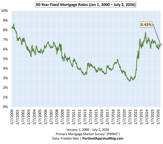
Long‑Run View (Since 2000)
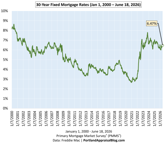
The long‑run chart shows how today’s rate fits into a 25‑year history of mortgage cycles. The early 2000s sat in the 6–8% range, the post‑Great Recession era brought a decade of unusually low rates, and the pandemic period pushed borrowing costs to historic lows. Years after leaving that ultra‑low‑rate environment, the market continues to adjust to more difficult financing constraints, and today’s 6.49% reflects that ongoing shift. With this week’s jump, rates remain elevated in a long‑term context, and affordability continues to be shaped by the same structural pressures highlighted in the medium‑run and short‑run views.
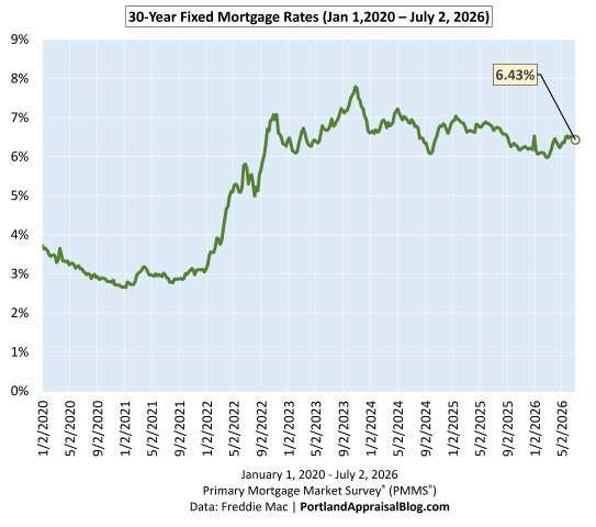
Medium‑Run View (Since COVID)
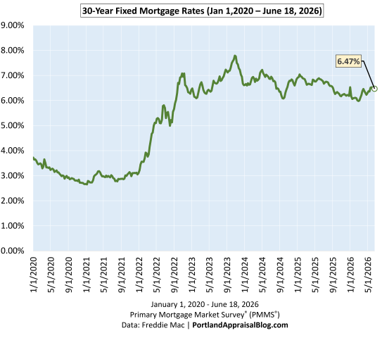
The COVID‑era chart highlights the dramatic rate compression of 2020–2021, the rapid surge of 2022, and the choppy plateau that has defined the past two years. Rates have been oscillating between roughly 6% and 7% since mid‑2023, and today’s 6.49% sits near the middle of that band. Volatility has cooled compared to 2022, but the medium‑run trend remains one of elevated and persistent borrowing costs, with the market continuing to adjust to structurally higher financing conditions across the Portland Region.
Short‑Run View (2026 YTD)
The year‑to‑date chart shows the full shape of the 2026 cycle: a clear bottom at 5.98% on February 26th, a sharp rise into early April, a brief cooldown, and a renewed climb that pushed rates to 6.53% in late May—the highest level of the year. This week’s reading of 6.49% brings us just below that peak, and affordability remains near its weakest point of 2026. This short‑run pattern is the most relevant for buyers today, as it directly shapes monthly payments and qualifying power across the Portland Region.
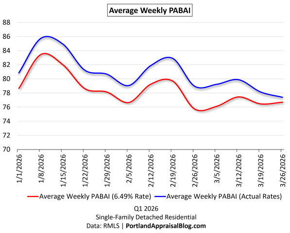
Portland Appraisal Blog Affordability Index (PABAI)
What PABAI Measures
The Portland Appraisal Blog Affordability Index (PABAI) measures how home close prices compare to what a median‑income household can qualify for under standard lending assumptions (HUD Portland‑Vancouver‑Hillsboro MSA median income, 20% down, and a 28% DTI for principal, interest, taxes, insurance, and HOA dues).
Unlike national affordability indices, PABAI is built from actual RMLS transactions rather than a single hypothetical price point. It computes an affordability ratio for every closed sale in the Portland Region during Q1 2026 and then averages those results—that average is the reported PABAI. Each housing segment—detached, attached, condos, and manufactured—is calculated separately, ensuring that segment‑specific dynamics are preserved rather than blended together. This approach produces far more precise, locally grounded insights into Portland‑area affordability and avoids the distortions that occur when fundamentally different housing types are combined into a single regional metric.
A PABAI of 100 means the market is exactly affordable at that income level (the Q1 2026 HUD median MSA income was $124,100 for a family of four). Values above 100 indicate excess qualifying capacity (more affordable), while values below 100 indicate a shortfall (strained affordability). Full methodology and the interpretation scale are available on the PABAI explainer page.
PABAI Range
Interpretation
120+
Strongly Affordable
100–119
Moderately Affordable
80–99
Strained
Below 80
Severely Constrained
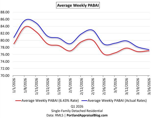
Q1 2026: Actual vs. Constant‑Rate Affordability
The Q1 chart compares two versions of PABAI: one using actual weekly mortgage rates, and one using today’s rate (6.49%) as a constant. Because the constant‑rate line uses a rate near the top of the 2026 range, it naturally sits below the actual‑rate line for most of the quarter. That part isn’t the story.
The key insight is the size and behavior of the gap between the two lines. Early in the quarter, actual rates were meaningfully lower than today’s 6.49% level, giving buyers more qualifying power than a flat‑rate environment would suggest. But as rates climbed through March and into April, the two lines began to converge—a visual confirmation of how persistent rate increases eroded affordability heading into spring. Today’s 6.49% rate keeps the constant‑rate line very close to the actual‑rate line at the end of Q1, reflecting the tightening affordability conditions that carried into mid‑ and late‑spring across the Portland Region.
Structural Unaffordability and the Seasonal Pattern
Detached homes in the Portland Region remain structurally unaffordable to a household earning the HUD median MSA income. PABAI has been below 100 for years, and Q1 2026 continues that pattern. What the chart makes clear is that winter remains the best window for buyers on tight qualifying budgets: affordability improves when rates soften and seasonal pricing cools. As spring approaches, both rates and prices firm up, and affordability reliably compresses.
With the 30‑year fixed now sitting near the highest levels of 2026, the convergence of the two PABAI lines at the end of the quarter reflects the same reality: rising rates have pushed qualifying costs to their weakest point of the year, and the early‑year affordability advantage has largely evaporated. Today’s 6.49% reading keeps affordability firmly in the strained range, underscoring how sensitive the market remains to even small rate movements.
Affordability Snapshot (This Week)
Q1 2026 Affordability Recomputed at Today’s Rate
The table below shows how Q1 2026 affordability metrics change when all 3,349 detached sales are recalculated at this week’s 6.49% rate. This is the clearest way to see how rising rates reshape qualifying power, housing burden, and the share of homes accessible to a median‑income household.
Because today’s rate sits near the top of the 2026 range, the recomputed metrics show a meaningful deterioration in affordability relative to the actual Q1 environment. Required income rises, housing burden increases, and the number of homes affordable to a median‑income household falls sharply—a direct reflection of how even small rate increases compound at elevated levels.
Taken together, these metrics show how quickly affordability erodes when rates rise into the mid‑6% range. The drop in Average PABAI from 80.47 to 78.02 may look modest at first glance, but it represents a meaningful tightening of qualifying power across the entire detached market. Required income rises to roughly $159,000, widening the gap between what a median‑income household earns and what the market demands. That shortfall now exceeds 28%, a reminder that the typical Portland household remains well outside traditional affordability thresholds defined in the PABAI framework.
The payment side tells the same story. Recomputing Q1 sales at today’s rate pushes the average monthly mortgage obligation up by about $130, which may seem incremental on a monthly basis but compounds sharply over a 30‑year horizon. More importantly, the higher rate pushes the average front‑end DTI from 40.36% to 41.62%, a level that would be considered stretched even in more forgiving underwriting environments. These shifts are not abstract; they directly shape who can buy, what they can buy, and how competitive they can be in the Portland Region.
The Buyer‑Side Impact
The most visible consequence of these changes is the shrinking pool of homes accessible to a median‑income household. Under actual Q1 2026 rates, 738 detached homes were affordable; at today’s 6.49% rate, that number falls to 604. In percentage terms, the share of the market within reach drops from 22.0% to 18.04%—a loss of nearly four percentage points in a single recalculation. This is the practical expression of rising rates: fewer viable options, tighter qualifying margins, and a market that becomes increasingly selective about who can participate.
For buyers, the experience varies by circumstance but the direction is the same. Households with limited flexibility feel the tightening most acutely, as even small rate movements can eliminate entire segments of the market. Move‑up buyers face a widening payment gap between their current home and the next one, making the trade‑up calculus more difficult unless equity is substantial. Cash buyers, by contrast, gain relative leverage as financed demand thins—though that advantage is uneven across price tiers.
Across all buyer types, the message is consistent: rising rates are reshaping the market in real time, and the affordability landscape at a 6.49% mortgage rate is meaningfully different from the one buyers faced just a few months ago. The shift is incremental week to week, but cumulative in effect—a defining feature of today’s strained affordability environment.
The Seller‑Side Impact
Rising rates don’t just reshape the buyer experience—they influence seller outcomes as well. In the Q1 2026 detached market, cumulative days on market (CDOM) increased 11.27%, and the current rate environment suggests that upward pressure on market times may persist. As affordability tightens and the pool of qualified buyers shrinks, homes that would have moved quickly in a lower‑rate environment may begin to sit longer, particularly in segments where pricing is already stretched.
Today’s 6.49% rate keeps financing conditions near the most challenging levels of 2026, reinforcing the same dynamic: fewer qualified buyers, more selective demand, and a market where pricing precision matters. This doesn’t imply an abrupt market slowdown, but it does mean sellers should expect a more deliberate buyer pool and prepare for longer market times—especially in higher‑priced tiers where rate sensitivity is most acute.
TIP: Total Interest Paid — Why Small Rate Moves Matter
Total Interest Paid (TIP) is one of the clearest ways to understand how mortgage rates shape long‑run affordability. While buyers shop based on monthly payment, the lifetime cost of borrowing moves far more dramatically than the payment itself. Even small rate changes can add—or remove—tens of thousands of dollars in interest over the life of a loan.
At today’s 6.49% rate, the lifetime interest on a standard Portland‑area purchase sits far above the levels buyers saw during the pandemic and meaningfully higher than the early‑March lows of this year. The difference between a 5.98% environment and a 6.49% environment may feel subtle on a monthly basis, but over 30 years it compounds into a substantial increase in total repayment—the kind of shift that materially affects long‑run household finances in the Portland Region.
This is why TIP matters: it captures the hidden cost of rising rates. Buyers feel the payment, but the long‑run financial burden is embedded in the interest curve. As the charts below show, the 2026 rate path has pushed TIP to some of the highest levels of the year, even as the monthly payment has moved more gradually. The cumulative effect is what reshapes affordability—a dynamic that becomes especially clear when comparing TIP across different rate scenarios.
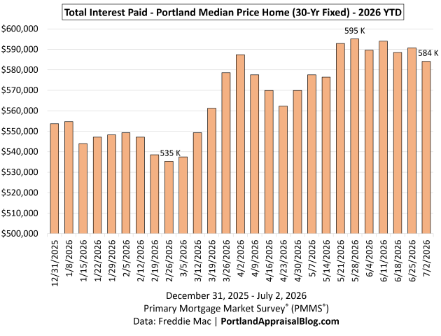
2026 YTD Total Interest Paid
Note: The y-axis starts at $500,000 to allow better examination of monthly differences.
The 2026 YTD TIP chart shows how sharply lifetime borrowing costs have moved as rates climbed through the first half of the year. These calculations are based on the total interest a buyer would pay on the Q1 2026 Portland median‑priced home of $580,000, assuming a 20% down payment and applying the rate effective in each week. This isolates the impact of rate movements alone, holding price and loan structure constant.
The low point came on February 26th, when a 5.98% mortgage rate produced a total interest burden of $535,342. As rates rose through March and into late May, TIP increased steadily, reaching a year‑to‑date high of $595,104 at the 6.53% rate on May 28th—a swing of nearly $60,000 in lifetime interest in just three months, driven entirely by rate movement.
This week’s 6.49% rate pulls TIP down slightly from the YTD high: the total interest burden at today’s rate is $590,708, a modest improvement but still among the highest readings of the year. The shape of the chart makes the pattern unmistakable—at today’s price levels, even small rate changes translate into large long‑run cost differences. Buyers feel the monthly payment, but the lifetime interest curve is where the true financial impact of rising rates becomes visible, especially when comparing TIP across different rate environments.
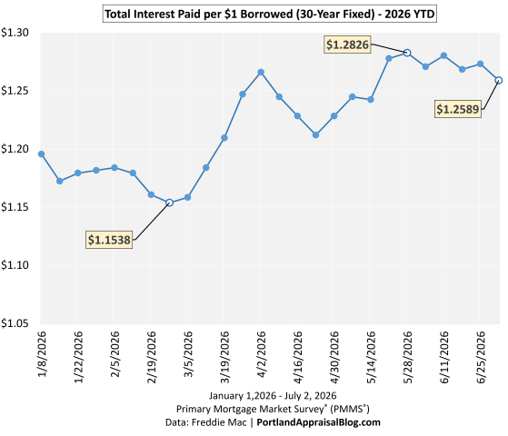
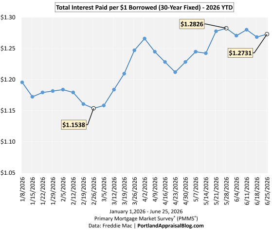
TIP per $1 Borrowed
The TIP‑per‑$1 chart shows how much interest a buyer pays for every dollar borrowed at different mortgage rates. This is the clearest way to visualize the rate sensitivity of long‑run borrowing costs. At the year‑to‑date low of 5.98%, each dollar borrowed generated about $1.1538 in interest over the life of the loan. As rates climbed through the spring, that figure rose steadily, reaching $1.2826 at the late‑May peak of 6.53%.
Today’s 6.49% rate places the cost at $1.2731 per $1 borrowed, a slight improvement from the peak but still near the highest levels of the year. The line makes the pattern clear: once rates move into the mid‑6% range, each additional uptick adds meaningfully more lifetime interest—a dynamic that becomes especially clear when comparing rate environments side by side.
Regional Interest Delta (RID)
The Regional Interest Delta (RID) models how much total lifetime interest the Portland Region’s Q1 detached‑home buyers would collectively pay when mortgage rates shift. To keep the metric consistent, RID assumes that all 3,349 Q1 detached sales were financed under standard 20%‑down, 30‑year conventional underwriting, even though the actual dataset includes cash purchases and loans under FHA, VA, jumbo, and other programs. Rates are matched to each home’s close date to reflect the real timing of rate movements, but individual buyers may have locked slightly different rates depending on their specific loan terms. This approach provides a clean, apples‑to‑apples way to measure how rate changes affect the region’s total interest burden.
Using those actual matched rates, the region’s Q1 2026 pipeline will generate $2,091,901,976 in lifetime interest. Recomputing the same loans at today’s 6.49% rate increases the total to $2,248,407,532. The difference—the RID—is $156,505,556 in additional lifetime interest.
To put that number in perspective: the hollywoodHUB affordable‑housing development cost roughly $152 million to build. A single rate shift—applied across one quarter’s mortgage activity—now produces a lifetime interest delta exceeding the scale of a major regional housing project. This week’s RID represents a nine‑figure increase in long‑run borrowing costs driven solely by rate movement.
RID makes the scale of rate changes unmistakable. What looks like a modest shift at the household level becomes a region‑wide financial impact when applied across thousands of loans—a reminder of how sensitive the Portland market remains to even small movements in the 30‑year fixed.
Payment Delta
The Payment Delta shows how monthly affordability shifts as mortgage rates move. Using the Q1 2026 Portland median‑priced home of $580,000 with a 20% down payment, the monthly principal‑and‑interest payment changes meaningfully even with small rate movements.
Date
Rate
Monthly P&I
Pmt Delta
Feb 26, 2026
5.98%
$2,775.95
—
May 28, 2026
6.53%
$2,941.96
$166.01
July 9, 2026
6.49%
$2,929.74
$153.79
Payment Delta reflects the change from the year‑to‑date low on February 26. Monthly payment for home using median Q1 2026 price ($580,000) and 20% down. Primary Mortgage Market Survey® (PMMS®) Data: Freddie Mac | PortlandAppraisalBlog.com
From the YTD low to the late‑May peak, the monthly payment increased by about $166, and today’s payment remains nearly $154 higher than the February low.
While the Payment Delta is smaller in scale than the lifetime interest changes shown in TIP and RID, it is the number buyers feel most immediately. For households shopping at the lower end of the market, even a $150–$175 shift can meaningfully affect qualifying ratios, required down payment, or even which housing types remain viable—such as moving from detached homes to attached or condos. These adjustments often matter more for affordability‑sensitive buyers than for the broader market.
Closing Thoughts
The story of this week is straightforward: mortgage rates remain elevated, and the effects are visible across every major affordability metric. The PABAI continues to signal structural strain for median‑income households, and the recalculated Q1 data shows how even modest rate movements reshape qualifying power, monthly payments, and the share of homes within reach. The TIP and RID visuals make the pattern clear: higher rates don’t just affect individual buyers—they reshape the long‑run financial burden carried across the entire region.
For buyers, the takeaway is that financing conditions remain tight as we move into early summer. Winter continues to offer the best affordability window, but today’s rate environment means households on the margin feel pressure sooner and more sharply than in prior years. Even a $150‑range shift in the Payment Delta can influence qualifying ratios, required down payment, or which housing types remain viable—including whether buyers need to consider attached homes or condos instead of detached options.
For sellers, the implications are more subtle but no less real. The Q1 2026 detached market saw CDOM rise more than 11%, and the current rate backdrop suggests that upward pressure on market times may persist. A smaller pool of qualified buyers and higher monthly payments can translate into longer exposure, especially for homes priced aggressively or positioned in segments where affordability is already stretched. Pricing discipline and realistic expectations matter more in this environment than they did during the ultra‑low‑rate era.
As always, the Portland market adapts—sometimes quickly, sometimes reluctantly—but the direction of travel is clear. Higher rates are reshaping both sides of the transaction, and the early summer of 2026 is operating under some of the most constrained financing conditions we’ve seen this year.
Sources & Further Reading
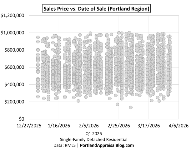
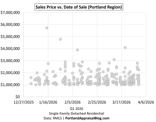
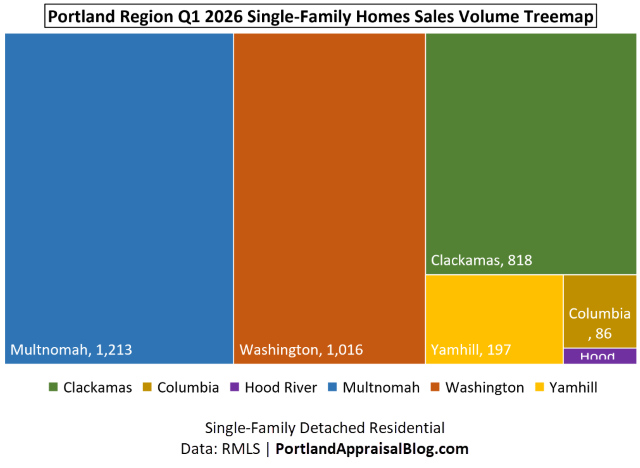
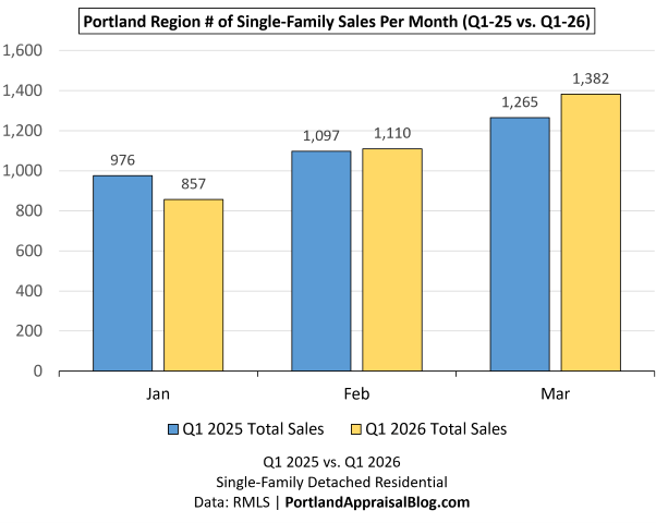
All data presented in this weekly mortgage rate update is based on the Q1 2026 detached homes segment. The data is sourced directly from RMLS and has been subjected to rigorous cleaning and validation processes to ensure reliability for detached single-family residential analysis in the six-county Portland Region. The trends, comparisons, and commentary are the result of original appraisal expertise and independent analysis—not aggregated from secondary sources or news summaries.
Freddie Mac Primary Mortgage Market Survey® (PMMS®): Dataset
Thanks for reading—I hope you found a useful insight or an unexpected nugget along the way. If you enjoyed the post, please consider subscribing for future updates.
Are you an agent in Portland who wonders why appraisers always do “x”?
A homeowner with questions about appraiser methodology?
If so, feel free to reach out—I enjoy connecting with market participants across Portland and the surrounding counties, and am always happy to help where I can.
And if you’re in need of appraisal services in Portland or anywhere in the Portland Region, we’d be glad to assist.
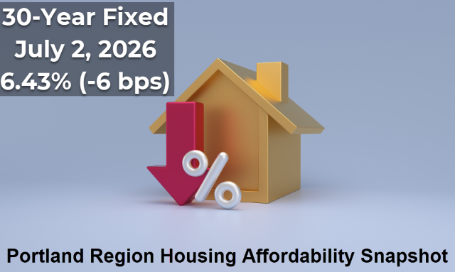
At today’s 6.43% mortgage rate, the monthly principal‑and‑interest payment on a Q1 2026 Portland Region median-priced detached home ($580,000) with 20% down is $2,911 up from $2,776 at February’s low. Lifetime interest rises to $584,128, and repricing all Q1 loans at today’s rate adds $131M in regional interest.
What Happened This Week
Mortgage rates eased slightly this week, with the 30‑year fixed dipping to 6.43%, down 6 bps from last week’s 6.49% reading. Despite the improvement, we remain close to year‑to‑date highs, and the broader 2026 pattern is still intact: rates bottomed on February 26th, climbed sharply through early April, cooled modestly, and then settled into a tight 6.45%–6.55% band over the past month. This week’s decline nudges us toward the lower edge of that range, but the overall trend remains one of sideways movement with a slight downward tilt.
Affordability improves—very slightly—at 6.43%. Even a 6 bps decrease helps when rates are this elevated, but monthly payments remain near their most challenging levels of the year. As the charts below show, today’s rate sits just under the ceiling of the year‑to‑date range, and the PABAI continues to reflect the persistent affordability strain facing buyers across the Portland Region.
Mortgage Rate Context
Long‑Run View (Since 2000)
The long‑run chart shows how today’s rate fits into a 25‑year history of mortgage cycles. The early 2000s sat in the 6–8% range, the post‑Great Recession era brought a decade of unusually low rates, and the pandemic period pushed borrowing costs to historic lows. Years after leaving that ultra‑low‑rate environment, the market continues to adjust to more difficult financing constraints, and today’s 6.43% reflects that ongoing shift.
Medium‑Run View (Since COVID)
The COVID‑era chart highlights the dramatic rate compression of 2020–2021, the rapid surge of 2022, and the choppy plateau that has defined the past two years. Rates have been oscillating between roughly 6% and 7% since mid‑2023, and today’s 6.43% sits in the middle of that band, slightly below the upper half where we’ve spent much of 2026. Volatility has cooled compared to 2022, but the medium‑run trend remains one of elevated and persistent borrowing costs.
Short‑Run View (2026 YTD)
Note: The y-axis starts at 5.70% to allow better examination of weekly differences.
The year‑to‑date chart shows the full shape of the 2026 cycle: a clear bottom at 5.98% on February 26th, a sharp rise into early April, a brief cooldown, and a renewed climb that pushed rates to 6.53% in late May—the highest level of the year. This week’s reading of 6.43% places us just below that peak, marking a modest improvement but still keeping buyers near the upper end of the 2026 range. Affordability remains strained at these levels, and this short‑run pattern is the most relevant for buyers today, as it directly shapes monthly payments and qualifying power.
Portland Appraisal Blog Affordability Index (PABAI)
What PABAI Measures
The Portland Appraisal Blog Affordability Index (PABAI) measures how home close prices compare to what a median‑income household can qualify for under standard lending assumptions (HUD Portland‑Vancouver‑Hillsboro MSA median income, 20% down, and a 28% DTI for principal, interest, taxes, insurance, and HOA dues).
Unlike national affordability indices, PABAI is built from actual RMLS transactions rather than a single hypothetical price point. It computes an affordability ratio for every closed sale in the Portland Region during Q1 2026 and then averages those results—that average is the reported PABAI. Each housing segment—detached, attached, condos, and manufactured—is calculated separately, ensuring that segment‑specific dynamics are preserved rather than blended together. This approach produces far more precise, locally grounded insights into Portland‑area affordability and avoids the distortions that occur when fundamentally different housing types are combined into a single regional metric.
A PABAI of 100 means the market is exactly affordable at that income level (the Q1 2026 HUD median MSA income was $124,100 for a family of four). Values above 100 indicate excess qualifying capacity (more affordable), while values below 100 indicate a shortfall (strained affordability). Full methodology and the interpretation scale are available on the PABAI explainer page.
PABAI Range
Interpretation
120+
Strongly Affordable
100–119
Moderately Affordable
80–99
Strained
Below 80
Severely Constrained
Q1 2026: Actual vs. Constant‑Rate Affordability
The Q1 chart compares two versions of PABAI: one using actual weekly mortgage rates, and one using today’s rate (6.43%) as a constant. Because the constant‑rate line uses a rate near the upper end of the 2026 range, it naturally sits below the actual‑rate line for most of the quarter. That part isn’t the story.
The key insight is the size and behavior of the gap between the two lines. Early in the quarter, actual rates were meaningfully lower than today’s 6.43% level, giving buyers more qualifying power than a flat‑rate environment would suggest. This is why the actual‑rate PABAI runs several points higher throughout January and February. But as rates climbed through March, the two lines began to converge—a visual confirmation of how rising borrowing costs steadily eroded affordability heading into spring. By late March, the gap had nearly closed, and today’s 6.43% rate keeps the constant‑rate line very close to the actual‑rate line at the end of Q1, reflecting the tightening affordability conditions that carried into mid‑ and late‑spring.
Structural Unaffordability and the Seasonal Pattern
Detached homes in the Portland Region remain structurally unaffordable to a household earning the HUD median MSA income. PABAI has been below 100 for years, and Q1 2026 continues that pattern. What the chart makes clear is that winter remains the best window for buyers on tight qualifying budgets: affordability improves when rates soften and seasonal pricing cools. As spring approaches, both rates and prices firm up, and affordability reliably compresses.
With the 30‑year fixed now sitting near the upper end of the 2026 range, the convergence of the two PABAI lines at the end of the quarter reflects the same reality: rising rates steadily pushed qualifying costs to their weakest point of the year, and the early‑year affordability advantage has largely evaporated. Today’s 6.43% reading keeps affordability firmly in the strained range, underscoring how sensitive the market remains to even small rate movements.
Affordability Snapshot (This Week)
Q1 2026 Affordability Recomputed at Today’s Rate
The table below shows how Q1 2026 affordability metrics change when all 3,349 detached sales are recalculated at this week’s 6.43% rate. This is the clearest way to see how elevated borrowing costs reshape qualifying power, housing burden, and the share of homes accessible to a median‑income household.
Because today’s rate sits near the upper end of the 2026 range—but slightly below recent highs—the recomputed metrics still show a meaningful deterioration in affordability relative to the actual Q1 environment, though the impact is marginally softer than last week’s 6.49% recalculation. Required income rises, housing burden increases, and the number of homes affordable to a median‑income household declines—a direct reflection of how even small rate movements compound at elevated levels.
Taken together, these metrics show how quickly affordability erodes when rates rise into the mid‑6% range. The drop in Average PABAI from 80.47 to 78.40 may look modest at first glance, but it represents a meaningful tightening of qualifying power across the entire detached market. Required income rises to roughly $158,300, widening the gap between what a median‑income household earns and what the market demands. That shortfall now approaches 27.5%, a reminder that the typical Portland household remains well outside traditional affordability thresholds.
The payment side tells the same story. Recomputing Q1 sales at today’s rate pushes the average monthly mortgage obligation up by about $109, which may seem incremental on a monthly basis but compounds sharply over a 30‑year horizon. More importantly, the higher rate pushes the average front‑end DTI from 40.36% to 41.42%, a level that would be considered stretched even in more forgiving underwriting environments. These shifts are not abstract; they directly shape who can buy, what they can buy, and how competitive they can be.
The Buyer‑Side Impact
The most visible consequence of these changes is the shrinking pool of homes accessible to a median‑income household. Under actual Q1 2026 rates, 738 detached homes were affordable; at today’s 6.43% rate, that number falls to 627. In percentage terms, the share of the market within reach drops from 22.0% to 18.72%—a loss of just over three percentage points in a single recalculation. This is the practical expression of rising rates: fewer viable options, tighter qualifying margins, and a market that becomes increasingly selective about who can participate.
For buyers, the experience varies by circumstance but the direction is the same. Households with limited flexibility feel the tightening most acutely, as even small rate movements can eliminate entire segments of the market. Move‑up buyers face a widening payment gap between their current home and the next one, making the trade‑up calculus more difficult unless equity is substantial. Cash buyers, by contrast, gain relative leverage as financed demand thins—though that advantage is uneven across price tiers.
Across all buyer types, the message is consistent: rising rates are reshaping the market in real time, and the affordability landscape at a 6.43% mortgage rate is meaningfully different from the one buyers faced just a few months ago. The shift is incremental week to week, but cumulative in effect—a defining feature of today’s strained affordability environment.
The Seller‑Side Impact
Rising rates don’t just reshape the buyer experience—they influence seller outcomes as well. In the Q1 2026 detached market, cumulative days on market (CDOM) increased 11.27%, and the current rate environment suggests that upward pressure on market times may persist. As affordability tightens and the pool of qualified buyers shrinks, homes that would have moved quickly in a lower‑rate environment may begin to sit longer, particularly in segments where pricing is already stretched.
Today’s 6.43% rate keeps financing conditions near the most challenging levels of 2026, reinforcing the same dynamic: fewer qualified buyers, more selective demand, and a market where pricing precision matters. This doesn’t imply an abrupt market slowdown, but it does mean sellers should expect a more deliberate buyer pool and prepare for longer market times—especially in higher‑priced tiers where rate sensitivity is most acute.
TIP: Total Interest Paid — Why Small Rate Moves Matter
Total Interest Paid (TIP) is one of the clearest ways to understand how mortgage rates shape long‑run affordability. While buyers shop based on monthly payment, the lifetime cost of borrowing moves far more dramatically than the payment itself. Even small rate changes can add—or remove—tens of thousands of dollars in interest over the life of a loan.
At today’s 6.43% rate, the lifetime interest on a standard Portland‑area purchase sits far above the levels buyers saw during the pandemic and meaningfully higher than the early‑March lows of this year. The difference between a 5.98% environment and a 6.43% environment may feel subtle on a monthly basis, but over 30 years it compounds into a substantial increase in total repayment—the kind of shift that materially affects long‑run household finances in the Portland Region.
This is why TIP matters: it captures the hidden cost of rising rates. Buyers feel the payment, but the long‑run financial burden is embedded in the interest curve. As the charts below show, the 2026 rate path has pushed TIP to some of the highest levels of the year, even as the monthly payment has moved more gradually. The cumulative effect is what reshapes affordability—a dynamic that becomes especially clear when comparing TIP across different rate scenarios.
2026 YTD Total Interest Paid
Note: The y-axis starts at $500,000 to allow better examination of monthly differences.
The 2026 YTD TIP chart shows how sharply lifetime borrowing costs have moved as rates climbed through the first half of the year. These calculations are based on the total interest a buyer would pay on the Q1 2026 Portland median‑priced home of $580,000, assuming a 20% down payment and applying the rate effective in each week. This isolates the impact of rate movements alone, holding price and loan structure constant.
The low point came on February 26th, when a 5.98% mortgage rate produced a total interest burden of $535,342. As rates rose through March and into late May, TIP increased steadily, reaching a year‑to‑date high of $595,104 at the 6.53% rate on May 28th. That’s nearly a $60,000 increase in lifetime interest in just three months, driven entirely by rate movement.
This week’s 6.43% rate pulls TIP down from last week’s level: the total interest burden at today’s rate is $584,128, a modest improvement but still among the highest readings of the year. The shape of the chart makes the pattern unmistakable—at today’s price levels, even small rate changes translate into large long‑run cost differences. Buyers feel the monthly payment, but the lifetime interest curve is where the true financial impact of rising rates becomes visible, especially when comparing TIP across different rate environments.
TIP per $1 Borrowed
The TIP‑per‑$1 chart shows how much interest a buyer pays for every dollar borrowed at different mortgage rates. This is the clearest way to visualize the rate sensitivity of long‑run borrowing costs. At the year‑to‑date low of 5.98%, each dollar borrowed generated about $1.1538 in interest over the life of the loan. As rates climbed through the spring, that figure rose steadily, reaching $1.2826 at the late‑May peak of 6.53%.
Today’s 6.43% rate places the cost at $1.2589 per $1 borrowed, a modest improvement from last week but still near the highest levels of the year. The line makes the pattern clear: once rates move into the mid‑6% range, each additional uptick adds meaningfully more lifetime interest—a dynamic that becomes especially clear when comparing rate environments side by side.
Regional Interest Delta (RID)
The Regional Interest Delta (RID) models how much total lifetime interest the Portland Region’s Q1 detached‑home buyers would collectively pay when mortgage rates shift. To keep the metric consistent, RID assumes that all 3,349 Q1 detached sales were financed under standard 20%‑down, 30‑year conventional underwriting, even though the actual dataset includes cash purchases and loans under FHA, VA, jumbo, and other programs. Rates are matched to each home’s close date to reflect the real timing of rate movements, but individual buyers may have locked slightly different rates depending on their specific loan terms. This approach provides a clean, apples‑to‑apples way to measure how rate changes affect the region’s total interest burden.
Using those actual matched rates, the region’s Q1 2026 pipeline will generate $2,091,901,976 in lifetime interest. Recomputing the same loans at today’s 6.43% rate increases the total to $2,223,363,234. The difference—the RID—is $131,461,258 in additional lifetime interest.
To put that number in perspective: $131 million is roughly equivalent to the cost of a large‑scale affordable housing development in Portland—something on the scale of a multi‑hundred‑unit project like hollywoodHUB. A single rate shift—applied across one quarter’s mortgage activity—creates a lifetime interest delta comparable to building an entire affordable housing complex from the ground up. Today’s RID comes in below the peaks we saw when rates were sitting at 6.49%–6.53%, but it still represents a nine‑figure increase in long‑run borrowing costs driven solely by rate movement.
RID makes the scale of rate changes unmistakable. What looks like a modest shift at the household level becomes a region‑wide financial impact when applied across thousands of loans—a reminder of how sensitive the Portland market remains to even small movements in the 30‑year fixed.
Payment Delta
The Payment Delta shows how monthly affordability shifts as mortgage rates move. Using the Q1 2026 Portland median‑priced home of $580,000 with a 20% down payment, the monthly principal‑and‑interest payment changes meaningfully even with small rate movements.
Date
Rate
Monthly P&I
Pmt Delta
Feb 26, 2026
5.98%
$2,775.95
—
May 28, 2026
6.53%
$2,941.96
$166.01
July 2, 2026
6.43%
$2,911.47
$135.52
Payment Delta reflects the change from the year‑to‑date low on February 26. Monthly payment for home using median Q1 2026 price ($580,000) and 20% down. Primary Mortgage Market Survey® (PMMS®) Data: Freddie Mac | PortlandAppraisalBlog.com
From the YTD low to the late‑May peak, the monthly payment increased by about $166, and today’s payment remains nearly $136 higher than the February low.
While the Payment Delta is smaller in scale than the lifetime interest changes shown in TIP and RID, it is the number buyers feel most immediately. For households shopping at the lower end of the market, even a $150–$175 shift can meaningfully affect qualifying ratios, required down payment, or even which housing types remain viable—such as moving from detached homes to attached or condos. These adjustments often matter more for affordability‑sensitive buyers than for the broader market.
Closing Thoughts
The story of this week is straightforward: mortgage rates remain elevated, and the effects are visible across every major affordability metric. The PABAI continues to signal structural strain for median‑income households, and the recalculated Q1 data shows how even modest rate movements reshape qualifying power, monthly payments, and the share of homes within reach. The TIP and RID visuals make the pattern clear: higher rates don’t just affect individual buyers—they reshape the long‑run financial burden carried across the entire region.
For buyers, the takeaway is that financing conditions remain tight as we move into early summer. Winter continues to offer the best affordability window, but today’s rate environment means households on the margin feel pressure sooner and more sharply than in prior years. Even a roughly $150‑range shift in the Payment Delta can influence qualifying ratios, required down payment, or which housing types remain viable—including whether buyers need to consider attached homes or condos instead of detached options.
For sellers, the implications are more subtle but no less real. The Q1 2026 detached market saw CDOM rise more than 11%, and the current rate backdrop suggests that upward pressure on market times may persist. A smaller pool of qualified buyers and higher monthly payments can translate into longer exposure, especially for homes priced aggressively or positioned in segments where affordability is already stretched. Pricing discipline and realistic expectations matter more in this environment than they did during the ultra‑low‑rate era.
As always, the Portland market adapts—sometimes quickly, sometimes reluctantly—but the direction of travel is clear. Higher rates are reshaping both sides of the transaction, and the early summer of 2026 is operating under some of the most constrained financing conditions we’ve seen this year.
Sources & Further Reading
All data presented in this weekly mortgage rate update is based on the Q1 2026 detached homes segment. The data is sourced directly from RMLS and has been subjected to rigorous cleaning and validation processes to ensure reliability for detached single-family residential analysis in the six-county Portland Region. The trends, comparisons, and commentary are the result of original appraisal expertise and independent analysis—not aggregated from secondary sources or news summaries.
Freddie Mac Primary Mortgage Market Survey® (PMMS®): Dataset
Thanks for reading—I hope you found a useful insight or an unexpected nugget along the way. If you enjoyed the post, please consider subscribing for future updates.
Are you an agent in Portland who wonders why appraisers always do “x”?
A homeowner with questions about appraiser methodology?
If so, feel free to reach out—I enjoy connecting with market participants across Portland and the surrounding counties, and am always happy to help where I can.
And if you’re in need of appraisal services in Portland or anywhere in the Portland Region, we’d be glad to assist.
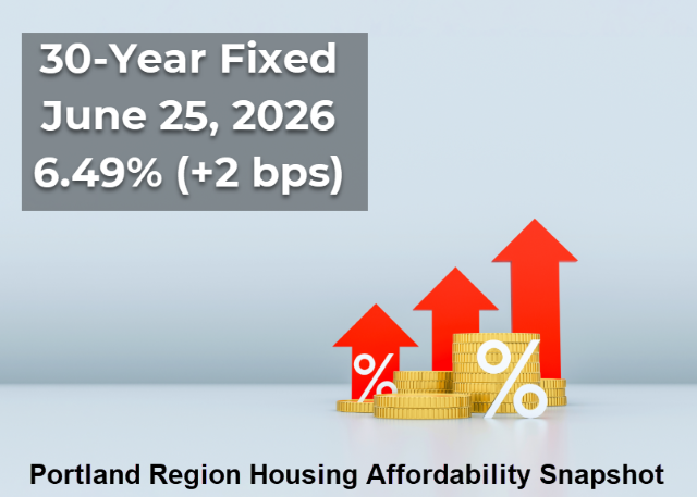
At today’s 6.49% mortgage rate, the monthly principal‑and‑interest payment on a Q1 2026 Portland Region median-priced detached home ($580,000) with 20% down is $2,930, up from $2,776 at February’s low. Lifetime interest rises to $590,708, and repricing all Q1 loans at today’s rate adds $156M in regional interest.
What Happened This Week
Mortgage rates nudged higher this week, with the 30‑year fixed rising to 6.49%, a 2 bps increase from last week and still sitting close to the year‑to‑date highs. The broader 2026 pattern remains intact: rates bottomed on February 26th, climbed sharply through early April, cooled briefly, and then resumed their upward drift beginning April 23rd. With this week’s move, we remain near the top of the 2026 range, and the past month has been defined by a narrow, high‑pressure band of rate movement.
Affordability remains strained at these elevated levels. Even a modest 2 bps increase carries weight when rates are this high, and monthly payments continue to hover near their most challenging point of the year. As the charts below show, today’s rate sits just under the ceiling of the year‑to‑date range, and the PABAI continues to reflect the compounding affordability pressure facing buyers across the Portland Region.
Mortgage Rate Context
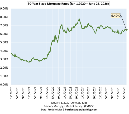
Long‑Run View (Since 2000)
The long‑run chart shows how today’s rate fits into a 25‑year history of mortgage cycles. The early 2000s sat in the 6–8% range, the post‑Great Recession era brought a decade of unusually low rates, and the pandemic period pushed borrowing costs to historic lows. Years after leaving that ultra‑low‑rate environment, the market continues to adjust to more difficult financing constraints, and today’s 6.49% reflects that ongoing shift. Even with this week’s small uptick, rates remain elevated in a long‑term context, and affordability continues to be shaped by the same structural pressures highlighted in the medium‑run and short‑run views.
Medium‑Run View (Since COVID)
The COVID‑era chart highlights the dramatic rate compression of 2020–2021, the rapid surge of 2022, and the choppy plateau that has defined the past two years. Rates have been oscillating between roughly 6% and 7% since mid‑2023, and today’s 6.49% sits near the middle of that band. Volatility has cooled compared to 2022, but the medium‑run trend remains one of elevated and persistent borrowing costs, with the market continuing to adjust to structurally higher financing conditions across the Portland Region.
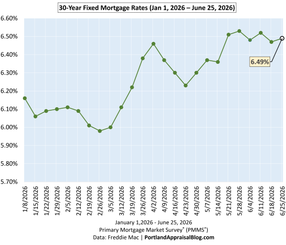
Short‑Run View (2026 YTD)
The year‑to‑date chart shows the full shape of the 2026 cycle: a clear bottom at 5.98% on February 26th, a sharp rise into early April, a brief cooldown, and a renewed climb that pushed rates to 6.53% in late May—the highest level of the year. This week’s reading of 6.49% brings us just below that peak, and affordability remains near its weakest point of 2026. This short‑run pattern is the most relevant for buyers today, as it directly shapes monthly payments and qualifying power across the Portland Region.
Portland Appraisal Blog Affordability Index (PABAI)
What PABAI Measures
The Portland Appraisal Blog Affordability Index (PABAI) measures how the average home close price compares to what a median‑income household can qualify for under standard lending assumptions (HUD Portland‑Vancouver‑Hillsboro MSA median income, 20% down, and a 28% DTI for principal, interest, taxes, insurance, and HOA dues).
Unlike national affordability indices, PABAI is built from actual RMLS transactions—all 3,349 detached sales for the Portland Region in Q1 2026—which allows for far more precise, locally grounded insights into Portland‑area affordability than any national model can provide.
A PABAI of 100 means the market is exactly affordable at that income level (the Q1 2026 HUD median MSA income was $124,100 for a family of four). Values above 100 indicate excess qualifying capacity (more affordable), while values below 100 indicate a shortfall (strained affordability). Full methodology and the interpretation scale are available on the PABAI explainer page.
PABAI Range
Interpretation
120+
Strongly Affordable
100–119
Moderately Affordable
80–99
Strained
Below 80
Severely Constrained
Q1 2026: Actual vs. Constant‑Rate Affordability
The Q1 chart compares two versions of PABAI: one using actual weekly mortgage rates, and one using today’s rate (6.49%) as a constant. Because the constant‑rate line uses a rate near the top of the 2026 range, it naturally sits below the actual‑rate line for most of the quarter. That part isn’t the story.
The key insight is the size and behavior of the gap between the two lines. Early in the quarter, actual rates were meaningfully lower than today’s 6.49% level, giving buyers more qualifying power than a flat‑rate environment would suggest. But as rates climbed through March and into April, the two lines began to converge—a visual confirmation of how persistent rate increases eroded affordability heading into spring. Today’s 6.49% rate keeps the constant‑rate line very close to the actual‑rate line at the end of Q1, reflecting the tightening affordability conditions that carried into mid‑ and late‑spring across the Portland Region.
Structural Unaffordability and the Seasonal Pattern
Detached homes in the Portland Region remain structurally unaffordable to a household earning the HUD median MSA income. PABAI has been below 100 for years, and Q1 2026 continues that pattern. What the chart makes clear is that winter remains the best window for buyers on tight qualifying budgets: affordability improves when rates soften and seasonal pricing cools. As spring approaches, both rates and prices firm up, and affordability reliably compresses.
With the 30‑year fixed now sitting near the highest levels of 2026, the convergence of the two PABAI lines at the end of the quarter reflects the same reality: rising rates have pushed qualifying costs to their weakest point of the year, and the early‑year affordability advantage has largely evaporated. Today’s 6.49% reading keeps affordability firmly in the strained range, underscoring how sensitive the market remains to even small rate movements.
Affordability Snapshot (This Week)
Q1 2026 Affordability Recomputed at Today’s Rate
The table below shows how Q1 2026 affordability metrics change when all 3,349 detached sales are recalculated at this week’s 6.49% rate. This is the clearest way to see how rising rates reshape qualifying power, housing burden, and the share of homes accessible to a median‑income household.
Because today’s rate sits near the top of the 2026 range, the recomputed metrics show a meaningful deterioration in affordability relative to the actual Q1 environment. Required income rises, housing burden increases, and the number of homes affordable to a median‑income household falls sharply—a direct reflection of how even small rate increases compound at elevated levels.
Taken together, these metrics show how quickly affordability erodes when rates rise into the mid‑6% range. The drop in Average PABAI from 80.47 to 78.02 may look modest at first glance, but it represents a meaningful tightening of qualifying power across the entire detached market. Required income rises to roughly $159,000, widening the gap between what a median‑income household earns and what the market demands. That shortfall now exceeds 28%, a reminder that the typical Portland household remains well outside traditional affordability thresholds defined in the PABAI framework.
The payment side tells the same story. Recomputing Q1 sales at today’s rate pushes the average monthly mortgage obligation up by about $130, which may seem incremental on a monthly basis but compounds sharply over a 30‑year horizon. More importantly, the higher rate pushes the average front‑end DTI from 40.36% to 41.62%, a level that would be considered stretched even in more forgiving underwriting environments. These shifts are not abstract; they directly shape who can buy, what they can buy, and how competitive they can be in the Portland Region.
The Buyer‑Side Impact
The most visible consequence of these changes is the shrinking pool of homes accessible to a median‑income household. Under actual Q1 2026 rates, 738 detached homes were affordable; at today’s 6.49% rate, that number falls to 604. In percentage terms, the share of the market within reach drops from 22.0% to 18.04%—a loss of nearly four percentage points in a single recalculation. This is the practical expression of rising rates: fewer viable options, tighter qualifying margins, and a market that becomes increasingly selective about who can participate.
For buyers, the experience varies by circumstance but the direction is the same. Households with limited flexibility feel the tightening most acutely, as even small rate movements can eliminate entire segments of the market. Move‑up buyers face a widening payment gap between their current home and the next one, making the trade‑up calculus more difficult unless equity is substantial. Cash buyers, by contrast, gain relative leverage as financed demand thins—though that advantage is uneven across price tiers.
Across all buyer types, the message is consistent: rising rates are reshaping the market in real time, and the affordability landscape at a 6.49% mortgage rate is meaningfully different from the one buyers faced just a few months ago. The shift is incremental week to week, but cumulative in effect—a defining feature of today’s strained affordability environment.
The Seller‑Side Impact
Rising rates don’t just reshape the buyer experience—they influence seller outcomes as well. In the Q1 2026 detached market, cumulative days on market (CDOM) increased 11.27%, and the current rate environment suggests that upward pressure on market times may persist. As affordability tightens and the pool of qualified buyers shrinks, homes that would have moved quickly in a lower‑rate environment may begin to sit longer, particularly in segments where pricing is already stretched.
Today’s 6.49% rate keeps financing conditions near the most challenging levels of 2026, reinforcing the same dynamic: fewer qualified buyers, more selective demand, and a market where pricing precision matters. This doesn’t imply an abrupt market slowdown, but it does mean sellers should expect a more deliberate buyer pool and prepare for longer market times—especially in higher‑priced tiers where rate sensitivity is most acute.
TIP: Total Interest Paid — Why Small Rate Moves Matter
Total Interest Paid (TIP) is one of the clearest ways to understand how mortgage rates shape long‑run affordability. While buyers shop based on monthly payment, the lifetime cost of borrowing moves far more dramatically than the payment itself. Even small rate changes can add—or remove—tens of thousands of dollars in interest over the life of a loan.
At today’s 6.49% rate, the lifetime interest on a standard Portland‑area purchase sits far above the levels buyers saw during the pandemic and meaningfully higher than the early‑March lows of this year. The difference between a 5.98% environment and a 6.49% environment may feel subtle on a monthly basis, but over 30 years it compounds into a substantial increase in total repayment—the kind of shift that materially affects long‑run household finances in the Portland Region.
This is why TIP matters: it captures the hidden cost of rising rates. Buyers feel the payment, but the long‑run financial burden is embedded in the interest curve. As the charts below show, the 2026 rate path has pushed TIP to some of the highest levels of the year, even as the monthly payment has moved more gradually. The cumulative effect is what reshapes affordability—a dynamic that becomes especially clear when comparing TIP across different rate scenarios.
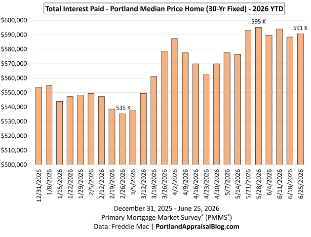
2026 YTD Total Interest Paid
Note: The y-axis starts at $500,000 to allow better examination of monthly differences.
The 2026 YTD TIP chart shows how sharply lifetime borrowing costs have moved as rates climbed through the first half of the year. These calculations are based on the total interest a buyer would pay on the Q1 2026 Portland median‑priced home of $580,000, assuming a 20% down payment and applying the rate effective in each week. This isolates the impact of rate movements alone, holding price and loan structure constant.
The low point came on February 26th, when a 5.98% mortgage rate produced a total interest burden of $535,342. As rates rose through March and into late May, TIP increased steadily, reaching a year‑to‑date high of $595,104 at the 6.53% rate on May 28th—a swing of nearly $60,000 in lifetime interest in just three months, driven entirely by rate movement.
This week’s 6.49% rate pulls TIP down slightly from last week’s level: the total interest burden at today’s rate is $590,708, a modest improvement but still among the highest readings of the year. The shape of the chart makes the pattern unmistakable—at today’s price levels, even small rate changes translate into large long‑run cost differences. Buyers feel the monthly payment, but the lifetime interest curve is where the true financial impact of rising rates becomes visible, especially when comparing TIP across different rate environments.
TIP per $1 Borrowed
The TIP‑per‑$1 chart shows how much interest a buyer pays for every dollar borrowed at different mortgage rates. This is the clearest way to visualize the rate sensitivity of long‑run borrowing costs. At the year‑to‑date low of 5.98%, each dollar borrowed generated about $1.1538 in interest over the life of the loan. As rates climbed through the spring, that figure rose steadily, reaching $1.2826 at the late‑May peak of 6.53%.
Today’s 6.49% rate places the cost at $1.2731 per $1 borrowed, a slight improvement from last week but still near the highest levels of the year. The line makes the pattern clear: once rates move into the mid‑6% range, each additional uptick adds meaningfully more lifetime interest—a dynamic that becomes especially clear when comparing rate environments side by side.
Regional Interest Delta (RID)
The Regional Interest Delta (RID) models how much total lifetime interest the Portland Region’s Q1 detached‑home buyers would collectively pay when mortgage rates shift. To keep the metric consistent, RID assumes that all 3,349 Q1 detached sales were financed under standard 20%‑down, 30‑year conventional underwriting, even though the actual dataset includes cash purchases and loans under FHA, VA, jumbo, and other programs. Rates are matched to each home’s close date to reflect the real timing of rate movements, but individual buyers may have locked slightly different rates depending on their specific loan terms. This approach provides a clean, apples‑to‑apples way to measure how rate changes affect the region’s total interest burden.
Using those actual matched rates, the region’s Q1 2026 pipeline will generate $2,091,901,976 in lifetime interest. Recomputing the same loans at today’s 6.49% rate increases the total to $2,248,407,532. The difference—the RID—is $156,505,556 in additional lifetime interest.
To put that number in perspective: the hollywoodHUB affordable‑housing development cost roughly $152 million to build. A single rate shift—applied across one quarter’s mortgage activity—now produces a lifetime interest delta exceeding the scale of a major regional housing project. This week’s RID represents a nine‑figure increase in long‑run borrowing costs driven solely by rate movement.
RID makes the scale of rate changes unmistakable. What looks like a modest shift at the household level becomes a region‑wide financial impact when applied across thousands of loans—a reminder of how sensitive the Portland market remains to even small movements in the 30‑year fixed.
Payment Delta
The Payment Delta shows how monthly affordability shifts as mortgage rates move. Using the Q1 2026 Portland median‑priced home of $580,000 with a 20% down payment, the monthly principal‑and‑interest payment changes meaningfully even with small rate movements.
Date
Rate
Monthly P&I
Pmt Delta
Feb 26, 2026
5.98%
$2,775.95
—
May 28, 2026
6.53%
$2,941.96
$166.01
June 25, 2026
6.49%
$2,929.74
$153.79
Payment Delta reflects the change from the year‑to‑date low on February 26. Monthly payment for home using median Q1 2026 price ($580,000) and 20% down. Primary Mortgage Market Survey® (PMMS®) Data: Freddie Mac | PortlandAppraisalBlog.com
From the YTD low to the late‑May peak, the monthly payment increased by about $166, and today’s payment remains nearly $154 higher than the February low.
While the Payment Delta is smaller in scale than the lifetime interest changes shown in TIP and RID, it is the number buyers feel most immediately. For households shopping at the lower end of the market, even a $150–$175 shift can meaningfully affect qualifying ratios, required down payment, or even which housing types remain viable—such as moving from detached homes to attached or condos. These adjustments often matter more for affordability‑sensitive buyers than for the broader market.
Closing Thoughts
The story of this week is straightforward: mortgage rates remain elevated, and the effects are visible across every major affordability metric. The PABAI continues to signal structural strain for median‑income households, and the recalculated Q1 data shows how even modest rate movements reshape qualifying power, monthly payments, and the share of homes within reach. The TIP and RID visuals make the pattern clear: higher rates don’t just affect individual buyers—they reshape the long‑run financial burden carried across the entire region.
For buyers, the takeaway is that financing conditions remain tight as we move into early summer. Winter continues to offer the best affordability window, but today’s rate environment means households on the margin feel pressure sooner and more sharply than in prior years. Even a $150‑range shift in the Payment Delta can influence qualifying ratios, required down payment, or which housing types remain viable—including whether buyers need to consider attached homes or condos instead of detached options.
For sellers, the implications are more subtle but no less real. The Q1 2026 detached market saw CDOM rise more than 11%, and the current rate backdrop suggests that upward pressure on market times may persist. A smaller pool of qualified buyers and higher monthly payments can translate into longer exposure, especially for homes priced aggressively or positioned in segments where affordability is already stretched. Pricing discipline and realistic expectations matter more in this environment than they did during the ultra‑low‑rate era.
As always, the Portland market adapts—sometimes quickly, sometimes reluctantly—but the direction of travel is clear. Higher rates are reshaping both sides of the transaction, and the early summer of 2026 is operating under some of the most constrained financing conditions we’ve seen this year.
Sources & Further Reading
All data presented in this weekly mortgage rate update is based on the Q1 2026 detached homes segment. The data is sourced directly from RMLS and has been subjected to rigorous cleaning and validation processes to ensure reliability for detached single-family residential analysis in the six-county Portland Region. The trends, comparisons, and commentary are the result of original appraisal expertise and independent analysis—not aggregated from secondary sources or news summaries.
Freddie Mac Primary Mortgage Market Survey® (PMMS®): Dataset
Thanks for reading—I hope you found a useful insight or an unexpected nugget along the way. If you enjoyed the post, please consider subscribing for future updates.
Are you an agent in Portland who wonders why appraisers always do “x”?
A homeowner with questions about appraiser methodology?
If so, feel free to reach out—I enjoy connecting with market participants across Portland and the surrounding counties, and am always happy to help where I can.
And if you’re in need of appraisal services in Portland or anywhere in the Portland Region, we’d be glad to assist.
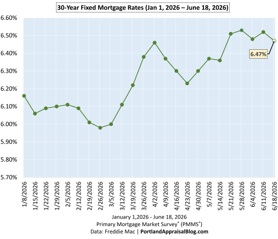
At today’s 6.47% mortgage rate, the monthly principal‑and‑interest payment on a Q1 2026 Portland Region median-priced detached home ($580,000) with 20% down is $2,924, up from $2,776 at February’s low. Lifetime interest rises to $588,513, and repricing all Q1 loans at today’s rate adds $148M in regional interest.
What Happened This Week
Mortgage rates moved lower this week, with the 30‑year fixed dipping to 6.47%, a 5‑basis‑point decline from last week’s 6.52%. The broader 2026 pattern remains intact: rates bottomed on February 26th, surged through early April, eased briefly, and then turned upward again on April 23rd. Over the past month, rates have been oscillating in a narrow range near the year‑to‑date highs, and this week’s pullback simply nudges us off the ceiling rather than signaling a meaningful shift in trend.
Affordability improves only marginally at these levels. A 5 bps decline provides some relief, but monthly payments remain near their highest point of the year, and qualifying thresholds are still significantly above their early‑March lows. As the charts below show, today’s rate sits just under the recent ceiling of the year‑to‑date range, and the PABAI continues to reflect the persistent affordability pressure facing buyers across the Portland Region.
Mortgage Rate Context
Long‑Run View (Since 2000)
The long‑run chart shows how today’s rate fits into a 25‑year history of mortgage cycles. The early 2000s sat in the 6–8% range, the post‑Great Recession era brought a decade of unusually low rates, and the pandemic period pushed borrowing costs to historic lows. Years after leaving that ultra‑low‑rate environment, the market continues to adjust to more difficult financing constraints, and today’s 6.47% reflects that ongoing shift. Even with this week’s modest decline, rates remain elevated in a long‑term context, and the broader affordability landscape remains shaped by the same structural pressures highlighted in the medium‑run and short‑run views.
Medium‑Run View (Since COVID)
The COVID‑era chart highlights the dramatic rate compression of 2020–2021, the rapid surge of 2022, and the choppy plateau that has defined the past two years. Rates have been oscillating between roughly 6% and 7% since mid‑2023, and today’s 6.47% sits near the middle of that band. Volatility has cooled compared to 2022, but the medium‑run trend remains one of elevated and persistent borrowing costs, with the market continuing to adjust to structurally higher financing conditions across the Portland Region.
Short‑Run View (2026 YTD)
The year‑to‑date chart shows the full shape of the 2026 cycle: a clear bottom at 5.98% on February 26th, a sharp rise into early April, a brief cooldown, and a renewed climb that pushed rates to 6.53% in late May—the highest level of the year. This week’s reading of 6.47% brings us slightly off that peak, but affordability remains near its weakest point of 2026. This short‑run pattern is the most relevant for buyers today, as it directly shapes monthly payments and qualifying power across the Portland Region.
Portland Appraisal Blog Affordability Index (PABAI)
What PABAI Measures
The Portland Appraisal Blog Affordability Index (PABAI) measures how the average home close price compares to what a median‑income household can qualify for under standard lending assumptions (HUD Portland‑Vancouver‑Hillsboro MSA median income, 20% down, and a 28% DTI for principal, interest, taxes, insurance, and HOA dues).
Unlike national affordability indices, PABAI is built from actual RMLS transactions—all 3,349 detached sales for the Portland Region in Q1 2026—which allows for far more precise, locally grounded insights into Portland‑area affordability than any national model can provide.
A PABAI of 100 means the market is exactly affordable at that income level (the Q1 2026 HUD median MSA income was $124,100 for a family of four). Values above 100 indicate excess qualifying capacity (more affordable), while values below 100 indicate a shortfall (strained affordability). Full methodology and the interpretation scale are available on the PABAI explainer page.
PABAI Range
Interpretation
120+
Strongly Affordable
100–119
Moderately Affordable
80–99
Strained
Below 80
Severely Constrained
Q1 2026: Actual vs. Constant‑Rate Affordability
The Q1 chart compares two versions of PABAI: one using actual weekly mortgage rates, and one using today’s rate (6.47%) as a constant. Because the constant‑rate line uses a rate near the top of the 2026 range, it naturally sits below the actual‑rate line for most of the quarter. That part isn’t the story.
The key insight is the size and behavior of the gap between the two lines. Early in the quarter, actual rates were meaningfully lower than today’s 6.47% level, giving buyers more qualifying power than a flat‑rate environment would suggest. But as rates climbed through March and into April, the two lines began to converge—a visual confirmation of how persistent rate increases eroded affordability heading into spring. Today’s 6.47% rate keeps the constant‑rate line very close to the actual‑rate line at the end of Q1, reflecting the tightening affordability conditions that carried into mid‑ and late‑spring across the Portland Region.
Structural Unaffordability and the Seasonal Pattern
Detached homes in the Portland Region remain structurally unaffordable to a household earning the HUD median MSA income. PABAI has been below 100 for years, and Q1 2026 continues that pattern. What the chart makes clear is that winter remains the best window for buyers on tight qualifying budgets: affordability improves when rates soften and seasonal pricing cools. As spring approaches, both rates and prices firm up, and affordability reliably compresses.
With the 30‑year fixed now sitting near the highest levels of 2026, the convergence of the two PABAI lines at the end of the quarter reflects the same reality: rising rates have pushed qualifying costs to their weakest point of the year, and the early‑year affordability advantage has largely evaporated. Today’s 6.47% reading keeps affordability firmly in the strained range, underscoring how sensitive the market remains to even small rate movements.
Affordability Snapshot (This Week)
Q1 2026 Affordability Recomputed at Today’s Rate
The table below shows how Q1 2026 affordability metrics change when all 3,349 detached sales are recalculated at this week’s 6.47% rate. This is the clearest way to see how rising rates reshape qualifying power, housing burden, and the share of homes accessible to a median‑income household.
Because today’s rate sits near the top of the 2026 range, the recomputed metrics show a meaningful deterioration in affordability relative to the actual Q1 environment. Required income rises, housing burden increases, and the number of homes affordable to a median‑income household falls sharply—a direct reflection of how even small rate increases compound at elevated levels in the Portland Region.
Taken together, these metrics show how quickly affordability erodes when rates rise into the mid‑6% range. The drop in Average PABAI from 80.47 to 78.14 may look modest at first glance, but it represents a meaningful tightening of qualifying power across the entire detached market. Required income rises to roughly $158,800, widening the gap between what a median‑income household earns and what the market demands. That shortfall now approaches 28%, a reminder that the typical Portland household remains well outside traditional affordability thresholds defined in the PABAI framework.
The payment side tells the same story. Recomputing Q1 sales at today’s 6.47% rate pushes the average monthly mortgage obligation up by about $123, which may seem incremental on a monthly basis but compounds sharply over a 30‑year horizon. More importantly, the higher rate pushes the average front‑end DTI from 40.36% to 41.55%, a level that would be considered stretched even in more forgiving underwriting environments. These shifts are not abstract; they directly shape who can buy, what they can buy, and how competitive they can be in the Portland Region.
The Buyer‑Side Impact
The most visible consequence of these changes is the shrinking pool of homes accessible to a median‑income household. Under actual Q1 2026 rates, 738 detached homes were affordable; at today’s 6.47% rate, that number falls to 618. In percentage terms, the share of the market within reach drops from 22.0% to 18.45%—a loss of more than three and a half percentage points in a single recalculation. This is the practical expression of rising rates: fewer viable options, tighter qualifying margins, and a market that becomes increasingly selective about who can participate in the Portland Region.
For buyers, the experience varies by circumstance but the direction is the same. Households with limited flexibility feel the tightening most acutely, as even small rate movements can eliminate entire segments of the market. Move‑up buyers face a widening payment gap between their current home and the next one, making the trade‑up calculus more difficult unless equity is substantial. Cash buyers, by contrast, gain relative leverage as financed demand thins—though that advantage is uneven across price tiers.
Across all buyer types, the message is consistent: rising rates are reshaping the market in real time, and the affordability landscape at a 6.47% mortgage rate is meaningfully different from the one buyers faced just a few months ago. The shift is incremental week to week, but cumulative in effect—a defining feature of today’s strained affordability environment.
The Seller‑Side Impact
Rising rates don’t just reshape the buyer experience—they influence seller outcomes as well. In the Q1 2026 detached market, cumulative days on market (CDOM) increased 11.27%, and the current rate environment suggests that upward pressure on market times may persist. As affordability tightens and the pool of qualified buyers shrinks, homes that would have moved quickly in a lower‑rate environment may begin to sit longer, particularly in segments where pricing is already stretched.
Today’s 6.47% rate keeps financing conditions near the most challenging levels of 2026, reinforcing the same dynamic: fewer qualified buyers, more selective demand, and a market where pricing precision matters. This doesn’t imply an abrupt market slowdown, but it does mean sellers should expect a more deliberate buyer pool and prepare for longer market times—especially in higher‑priced tiers where rate sensitivity is most acute.
TIP: Total Interest Paid — Why Small Rate Moves Matter
Total Interest Paid (TIP) is one of the clearest ways to understand how mortgage rates shape long‑run affordability. While buyers shop based on monthly payment, the lifetime cost of borrowing moves far more dramatically than the payment itself. Even small rate changes can add—or remove—tens of thousands of dollars in interest over the life of a loan.
At today’s 6.47% rate, the lifetime interest on a standard Portland‑area purchase sits far above the levels buyers saw during the pandemic and meaningfully higher than the early‑March lows of this year. The difference between a 5.98% environment and a 6.47% environment may feel subtle on a monthly basis, but over 30 years it compounds into a substantial increase in total repayment—the kind of shift that materially affects long‑run household finances in the Portland Region.
This is why TIP matters: it captures the hidden cost of rising rates. Buyers feel the payment, but the long‑run financial burden is embedded in the interest curve. As the charts below show, the 2026 rate path has pushed TIP to some of the highest levels of the year, even as the monthly payment has moved more gradually. The cumulative effect is what reshapes affordability—a dynamic that becomes especially clear when comparing TIP across different rate scenarios.
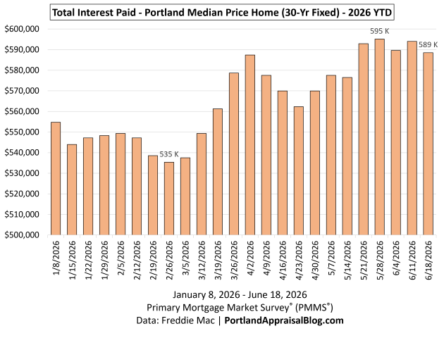
2026 YTD Total Interest Paid
Note: The y-axis starts at $500,000 to allow better examination of monthly differences.
The 2026 YTD TIP chart shows how sharply lifetime borrowing costs have moved as rates climbed through the first half of the year. These calculations are based on the total interest a buyer would pay on the Q1 2026 Portland median‑priced home of $580,000, assuming a 20% down payment and applying the rate effective in each week. This isolates the impact of rate movements alone, holding price and loan structure constant.
The low point came on February 26th, when a 5.98% mortgage rate produced a total interest burden of $535,342. As rates rose through March and into late May, TIP increased steadily, reaching a year‑to‑date high of $595,104 at the 6.53% rate on May 28th—nearly a $60,000 increase in lifetime interest in just three months, driven entirely by rate movement.
This week’s 6.47% rate pulls TIP down slightly from last week’s level: the total interest burden at today’s rate is $588,513, a modest improvement but still among the highest readings of the year. The shape of the chart makes the pattern unmistakable—at today’s price levels, even small rate changes translate into large long‑run cost differences. Buyers feel the monthly payment, but the lifetime interest curve is where the true financial impact of rising rates becomes visible, especially when comparing TIP across different rate environments.
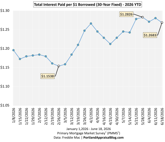
TIP per $1 Borrowed
The TIP‑per‑$1 chart shows how much interest a buyer pays for every dollar borrowed at different mortgage rates. This is the clearest way to visualize the rate sensitivity of long‑run borrowing costs. At the year‑to‑date low of 5.98%, each dollar borrowed generated about $1.1538 in interest over the life of the loan. As rates climbed through the spring, that figure rose steadily, reaching $1.2826 at the late‑May peak of 6.53%.
Today’s 6.47% rate places the cost at $1.2683 per $1 borrowed, a slight improvement from last week but still near the highest levels of the year. The line makes the pattern clear: once rates move into the mid‑6% range, each additional uptick adds meaningfully more lifetime interest—a dynamic that becomes especially clear when comparing rate environments side by side.
Regional Interest Delta (RID)
The Regional Interest Delta (RID) models how much total lifetime interest the Portland Region’s Q1 detached‑home buyers would collectively pay when mortgage rates shift. To keep the metric consistent, RID assumes that all 3,349 Q1 detached sales were financed under standard 20%‑down, 30‑year conventional underwriting, even though the actual dataset includes cash purchases and loans under FHA, VA, jumbo, and other programs. Rates are matched to each home’s close date to reflect the real timing of rate movements, but individual buyers may have locked slightly different rates depending on their specific loan terms. This approach provides a clean, apples‑to‑apples way to measure how rate changes affect the region’s total interest burden.
Using those actual matched rates, the region’s Q1 2026 pipeline will generate $2,091,901,976 in lifetime interest. Recomputing the same loans at today’s 6.47% rate increases the total to $2,240,052,110. The difference—the RID—is $148,150,134 in additional lifetime interest.
To put that number in perspective: $152 million is the cost of hollywoodHUB, a 222‑unit affordable housing development in Portland. A single rate shift—applied across one quarter’s mortgage activity—creates a lifetime interest delta on the scale of building an entire affordable housing project from the ground up. Today’s RID comes in just below that benchmark, but still represents a nine‑figure increase in long‑run borrowing costs driven solely by rate movement.
RID makes the scale of rate changes unmistakable. What looks like a modest shift at the household level becomes a region‑wide financial impact when applied across thousands of loans—a reminder of how sensitive the Portland market remains to even small movements in the 30‑year fixed.
Payment Delta
The Payment Delta shows how monthly affordability shifts as mortgage rates move. Using the Q1 2026 Portland median‑priced home of $580,000 with a 20% down payment, the monthly principal‑and‑interest payment changes meaningfully even with small rate movements.
Date
Rate
Monthly P&I
Feb 26, 2026
5.98%
$2,775.95
May 28, 2026
6.53%
$2,941.96
Jun 18, 2026
6.47%
$2,923.65
Monthly payment for home using median Q1 2026 price ($580,000) and 20% down. Primary Mortgage Market Survey® (PMMS®) Data: Freddie Mac | PortlandAppraisalBlog.com
From the YTD low to the late‑May peak, the monthly payment increased by $166, and today’s payment remains $148 higher than the February low.
While the Payment Delta is smaller in scale than the lifetime interest changes shown in TIP and RID, it is the number buyers feel most immediately. For households shopping at the lower end of the market, even a $150‑range shift can meaningfully affect qualifying ratios, required down payment, or even which housing types remain viable—such as moving from detached homes to attached or condos. These adjustments often matter more for affordability‑sensitive buyers than for the broader market.
Closing Thoughts
The story of this week is straightforward: mortgage rates remain elevated, and the effects are visible across every major affordability metric. The PABAI continues to signal structural strain for median‑income households, and the recalculated Q1 data shows how even modest rate movements reshape qualifying power, monthly payments, and the share of homes within reach. The TIP and RID visuals make the pattern clear: higher rates don’t just affect individual buyers—they reshape the long‑run financial burden carried across the entire region.
For buyers, the takeaway is that financing conditions remain tight as we move into early summer. Winter continues to offer the best affordability window, but today’s rate environment means households on the margin feel pressure sooner and more sharply than in prior years. Even a $150‑range shift in the Payment Delta can influence qualifying ratios, required down payment, or which housing types remain viable—including whether buyers need to consider attached homes or condos instead of detached options.
For sellers, the implications are more subtle but no less real. The Q1 2026 detached market saw CDOM rise more than 11%, and the current rate backdrop suggests that upward pressure on market times may persist. A smaller pool of qualified buyers and higher monthly payments can translate into longer exposure, especially for homes priced aggressively or positioned in segments where affordability is already stretched. Pricing discipline and realistic expectations matter more in this environment than they did during the ultra‑low‑rate era.
As always, the Portland market adapts—sometimes quickly, sometimes reluctantly—but the direction of travel is clear. Higher rates are reshaping both sides of the transaction, and the early summer of 2026 is operating under some of the most constrained financing conditions we’ve seen this year.
Sources & Further Reading
All data presented in this weekly mortgage rate update is based on the Q1 2026 detached homes segment. The data is sourced directly from RMLS and has been subjected to rigorous cleaning and validation processes to ensure reliability for detached single-family residential analysis in the six-county Portland Region. The trends, comparisons, and commentary are the result of original appraisal expertise and independent analysis—not aggregated from secondary sources or news summaries.
Freddie Mac Primary Mortgage Market Survey® (PMMS®): Dataset
Thanks for reading—I hope you found a useful insight or an unexpected nugget along the way. If you enjoyed the post, please consider subscribing for future updates.
Are you an agent in Portland who wonders why appraisers always do “x”?
A homeowner with questions about appraiser methodology?
If so, feel free to reach out—I enjoy connecting with market participants across Portland and the surrounding counties, and am always happy to help where I can.
And if you’re in need of appraisal services in Portland or anywhere in the Portland Region, we’d be glad to assist.
Q1 2026 detached homes: average price $659,197, median $580,000, and 3,349 sales in the Portland Region. Core (< $1M) dipped modestly, luxury new construction (≥ $1M) fell 44%, and CDOM rose in most counties. Mix shifts shaped pricing as smaller lots sold. Affordability improved, but demand held steady despite slightly lower mortgage rates.
Via Canva Pro
The first quarter of 2026 landed softer than the same period last year, even as mortgage rates eased from their 2025 highs. Activity across the region was steady enough to keep the market functional, but not strong enough to match last year’s pace. What emerged instead was a quarter defined by segmentation: different counties, and even different price tiers within counties, moved in noticeably different directions depending on what types of homes sold.
The core market—homes under $1 million—saw mild slippage, much of it tied to compositional changes. Smaller homes on smaller lots were more common this quarter, which pulled down average prices even as underlying values remained relatively stable. The luxury market told a different story. New construction in the $1M+ segment fell sharply, and that retreat alone accounted for a large share of the region’s year‑over‑year decline. With fewer high‑end new builds closing, luxury volume and pricing softened more noticeably than the core.
Across the region, buyers were active but deliberate, and sellers faced longer marketing times in most counties. Affordability improved modestly thanks to lower rates, but not enough to materially change buyer behavior. Taken together, Q1 2026 was not a dramatic quarter—just a quieter one, shaped as much by what sold as by how the market performed.
The Portland Region in this update comprises the six Oregon counties of Columbia, Clackamas, Hood River, Multnomah, Washington, and Yamhill. These counties form a contiguous housing ecosystem centered on Portland—Multnomah as the core home county, with the others tightly integrated through commuting patterns, economic ties, and shared market dynamics (e.g., Yamhill’s strong connection via Highway 99W and wine-country adjacency). Beyond Yamhill, the MLS system changes, further distinguishing this six-county area from broader geographic aggregations. For a detailed overview—including county profiles, population data, key value influencers, and why this definition differs from the official seven-county Portland–Vancouver–Hillsboro MSA—see my dedicated page: The Portland Region – Six-County Market Area Overview.
All data is sourced from RMLS and reflects open-market detached single-family residential sales (excluding condos, attached homes, manufactured homes on leased land, and multifamily). SNL (“Sold Not Listed”) entries—off-market transactions entered retroactively—have been excluded to preserve consistency with true market activity.
All figures have undergone my standard cleaning process to address common RMLS accuracy challenges, including misclassifications (e.g., condos listed as detached), square footage/price typos, incomplete fields, status/date mismatches, and non-representative entries. For a detailed overview of these issues, their impact on market analysis, and how I mitigate them through automated flagging, cross-verification, and manual review, see our dedicated page: RMLS Data Accuracy Challenges.
Residential Housing Snapshot
Metric
Detached
Attached
Condo
Manufact.
Total $ Volume
$2.2B
$161.0M
$199.0M
$31.8M
Average Price
$659,197
$444,672
$389,438
$547,486
Avg PPSF (TSF)
$316.17
$286.91
$325.56
$361.83
Avg Total SF
2,164
1,576
1,180
1,570
Avg Age (Yrs)
46.03
15.09
32.03
29.52
Avg Lot Size (ac)
0.655
0.066
N/A
8.228
Avg PABAI
80.47
104.13
117.08
110.07
Highest Sale
$5,725,950
$1,175,000
$2,450,000
$2,400,000
Lowest Sale
$135,000
$249,000
$100,000
$199,700
Price Spread Ratio
42.41
4.72
24.50
12.02
PPSF Spread Ratio
30.93
4.08
11.91
13.29
SF Spread Ratio
23.46
4.14
12.24
3.52
Avg CDOM
80.23
80.59
119.62
120.86
Total # of Sales
3,349
362
511
58
% of Market
78.25%
8.46%
11.94%
1.36%
Q1 2026 (4,280 total residential sales). Data: RMLS | PortlandAppraisalBlog.com
Detached homes continue to define the structure of the Portland Region’s residential market in Q1 2026. They account for more than three‑quarters of all open‑market residential sales and over $2.2 billion of the region’s $2.6 billion in total dollar volume, and they remain the least affordable segment with a PABAI of 80.47. For readers new to the metric, a PABAI of 100 means a home is perfectly affordable to the median HUD MSA income; values below 100 indicate unaffordability, and values above 100 indicate more readily affordable conditions. Detached properties also sit on ten times the land of attached homes on average and are significantly larger, with an average dwelling size more than 500 square feet above attached and manufactured homes and over 1,000 square feet above condos. Their wide spread ratios across price, PPSF, and size reflect a segment that spans everything from sub‑$150,000 fixers to multi‑million‑dollar estates. This combination of scale, land intensity, and internal diversity will be explored in greater detail in this update.
In contrast, the other three segments help illustrate the pathways buyers take when detached becomes harder to access. Attached homes are the clearest counterpoint: the youngest segment (average age ~15 years), the most uniform by spread ratios, and the most “commodity‑like” product in the region. Their modest affordability (PABAI 104.2) and predictable size and pricing make them the safety‑net entry point for buyers priced out of detached. Condos and manufactured homes share surprising similarities—affordability (PABAI 117.08 and 110.07), age, CDOM, and even price ceilings—yet diverge sharply in average price because manufactured homes trade on land, while condos trade on HOA dues, the hidden variable that shapes their affordability profile.
Entry‑level opportunities still exist across the region, with the lowest Q1 sale closing at $100,000, but buyers must compromise on location, utility, condition, or quality—especially for detached fixers. Three of the four segments cluster in the low–mid $300s PPSF, underscoring that structure cost is relatively consistent across the metro; it is land and home size that creates the separation between detached and everything else. Spread ratios help illustrate this internal variation by comparing the highest and lowest values within each segment—higher ratios indicate a wider spectrum of product types and price points, while lower ratios signal a more uniform, commodity‑like segment. Detached homes’ wide spread ratios (Price 42.41, PPSF 30.93, SF 23.46) highlight its internal variability and set the stage for the segment‑specific analysis that follows.
Portland Region Q1 2026 Overview
Overall Regional Trends
The table below summarizes key metrics for detached single-family residential sales in the Portland Region (Columbia, Clackamas, Hood River, Multnomah, Washington, and Yamhill counties) for Q1 2026 compared with Q1 2025.
Category
Q1 2025
Q1 2026
% Change
Total $ Volume
$2.25 Billion
$2.21 Billion
-1.79%
Average Price
$673,455
$659,197
-2.12%
Median Price
$590,000
$580,000
-1.69%
Avg SP/OLP
97.35%
96.88%
-0.48%
Avg PPSF (TSF)
$320.27
$316.21
-1.27%
Avg HOA Dues
$71.23
$69.10
-2.99%
Avg Lot Size (ac)
0.63
0.66
+4.15%
Avg Age (Yrs)
46.14
46.03
-0.24%
Avg CDOM
72.10
80.22
+11.26%
Avg Total SF
2,167
2,164
-0.16%
Total # of Sales
3,338
3,349
+0.33%
# of New Constr.
459
461
+0.44%
# of REOs
16
40
+150.00%
# of Short Sales
11
14
+27.27%
Average PABAI
71.05
80.47
+13.26%
Note: The calculated average HOA dues is for sales reporting nonzero HOA dues (860 sales for Q1 2025 & 879 sales for Q1 2026). All other metrics use the full dataset for each quarter. Single-Family Detached Residential | Q1 2025 & Q1 2026 Data: RMLS | PortlandAppraisalBlog.com
Key Observations From the Aggregate Data
The regional market showed modest softening in Q1 2026, with average and median prices both posting low‑single‑digit declines. Because total sales, average square footage, new‑construction activity, and the age of sold homes all remained essentially unchanged year over year, much of this movement reflects genuine price erosion rather than a shift in the types of homes selling. Dollar volume fell by nearly the same percentage as median price, reinforcing that the decline was driven by pricing rather than a contraction in activity.
Affordability improved meaningfully, with the regional PABAI rising from 71.05 to 80.47. This improvement was driven less by price relief and more by the combination of rising HUD MSA incomes and the fact that Q1 2025 mortgage rates were among the most punishing of the cycle. Even with this improvement, the region remains broadly unaffordable to the median household, but the year‑over‑year shift marks a notable easing of conditions compared to the prior winter.
One nuance becomes clear only when the market is sliced: while the regional average lot size increased slightly, this was driven by the ≥$1M segment, where larger‑parcel properties made up a greater share of sales. In the core market (<$1M), average lot size actually declined, and that shift contributed to the mild price softening in that segment. This compositional effect is not visible in the aggregate data but becomes important when interpreting the underlying dynamics of the detached market.
Distressed sales, while still a small share of the market, increased materially. REOs more than doubled and short sales rose as well, bringing the distressed share from 0.80% to 1.61% of all closings. These are not systemic levels, but they may represent early signs of pressure at the margins—particularly among households who purchased or refinanced during the peak‑rate environment. Marketing times lengthened for the second consecutive year, with CDOM rising more than 11%. This continues the multi‑quarter pattern of a market weighed down by persistently high interest rates, where buyers remain active but more selective, and sellers face longer exposure before securing a contract.
Portland Region Scatter Plots
To visualize the distribution of individual detached homes sales prices across Q1 2026, the following scatter plot shows sales price against date of sale:
The scatter plot below illustrates the distribution of individual detached home sales across Q1 2026, with each point representing a single closing. The vast majority of activity—more than 3,000 of the 3,349 sales—occurred below $1 million, forming the dense mid‑band that represents the functional core of the detached market. Above $1 million, the cloud begins to thin, with a smaller set of luxury transactions extending into the $3–5 million range; these outliers contribute to the segment’s wide price spread but do not define overall market behavior. The vertical dispersion in the chart reflects the extraordinary diversity of detached housing in the region, ranging from sub‑1,000‑square‑foot cottages to 9,000‑square‑foot luxury builds, combined with differences in land, location, and condition. Sales are evenly distributed across the quarter, showing a market that remained active and steady, and the absence of any clear trend reinforces that the modest year‑over‑year price erosion observed in the aggregate data reflects broader conditions rather than intra‑quarter softening.
Core Market (< $1M)
The core market—detached single‑family homes closing under $1 million—continues to anchor the region’s detached activity, representing 91.61% of all sales and 81.03% of total dollar volume in Q1 2026. Because this segment accounts for nearly all transactions, it provides the clearest view of underlying market conditions. Year‑over‑year changes are modest, but they reveal a market that remains functional, rate‑weighted, and subtly reshaped by a shift in land characteristics that is not visible in the regional aggregates.
The table below shows core-market metrics for Q1 2026 compared with Q1 2025.
Price levels in the core segment softened slightly, with average price down about 1.5% and median price slipping just under 1%. These declines are small but meaningful—and importantly, they are partly compositional. While total square footage, average age, and the number of sales remained essentially unchanged, average lot size contracted from 0.51 to 0.45 acres, a notable shift for detached homes. Smaller parcels naturally pull down both price and PPSF, even when structure size is stable. This nuance is masked in the regional overview, where the >$1M segment—characterized by larger lots—pulled the overall average upward. Only by slicing the market does the underlying trend become clear: the core segment sold slightly less land this year, and that contributed to the mild price erosion.
PPSF followed the same pattern, declining from $312.73 to $308.78 (‑1.3%). With total square footage essentially flat (2,007 → 2,005), this movement reflects both the modest softening in pricing and the shift toward smaller lots. In a detached market where land is a major component of value, even small changes in parcel size can influence price metrics in ways that are not immediately visible without segmentation.
New construction strengthened the segment, rising from 407 to 432 closings (+6.1%). This increase helped keep the average age of sold homes stable and indicates that builders continue to find demand in the entry‑to‑mid‑level detached market despite elevated borrowing costs. The steady flow of new inventory also contributes to the segment’s overall stability, offering buyers predictable options within the core price band.
Market tempo slowed, with average cumulative days on market rising from 69 to 75 days (+8.8%). This increase mirrors the broader regional pattern and reflects the behavior of affordability‑conscious buyers navigating higher rates: more comparison shopping, more negotiation, and more time before committing. The slight decline in the SP/OLP ratio (97.54% → 97.12%) reinforces this dynamic, showing that buyers in the core segment have gained a bit more leverage than they held a year ago.
Overall, the core market remains structurally stable. Prices softened modestly, lots trended smaller, new construction strengthened, and buyers took more time to transact—all consistent with a detached market adjusting to persistent rate pressure rather than reacting to distress or volatility. The compositional shift in land is the key nuance this quarter: it explains part of the mild price decline and highlights why slicing the market is essential for understanding the true dynamics beneath the regional averages.
Core Market (< $1M) Scatter Plot
To visualize pricing behavior within the core detached segment, the following scatter plot shows individual sales under $1 million across Q1 2026:
Most core‑market sales fall between $300,000 and $800,000, and this is where the scatter plot forms its densest cluster; 86.95% of detached sales occur within this range. Activity becomes noticeably thinner above $800,000 and tapers further as prices approach the $1 million threshold. The even spread of points across the quarter indicates a steady, active market with no visible intra‑quarter trend—consistent with a segment that is stable, rate‑weighted, and not experiencing rapid shifts in buyer or seller behavior. The mild year‑over‑year softening observed in the core market reflects broader conditions and subtle compositional changes rather than any short‑term movement within the quarter.
Luxury Market (≥ $1M)
The luxury segment—detached homes closing at $1 million or more—remains a small but influential share of the regional market, representing 8.39% of all sales and 18.97% of total dollar volume in Q1 2026. Activity held essentially flat year over year, with total sales dipping only slightly (284 → 281), but the composition of what sold shifted in ways that meaningfully shaped the segment’s pricing and tempo.
The table below shows luxury-market metrics for Q1 2026 compared with Q1 2025.
The most striking change this quarter is the sharp increase in market time. Average cumulative days on market rose from 105 to 136 days, a nearly 29% jump that pushes the segment well past the four‑month mark. This reflects a luxury market where buyers remain active but highly selective, and where elevated borrowing costs have lengthened decision cycles. The decline in the SP/OLP ratio (95.31% → 94.33%) reinforces this dynamic: sellers are conceding more at the negotiation table to secure a contract.
Pricing signals are mixed but ultimately point toward softening. Average price fell 3.8%, while median price rose 1.2%—a divergence explained by a significant compositional shift. The average lot size of sold luxury homes increased dramatically, from 1.93 to 2.90 acres (+50%). Larger parcels tend to pull the median upward even when underlying pricing is flat or declining. This is consistent with the modest drop in PPSF (‑1.0%) and the decline in average price, both of which indicate that the underlying value trend is softening despite the median tick upward.
The segment also skewed older this year, with average age rising from 37 to 41 years. This is directly tied to the steep decline in new‑construction closings (52 → 29, down 44%). With fewer new deliveries entering the upper market, older resale inventory made up a larger share of what sold. These resales helped keep total unit volume nearly flat.
Overall, the luxury market in Q1 2026 reflects a slower, more deliberate segment shaped by higher rates, fewer new‑construction offerings, and a shift toward larger, older properties. Demand remains present, but buyers are taking more time, negotiating more firmly, and showing greater sensitivity to price and condition. The compositional shift toward larger lots also helps explain why the regional average lot size appeared stable even as the core market contracted—an important nuance that becomes visible only when the market is segmented.
Luxury Market (≥ $1M) Scatter Plot
To visualize pricing behavior in the upper end of the detached market, the scatter plot below shows individual sales at or above $1 million across Q1 2026.
Most luxury‑segment sales cluster between $1 million and $2 million, with activity thinning noticeably above $2 million and only a small number of outliers reaching into the $4–6 million range. The distribution remains steady across the quarter, with no visible intra‑quarter trend—consistent with a segment that is active but slower‑moving, shaped more by buyer selectivity and longer marketing times than by rapid shifts in pricing. The wide vertical spread reflects the diversity of the upper market, where property characteristics vary substantially in size, age, and acreage. The mild softening observed in the luxury metrics aligns with what the scatter shows: a functioning but rate‑weighted segment where buyers are taking more time, negotiating more firmly, and concentrating their activity in the lower half of the luxury price band.
Sales Volume
A treemap visualizing the distribution of detached single-family home sales by county in Q1 2026 clearly illustrates the market’s geographic concentration.
Sales volume remains heavily concentrated in the region’s Big Three counties—Multnomah, Washington, and Clackamas—which together account for 90.98% of all detached transactions. Multnomah leads with 36.22% of sales, followed by Washington at 30.34% and Clackamas at 24.43%, forming the structural core of regional activity. The remaining counties—Yamhill, Columbia, and Hood River—collectively contribute less than 10% of sales, and their smaller footprints are clearly visible in the treemap.
This distribution underscores how dependent the detached market is on the Big Three for both volume and trend formation. Regional pricing, tempo, and compositional shifts are shaped primarily by these counties, while the outlying markets play a supporting but comparatively limited role. The treemap also reinforces why segmentation by price tier is essential: even within this dominant tri‑county block, the mix of property types, lot sizes, and buyer profiles varies enough to influence the broader narrative when examined more closely.
The bar chart below compares monthly sales volume across the three months of Q1 for 2025 and 2026.
Monthly activity varied between the two years, but total quarterly volume was nearly identical (3,338 vs. 3,349). January posted the largest difference, with 2026 starting slower (‑119 sales), while February and March both exceeded their 2025 counterparts. March in particular showed a notable lift, adding 117 more sales than the prior year and offsetting January’s deficit. The overall pattern reflects a market that remains active and steady despite rate pressure: timing shifted within the quarter, but the total number of homes changing hands was effectively unchanged. This reinforces the broader theme of Q1 2026—a functional, rate‑weighted market where buyer activity persists even as conditions evolve.
Sales Price
The bar chart below compares monthly average sales prices across the three months of Q1 for 2025 and 2026.
Note: The y-axis starts at $600,000 to allow better examination of monthly differences.
Average prices in January and February 2026 trailed their 2025 counterparts, down 3.9% and 4.4%, respectively. March posted a modest gain of 0.97%, but the improvement was not enough to offset the softer performance earlier in the quarter. The overall pattern reflects a market that began the year under mild price pressure before stabilizing toward the end of the quarter. This aligns with the broader Q1 narrative: steady sales volume, longer marketing times, and modest year‑over‑year softening shaped partly by composition and partly by rate‑driven buyer behavior.
New Construction
The bar graph below shows monthly total detached single-family sales in Q1 2026, with new construction volume nested within each bar to illustrate the portion of sales that were newly built.
New‑construction activity held remarkably steady throughout the quarter, ranging from 12% to 15% of monthly sales and totaling 461 closings, or 13.77% of all Q1 transactions. This consistency indicates that builders are delivering homes at a stable cadence and have adapted effectively to the higher‑rate environment. Even as resale activity fluctuated month to month, new‑construction volume remained a reliable contributor to overall supply, helping to support market stability and providing buyers with fresh inventory options across the region.
New‑construction activity in Q1 2026 landed almost exactly on par with the prior year—461 closings vs. 459, a difference of just two homes. This near‑perfect match is remarkable given the higher‑rate environment and reflects how effectively builders have adapted their pipelines, pricing, and product mix to current conditions.
At the county level, the distribution shifted modestly. Clackamas posted a small gain, Multnomah held perfectly steady, and Washington County—which continues to dominate the region’s new‑construction landscape—remained essentially unchanged with 230 closings, representing nearly half (49.89%) of all new‑construction sales. Smaller counties showed more volatility: Columbia saw a jump from 1 to 9 closings, Hood River recorded a single new‑construction sale, and Yamhill experienced a notable decline.
The dollar value of new construction closings provides additional context on builder activity and investment scale. The table below shows new construction sales volume by dollar amount for Q1 2026 compared with Q1 2025.
The following double bar chart provides the above information at a glance.
Even though the number of new‑construction closings in Q1 2026 nearly matched the prior year, total dollar volume declined by 9.61%. This reflects a meaningful shift in the mix of what builders delivered. The upper end of the market retreated this quarter, and because luxury new‑construction homes typically carry price points roughly double those of core‑market builds, the reduction in high‑value deliveries had an outsized impact on total dollars.
Washington County—still the region’s dominant new‑construction hub—saw an 11.79% decline in dollar volume despite only a slight dip in unit count. Clackamas and Multnomah posted similar declines, while Yamhill experienced a sharper drop. Smaller counties showed volatility in percentage terms, but their absolute dollar contributions remain minimal.
The overall pattern shows that builders maintained production levels but shifted toward more moderately priced offerings, resulting in a lower aggregate dollar footprint even as total units held steady. This aligns with the broader Q1 dynamic: the luxury segment softened, and that softness reflected directly in the new‑construction dollar totals.
Cumulative Days on Market
The bar chart below compares average cumulative days on market (CDOM) across the three months of Q1 for 2025 and 2026.
Marketing time increased across all three months, with January up 7.9%, February up 16.9%, and March up 11.2% compared with the prior year. The consistent rise reflects a market where buyers remain active but more deliberate, taking longer to commit as elevated rates continue to shape decision‑making. While sales volume held steady quarter over quarter, the longer exposure times indicate that sellers needed more patience in Q1 2026, and that homes generally required additional time to find the right match.
The bar chart below breaks out average CDOM by market segment for the three months of Q1 2026, comparing core (< $1M) and luxury (≥ $1M) properties.
Across all three months, luxury homes required substantially more time to sell, with differences ranging from 42 to 85 days. In January, the gap was widest—luxury listings averaged 166 days on market compared with 81 days for core‑market homes, a spread of nearly three months. February and March showed similar patterns, with luxury homes consistently taking 1.5 to 2.5 months longer to secure a buyer. This disparity reflects the natural dynamics of the upper market, where higher price points, specialized features, and a smaller buyer pool contribute to longer marketing times even in steady conditions.
HOA Dues
While HOA dues are not a defining feature of the detached‑home market, they are far from rare. More than a quarter of all detached sales in Q1 2026 were located in communities with mandatory dues.
Category
Q1 2025
Q1 2026
# of HOA Sales
860
879
Total Sales
3,338
3,349
% of Market
25.76%
26.25%
HOA dues count are sales reporting nonzero HOA dues. Single-Family Detached Residential | Q1 2025 & Q1 2026 Data: RMLS | PortlandAppraisalBlog.com
The share of detached homes with HOA dues edged slightly higher this year, rising to 26.25% of all sales. This reflects the continued prevalence of master‑planned communities, private streets, and shared‑amenity neighborhoods across the region—especially in newer suburban developments. While dues for detached homes are generally modest, they represent a persistent monthly expense for a meaningful portion of buyers and remain an important part of the carrying‑cost profile for these properties.
The bar chart below compares average monthly HOA dues (for reporting sales) for Q1 2025 and Q1 2026:
Average HOA dues for detached homes remained relatively modest across all counties, with most falling between $50 and $75 per month. Year‑over‑year changes were small and mixed: some counties saw slight decreases, while others posted mild increases. These shifts reflect normal variation in community‑level budgeting rather than any broad regional trend. Although detached‑home dues are a fraction of those seen in the attached and condominium segments, they remain a consistent monthly obligation for more than a quarter of buyers and continue to shape affordability at the margins.
Miscellaneous Statistics & Standout Transactions
A few notable extremes and outliers from Q1 2026 illustrate the wide range of value drivers across the six-county region.
Lowest close price: $135,000—a 1963 fixer in Lafayette (Yamhill County). Not much information was given, but tax records show it was sold to an LLC, so the site may be redeveloped. Exterior photos of this property are currently available online.
Highest close price: $5,725,950—a 1990 lakefront estate in Lake Oswego (Clackamas County). The custom-built residence features high-quality finishes, a swimming pool, and excellent views of the Lake. Photos of this property are currently available online.
Smallest Home: 485 sq. ft.—a 1946 cabin in Hood River County. The property was habitable at the time of sale. Given the two-acre lot, the cabin may be eventually demoted to an ADU and a larger residence built. Photos of this property are currently available online.
Largest Home: 8,913 sq. ft.—a 1999 estate home in Portland’s Forest Park neighborhood. The property is situated on a private, forested 10-acre lot and offers expansive rooms. Photos of this property are currently available online.
Largest Lot: 103.62 Acres—a 2008 custom home in Vernonia (Columbia County). The property is located along the Nehalem River and has a half mile of frontage. The property was used as an inn in the past. Photos of this property are currently available online.
Longest CDOM: 1,259 days—a $1.9M listing in Happy Valley (Clackamas County) that closed at $1.7M. The 2005 home is 7,070 sq. ft. and is located in a gated community. Photos of this property are currently available online.
These outliers demonstrate that detached single-family home ownership in the Portland Region can begin around $135,000 for buyers who are patient, flexible, and prepared to address condition or location factors. They stand in contrast to the region’s severely strained affordability.
With the regional aggregate trends, segment splits, monthly patterns, and notable outliers now in view, the remainder of this update turns to a county-level breakdown. The following sections present year-over-year comparisons for each of the six counties in the Portland Region—Multnomah, Washington, Clackamas, Yamhill, Columbia, and Hood River—ordered by Q1 2026 sales volume descending. Each county snapshot includes key metrics, commentary on local drivers, and any segment-specific observations that help explain broader regional patterns.
Multnomah County Q1 2026 Stats
The table below summarizes key metrics for Multnomah County detached single-family residential sales in Q1 2026 compared with Q1 2025.
Category
Q1 2025
Q1 2026
% Change
Total $ Volume
$756.1 Million
$740.9 Million
-2.02%
Average Price
$624,914
$610,761
-2.26%
Median Price
$540,000
$525,000
-2.78%
Avg SP/OLP
97.82%
97.57%
-0.25%
Avg PPSF (TSF)
$318.13
$313.92
-1.33%
Avg HOA Dues
$58.52
$66.21
+13.15%
Avg Lot Size (ac)
0.23
0.29
+28.18%
Avg Age (Yrs)
67.18
67.79
+0.91%
Avg CDOM
65.89
67.13
+1.88%
Avg Total SF
2,066
2,057
-0.44%
Total # of Sales
1,210
1,213
+0.25%
# of New Constr.
66
66
0.00%
# of REOs
9
21
+133.33%
# of Short Sales
6
6
0.00%
Average PABAI
75.13
85.58
+13.91%
HOA figures are for homes reporting nonzero dues. All other metrics use the full dataset. Single-Family Detached Residential | Q1 2025 & Q1 2026 Data: RMLS | PortlandAppraisalBlog.com
Multnomah County was one of the most stable submarkets in the region this quarter. Total sales were essentially unchanged (1,210 → 1,213), and average cumulative days on market held nearly flat (65.9 → 67.1 days). This is notable because the broader region saw a more pronounced slowdown in tempo; Multnomah’s size and liquidity helped keep marketing times steady even as rates remained elevated.
Prices softened modestly across all major measures. Average price (‑2.26%), median price (‑2.78%), and PPSF (‑1.33%) all moved in the same direction and by similar magnitudes, reflecting mild, rate‑weighted pressure rather than any structural shift in demand. The increase in average lot size (0.23 → 0.29 acres, +28%) appears to be a compositional change rather than a land‑value story, as it did not prevent prices from easing.
New construction held perfectly steady at 66 closings, a rare outcome among the counties and a sign of a stable, predictable supply pipeline. REOs increased from 9 to 21, but the absolute number remains very small—just 1.7% of all sales—so this does not indicate distress.
Affordability improved meaningfully. Multnomah’s PABAI rose from 75.13 to 85.58, a 13.9% gain, driven largely by slightly better mortgage rates and income growth. Even with this improvement, Multnomah remains less affordable than the regional average (80.47), reflecting its higher baseline pricing and urban cost structure.
The scatter plot of all Multnomah County sales in Q1 2026 reinforces these themes:
Most sales cluster below $1 million, with a consistent spread across the quarter and only a small number of outliers above $2 million. There is no visible intra‑quarter trend or volatility spike—just a steady, well‑distributed flow of transactions. This visual stability mirrors the metrics: Multnomah continues to function as the region’s most liquid and predictable submarket, with steady demand, steady tempo, and only mild softening at the margins.
Washington County Q1 2026 Stats
The table below summarizes key metrics for Washington County detached single-family residential sales in Q1 2026 compared with Q1 2025.
Category
Q1 2025
Q1 2026
% Change
Total $ Volume
$697.4 Million
$665.7 Million
-4.55%
Average Price
$678,423
$655,226
-3.42%
Median Price
$638,950
$604,250
-5.43%
Avg SP/OLP
97.54%
96.86%
-0.70%
Avg PPSF (TSF)
$318.99
$307.81
-3.50%
Avg HOA Dues
$70.55
$70.98
+0.61%
Avg Lot Size (ac)
0.41
0.33
-19.46%
Avg Age (Yrs)
30.00
30.11
+0.34%
Avg CDOM
72.44
79.97
+10.39%
Avg Total SF
2,211
2,198
-0.58%
Total # of Sales
1,028
1,016
-1.17%
# of New Constr.
233
230
-1.29%
# of REOs
1
7
+600.00%
# of Short Sales
4
1
-75.00%
Average PABAI
66.03
76.94
+16.51%
HOA figures are for homes reporting nonzero dues. All other metrics use the full dataset. Single-Family Detached Residential | Q1 2025 & Q1 2026 Data: RMLS | PortlandAppraisalBlog.com
Washington County showed a mild but noticeable softening in Q1 2026, with most metrics drifting slightly lower while overall activity remained stable. Total sales dipped only marginally (1,028 → 1,016, ‑1.17%), but the county experienced a more meaningful increase in marketing time: CDOM rose from 72.4 to 80.0 days (+10.39%). This was a larger tempo shift than in Multnomah and reflects a market where buyers took longer to commit, particularly in the mid‑tier price ranges.
Prices declined across all major measures. Average price (‑3.42%), median price (‑5.43%), and PPSF (‑3.50%) all moved downward in a coordinated way, indicating broad, rate‑weighted softening rather than a compositional anomaly. The sharper decline in median price suggests that the lower and middle segments of the market felt more pressure—a pattern consistent with the employment uncertainty tied to Intel’s layoffs, which disproportionately affect Washington County’s buyer pool.
Average lot size decreased from 0.41 → 0.33 acres (‑19.46%), which contributed to the price movement but does not fully explain it. Most other structural metrics—home size, age, HOA dues, and new‑construction volume—were essentially unchanged. New construction in particular held steady (233 → 230), reinforcing Washington County’s role as the region’s largest and most consistent builder hub.
Affordability improved meaningfully. Washington’s PABAI rose from 66.03 to 76.94, a 16.5% increase, driven by slightly better mortgage rates and income growth. Even so, the county remains less affordable than the regional average (80.47), reflecting its higher baseline pricing and strong demand for newer suburban housing.
The scatter plot reinforces these themes: a dense cluster of sales between $500k and $900k, a thinner upper tier, and a handful of outliers above $1.5M. There is no visible intra‑quarter trend — just steady, slightly slower activity. Overall, Washington County remained functional and active, but with softer pricing and a more deliberate buyer pace than last year.
The following is a scatter plot of all Washington County sales in Q1 2026:
The scatter plot reveals a dense cluster of sales between $500k and $900k, a thinner upper tier, and a handful of outliers above $1.5M. There is no visible intra‑quarter trend—just steady, slightly slower activity. Overall, Washington County remained functional and active, but with softer pricing and a more deliberate buyer pace than last year.
Clackamas County Q1 2026 Stats
The table below summarizes key metrics for Clackamas County detached single-family residential sales in Q1 2026 compared with Q1 2025.
Category
Q1 2025
Q1 2026
% Change
Total $ Volume
$607.5 Million
$620.5 Million
+2.13%
Average Price
$796,232
$758,529
-4.74%
Median Price
$644,000
$637,283
-1.04%
Avg SP/OLP
96.64%
96.51%
-0.13%
Avg PPSF (TSF)
$331.32
$331.56
+0.07%
Avg HOA Dues
$82.72
$71.50
-13.56%
Avg Lot Size (ac)
1.05
0.91
-14.12%
Avg Age (Yrs)
36.99
36.64
-0.97%
Avg CDOM
73.29
94.03
+28.29%
Avg Total SF
2,400
2,358
-1.71%
Total # of Sales
763
818
+7.21%
# of New Constr.
120
128
+6.67%
# of REOs
4
8
+100.00%
# of Short Sales
1
3
+200.00%
Average PABAI
64.22
72.51
+12.91%
HOA figures are for homes reporting nonzero dues. All other metrics use the full dataset. Single-Family Detached Residential | Q1 2025 & Q1 2026 Data: RMLS | PortlandAppraisalBlog.com
Clackamas County was one of the few counties to post an increase in total dollar volume this quarter, rising 2.13% year over year. This wasn’t driven by higher prices—average and median prices both dipped—but rather by more sales overall (763 → 818, +7.21%). Clackamas was one of the most active counties in Q1, and that higher transaction count helped offset modest price softening.
Prices declined in a way that clearly reflects compositional changes rather than value erosion. Average price fell 4.74%, but PPSF held almost perfectly flat ($331.32 → $331.56, +0.07%). At the same time, both average home size (‑1.71%) and average lot size (‑14.12%) decreased. This combination tells a consistent story: the mix shifted toward smaller homes on smaller parcels, pulling down the averages even as underlying price per square foot remained stable.
Marketing time increased sharply. Average CDOM rose from 73.3 to 94.0 days (+28.29%), one of the largest tempo shifts in the region. Buyers were more deliberate, and sellers needed more patience—especially in the upper‑end segments, which tend to be more sensitive to rate conditions and seasonal timing.
New construction increased (120 → 128, +6.67%), reinforcing Clackamas County’s role as a growth corridor with steady builder activity. REOs and short sales rose in percentage terms but remain extremely small in absolute numbers and do not indicate distress.
Affordability improved but remains strained. Clackamas’ PABAI rose from 64.22 to 72.51 (+12.91%), yet the county remains one of the least affordable in the region, driven in part by the presence of high‑value submarkets such as Lake Oswego and West Linn. One important feature of the PABAI is that it’s not strongly influenced by outliers. Since the index averages affordability ratios across every sale—not just a median price—high‑end transactions have only a muted effect on the final number. This makes county‑to‑county comparisons more stable and meaningful.
The following is a scatter plot of all Clackamas County sales in Q1 2026:
The following scatter plot zooms in on sales below $1,000,000:
The scatter plots reinforce these themes. Most sales cluster below $1M, with a healthy mid‑range and a handful of very high‑end outliers extending above $5M. There is no visible intra‑quarter trend—just steady activity across a wide price spectrum. The visual spread mirrors the metrics: active and stable, with price softening driven primarily by mix rather than market weakness.
Yamhill County Q1 2026 Stats
The table below summarizes key metrics for Yamhill County detached single-family residential sales in Q1 2026 compared with Q1 2025.
Category
Q1 2025
Q1 2026
% Change
Total $ Volume
$127.4 Million
$120.4 Million
-5.47%
Average Price
$571,125
$611,154
+7.01%
Median Price
$485,000
$499,500
+2.99%
Avg SP/OLP
97.43%
95.07%
-2.42%
Avg PPSF (TSF)
$312.30
$311.90
-0.13%
Avg HOA Dues
$56.43
$52.70
-6.61%
Avg Lot Size (ac)
1.62
2.22
+36.85%
Avg Age (Yrs)
36.09
36.83
+2.04%
Avg CDOM
84.09
100.55
+19.57%
Avg Total SF
1,866
1,956
+4.82%
Total # of Sales
223
197
-11.66%
# of New Constr.
39
27
-30.77%
# of REOs
1
1
0.00%
# of Short Sales
0
3
—
Average PABAI
86.35
93.13
+7.85%
HOA figures are for homes reporting nonzero dues. All other metrics use the full dataset. Single-Family Detached Residential | Q1 2025 & Q1 2026 Data: RMLS | PortlandAppraisalBlog.com
Yamhill County experienced one of the sharper slowdowns in sales activity this quarter. Total transactions fell from 223 → 197 (‑11.66%), which in turn pulled total dollar volume down 5.47%. Yet despite fewer sales, both average and median prices increased—a signal that the mix shifted toward larger, higher‑acreage properties rather than broad‑based appreciation.
That mix shift is visible in the structural metrics. Average lot size rose dramatically (1.62 → 2.22 acres, +36.85%), and average home size increased as well (1,866 → 1,956 SF, +4.82%). PPSF, however, remained essentially unchanged (‑0.13%), confirming that underlying values were stable and that the higher averages were driven by the types of homes selling, not by rising prices across the board.
Marketing time lengthened meaningfully. Average CDOM climbed from 84.1 to 100.6 days (+19.57%), crossing the 100‑day threshold and signaling a slower, more deliberate market. This is typical for rural counties with a wide range of property types and a thinner buyer pool, especially when larger acreage properties dominate the quarter’s activity.
New construction declined sharply (39 → 27, ‑30.77%), one of the steepest drops in the region. This reflects fewer subdivision deliveries and a shift toward resale activity on larger parcels. REOs and short sales remain negligible in number and do not indicate distress.
Affordability improved modestly. Yamhill’s PABAI rose from 86.35 to 93.13 (+7.85%), placing it among the more affordable counties in the region—well above the regional average (80.47). This aligns with its lower baseline pricing and rural character, even as larger properties influenced this quarter’s mix.
The following is a scatter plot of all Yamhill County sales in Q1 2026:
The following scatter plot zooms in on sales below $1,000,000:
Most sales cluster below $1M, with a handful of high‑end outliers reaching into the multi‑million‑dollar range. The distribution is wide, typical of a rural county with diverse housing stock. Overall, Yamhill’s Q1 performance reflects fewer sales, larger properties, stable underlying values, and a slower market tempo.
Columbia County Q1 2026 Stats
The table below summarizes key metrics for Columbia County detached single-family residential sales in Q1 2026 compared with Q1 2025.
Category
Q1 2025
Q1 2026
% Change
Total $ Volume
$48.48 Million
$44.83 Million
-7.52%
Average Price
$484,812
$521,336
+7.53%
Median Price
$468,500
$471,350
+0.61%
Avg SP/OLP
95.43%
96.11%
+0.71%
Avg PPSF (TSF)
$278.74
$275.14
-1.29%
Avg HOA Dues
$26.37
$35.20
+33.46%
Avg Lot Size (ac)
2.09
3.54
+69.41%
Avg Age (Yrs)
47.34
39.91
-15.70%
Avg CDOM
96.56
81.29
-15.81%
Avg Total SF
1,880
1,952
+3.79%
Total # of Sales
100
86
-14.00%
# of New Constr.
1
9
+800.00%
# of REOs
1
2
+100.00%
# of Short Sales
0
1
—
Average PABAI
92.74
100.27
+8.12%
HOA figures are for homes reporting nonzero dues. All other metrics use the full dataset. Single-Family Detached Residential | Q1 2025 & Q1 2026 Data: RMLS | PortlandAppraisalBlog.com
Columbia County remains the smallest and most variable market in the region, and that scale is essential context when interpreting quarterly changes. Total sales fell from 100 → 86 (‑14%), which alone explains the decline in total dollar volume (‑7.52%). With so few transactions, even modest shifts in the types of homes selling can move averages more than in the larger counties.
That mix shift is clearly visible this quarter. Average lot size increased dramatically (2.09 → 3.54 acres, +69.41%), and average home size rose as well (1,880 → 1,952 SF, +3.79%). These structural changes helped lift the average sale price by 7.53%, even though PPSF declined slightly (‑1.29%) and median price barely moved (+0.61%). This is a textbook example of how acreage‑heavy quarters can buoy averages without indicating broad appreciation.
Interestingly, Columbia was one of the few counties where marketing time improved. Average CDOM fell from 96.6 to 81.3 days (‑15.81%), suggesting that the buyers who were active in Q1 were decisive, even as overall activity thinned. The county also saw a notable increase in new construction closings (1 → 9), though the absolute numbers remain too small to draw structural conclusions.
Affordability remains Columbia County’s defining characteristic. Its PABAI rose from 92.74 to 100.27, making it the most affordable county in the region by a wide margin and the only one with a PABAI above 100. This reflects its lower baseline pricing, rural character, and the relative absence of high‑cost submarkets.
The following is a scatter plot of all Columbia County sales in Q1 2026:
The scatter plot reinforces the small‑market dynamics. Most sales cluster below $600k, with a handful of outliers extending upward. The distribution is wide but thin, typical of a rural county with diverse property types and limited transaction volume. Overall, Columbia’s Q1 performance reflects fewer sales, larger properties, stable underlying values, and the strongest affordability profile in the region.
Hood River County Q1 2026 Stats
The table below summarizes key metrics for Hood River County detached single-family residential sales in Q1 2026 compared with Q1 2025.
Category
Q1 2025
Q1 2026
% Change
Total $ Volume
$11.06 Million
$15.38 Million
+39.03%
Average Price
$790,029
$809,316
+2.44%
Median Price
$654,200
$745,000
+13.88%
Avg SP/OLP
93.64%
92.61%
-1.11%
Avg PPSF (TSF)
$420.77
$480.64
+14.23%
Avg HOA Dues
$41.66
$27.08
-35.00%
Avg Lot Size (ac)
1.85
1.12
-39.43%
Avg Age (Yrs)
62.36
35.00
-43.87%
Avg CDOM
153.86
120.11
-21.94%
Avg Total SF
1,959
1,928
-1.62%
Total # of Sales
14
19
+35.71%
# of New Constr.
0
1
—
# of REOs
0
1
—
# of Short Sales
0
0
—
Average PABAI
60.86
64.79
+6.46%
HOA figures are for homes reporting nonzero dues. All other metrics use the full dataset. Single-Family Detached Residential | Q1 2025 & Q1 2026 Data: RMLS | PortlandAppraisalBlog.com
Hood River County is by far the smallest market in the region, and that scale shapes how its quarterly metrics should be interpreted. With only 19 sales this quarter, even a handful of transactions can meaningfully shift averages. For that reason, the most appropriate approach here is to report the changes rather than infer broad trends.
Total sales increased from 14 → 19 (+35.71%), and total dollar volume rose proportionally (+39.03%). Average and median prices both increased—average price by 2.44% and median price by 13.88%—but these movements reflect the specific mix of homes that sold rather than market‑wide appreciation. The structural metrics confirm this: homes sold this quarter were younger on average (62.4 → 35.0 years, ‑43.87%) and sat on much smaller lots (1.85 → 1.12 acres, ‑39.43%). These shifts alone can easily move median and average prices in a small dataset.
Price per square foot increased ($420.77 → $480.64, +14.23%), but again, with so few sales, this reflects the characteristics of individual properties rather than a reliable directional signal. Average home size was nearly unchanged (‑1.62%), reinforcing that PPSF is being influenced by the composition of the sales rather than broad pricing pressure.
Marketing time improved meaningfully. Average CDOM fell from 153.9 to 120.1 days (‑21.94%), though both figures remain high relative to the metro counties. This is typical for a small, rural, and lifestyle‑driven market where unique properties take longer to match with the right buyer.
Affordability improved modestly. Hood River’s PABAI rose from 60.86 to 64.79 (+6.46%), but because the county had only 19 sales, this value should be interpreted with caution. The index is most reliable in segments with at least 20–30 transactions, and Hood River’s small sample size means quarterly fluctuations may reflect mix rather than underlying affordability conditions. PABAI is generally more meaningful for this county on a semi‑annual or annual basis.
The following is a scatter plot of all Hood River County sales in Q1 2026:
The scatter plot reinforces the small‑sample dynamics. Prices vary widely from sale to sale, with a handful of higher‑priced transactions early in the quarter and a cluster of mid‑range sales later on. There is no meaningful intra‑quarter trend—just the natural variability of a market with very few transactions.
Closing Thoughts
Taken together, the first quarter of 2026 reads as a softer, more composition‑driven period for the Portland region. Most counties posted lower dollar volume than last year, and even where prices held steady, the underlying story often came down to the types of homes that sold rather than broad market movement. Smaller homes and smaller lots were more common in several counties, while others saw the opposite—larger rural properties that lifted averages despite thinner activity. Across the board, the data shows a market that is functioning, but not accelerating.
The core and luxury segments reinforced this pattern. The sub‑$1M market slipped modestly, shaped largely by mix and by buyers who remained price‑sensitive despite slightly better mortgage rates. The luxury market, meanwhile, saw a sharper pullback, driven in large part by a steep decline in new construction closings. With fewer high‑end builds delivering, luxury volume contracted and marketing times lengthened, underscoring how sensitive the upper tier remains to both rates and inventory cycles.
Affordability improved across all counties, but not enough to materially change behavior. Buyers were active but deliberate, sellers needed more patience, and the region continued to operate in a narrow band between stability and constraint. Q1 wasn’t a dramatic quarter—just a quieter one, shaped by rate‑sensitivity, local variation, and the ongoing influence of what sells in any given slice of time. As we move into the spring and summer markets, the question is less about momentum and more about whether mortgage rates will continue to weigh upon the market.
What trends do you expect to see in Q2 2026? I’d love to hear your thoughts—feel free to reply here or reach out directly.
Sources & Further Reading
All data presented in this quarterly update is sourced directly from RMLS and has been subjected to our rigorous cleaning and validation process to ensure reliability for detached single-family residential analysis in the six-county Portland Region. The trends, comparisons, and commentary are the result of original appraisal expertise and independent analysis—not aggregated from secondary sources or news summaries.
External Obsolescence in Hillsboro — Residential Market Response to Intel’s 2024–2025 Workforce Reductions: Portland Appraisal Blog
Coda
Thanks for reading—I hope you found a useful insight or an unexpected nugget along the way. If you enjoyed the post, please consider subscribing for future updates.
Are you an agent in Portland who wonders why appraisers always do “x”?
A homeowner with questions about appraiser methodology?
If so, feel free to reach out—I enjoy connecting with market participants across Portland and the surrounding counties, and am always happy to help where I can.
And if you’re in need of appraisal services in Portland or anywhere in the Portland Region, we’d be glad to assist.